PLACES TO GO | NORD HOUSE, AUSTRALIA

8 November 2016

interior design, style, styling, decor, melbourne, mornington peninsula, monochrome, textures, scandi style, scandinavia, contemporary living, luxury, urban, hale mercantile, flocca signature bedding, design conscious, urban, modern rustic, poss samperi, orchard keepers, nord house


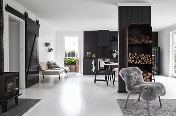
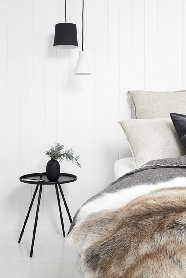
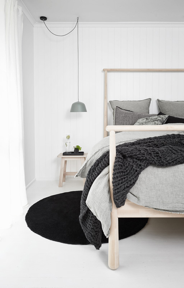
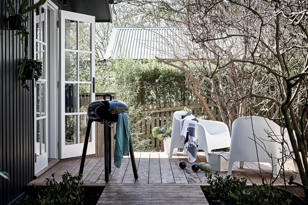
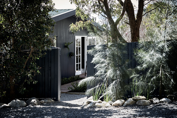
Now that the days are getting shorter in the Northern hemisphere I couldn’t resist sharing images of Nord House in Australia with you. A Scandi style weekend getaway designed by Poss Samperi who also runs – and styled – Orchard Keepers, another holiday accommodation on the Mornington Peninsula which I blogged about here a while ago.

Though it feels as if she’s taken a more radical monochrome approach to the interior the same modern rustic Scandi style applies and textures from wood, sheepskin rugs and textiles give a wonderful relaxed but yet luxurious edge. I spot the daybed by Ilse Crawford from the latest IKEA Sinnerlig collection which is made out of jute and fits perfectly into the space.

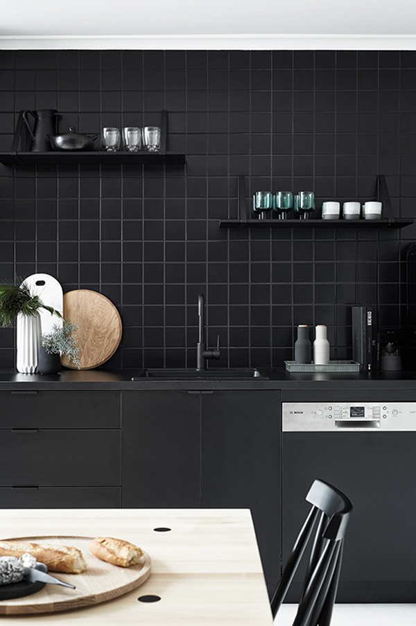
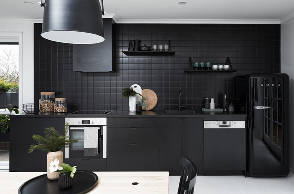
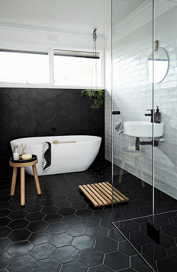
The dramatic monochrome colour palette is most distinct when you look at the matt black kitchen units, complete with black tiling and grout, next to the brilliant white painted wooden flooring. It’s a stark contrast but one that evokes luxury and contemporary living aimed at the urban Melbourne crowd who can reach this oasis in a few hours.

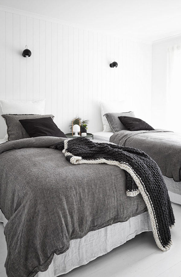
I also spotted some rather lovely linen in the bedrooms with beautifully tufted edges and after some digging I found that this signature Flocca bedding is made by brand Hale Mercantile and also comes in a range of beautiful soft off-colours. Interestingly, Poss steered away from any of those tempting colours and stuck with greys, whites and beiges to achieve maximum impact and a stunning setting for the design-conscious urban crowd.


interior design, style, styling, decor, melbourne, mornington peninsula, monochrome, textures, scandi style, scandinavia, contemporary living, luxury, urban, hale mercantile, flocca signature bedding, design conscious, urban, modern rustic, poss samperi, orchard keepers, nord house

interior design, style, styling, decor, melbourne, mornington peninsula, monochrome, textures, scandi style, scandinavia, contemporary living, luxury, urban, hale mercantile, flocca signature bedding, design conscious, urban, modern rustic, poss samperi, orchard keepers, nord house

interior design, style, styling, decor, melbourne, mornington peninsula, monochrome, textures, scandi style, scandinavia, contemporary living, luxury, urban, hale mercantile, flocca signature bedding, design conscious, urban, modern rustic, poss samperi, orchard keepers, nord house

interior design, style, styling, decor, melbourne, mornington peninsula, monochrome, textures, scandi style, scandinavia, contemporary living, luxury, urban, hale mercantile, flocca signature bedding, design conscious, urban, modern rustic, poss samperi, orchard keepers, nord house

interior design, style, styling, decor, melbourne, mornington peninsula, monochrome, textures, scandi style, scandinavia, contemporary living, luxury, urban, hale mercantile, flocca signature bedding, design conscious, urban, modern rustic, poss samperi, orchard keepers, nord house

interior design, style, styling, decor, melbourne, mornington peninsula, monochrome, textures, scandi style, scandinavia, contemporary living, luxury, urban, hale mercantile, flocca signature bedding, design conscious, urban, modern rustic, poss samperi, orchard keepers, nord house

interior design, style, styling, decor, melbourne, mornington peninsula, monochrome, textures, scandi style, scandinavia, contemporary living, luxury, urban, hale mercantile, flocca signature bedding, design conscious, urban, modern rustic, poss samperi, orchard keepers, nord house

interior design, style, styling, decor, melbourne, mornington peninsula, monochrome, textures, scandi style, scandinavia, contemporary living, luxury, urban, hale mercantile, flocca signature bedding, design conscious, urban, modern rustic, poss samperi, orchard keepers, nord house

interior design, style, styling, decor, melbourne, mornington peninsula, monochrome, textures, scandi style, scandinavia, contemporary living, luxury, urban, hale mercantile, flocca signature bedding, design conscious, urban, modern rustic, poss samperi, orchard keepers, nord house interior design, style, styling, decor, melbourne, mornington peninsula, monochrome, textures, scandi style, scandinavia, contemporary living, luxury, urban, hale mercantile, flocca signature bedding, design conscious, urban, modern rustic, poss samperi, orchard keepers, nord house

interior design, style, styling, decor, melbourne, mornington peninsula, monochrome, textures, scandi style, scandinavia, contemporary living, luxury, urban, hale mercantile, flocca signature bedding, design conscious, urban, modern rustic, poss samperi, orchard keepers, nord house


MORE INFORMATION | Nord House
PHOTOGRAPHY & STYLING | Doswell Maclean with thanks
 
Follow Stylejuicer with Bloglovin

FUNCTION AND FORM | BLOGGERS TOUR ANTWERP PART I

2 November 2016

function and form, bloggers tour antwerp, Belgium, Belgian, visit antwerp, cool, hip, style, trend, design, industrial, eclectic mix, kaffeenini, design centre de winkelhaak, Eilandje, hansi ombrengt, p8 architecten, contemporary, modern, mas museum, gallery traan, veerle wenes, felix pakhuis, balls and glory, old docks, regeneration, Axel Vervoordt, Dries van Noten, Ann Demeulemeester, Dirk Bikkembergs, royal academy of fine arts, modern belgian, aesthetic, brick flooring, pr agency pentacom


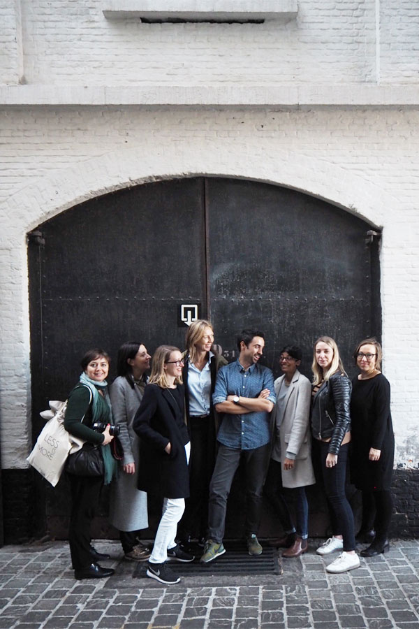
In the last couple of weeks you’ve probably caught some glimpses on Instagram of our first Function+Form Bloggers Tour Antwerp so today I’m going to tell you a bit more of what we got up to on our 3 day trip and how it all came about.

When Tiff and I started Function+Form last year we wanted to bring like-minded people together. People who shared our love for interiors, craftsmanship and design. People who would be excited and inspired by the same stuff – from clever details, beautiful materials and design across all disciplines from ceramics, furniture and textiles to photography, interiors and architecture. For want of a better word – we were looking for our tribe.

During our events it became clear to us that we were only scratching the surface. Our tribe was as keen and hungry to discover and explore our world as we were so we came up with the idea to organise our first Function and Form Bloggers Tour. A city break was an obvious choice but we wanted to go somewhere that had been slightly under the radar, somewhere we could truly discover – though in this digital socially-networked day and age this might sound like an oxymoron.

Our group came together quite organically and we teamed up with German PR agency Pentacom who wanted to introduce us to some of their interiors and design clients based in Antwerp. The owner Annekathrin Koch managed to put an amazing program together in collaboration with the City of Antwerp and the Design Center De Winkelhaak which gave us a great overview of the local design scene and take in the city’s vibe.


function and form, bloggers tour antwerp, Belgium, Belgian, visit antwerp, cool, hip, style, trend, design, industrial, eclectic mix, kaffeenini, design centre de winkelhaak, Eilandje, hansi ombrengt, p8 architecten, contemporary, modern, mas museum, gallery traan, veerle wenes, felix pakhuis, balls and glory, old docks, regeneration, Axel Vervoordt, Dries van Noten, Ann Demeulemeester, Dirk Bikkembergs, royal academy of fine arts, modern belgian, aesthetic, brick flooring, pr agency pentacom

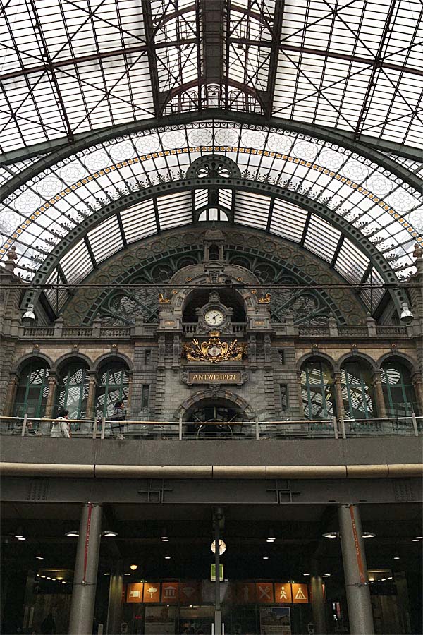
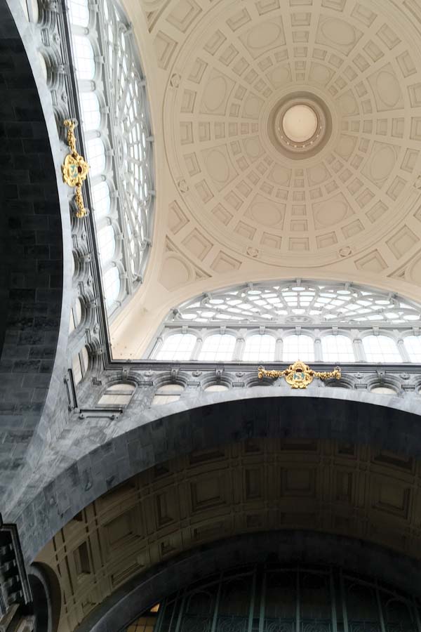
One of the most beautiful train stations in Europe.

function and form, bloggers tour antwerp, Belgium, Belgian, visit antwerp, cool, hip, style, trend, design, industrial, eclectic mix, kaffeenini, design centre de winkelhaak, Eilandje, hansi ombrengt, p8 architecten, contemporary, modern, mas museum, gallery traan, veerle wenes, felix pakhuis, balls and glory, old docks, regeneration, Axel Vervoordt, Dries van Noten, Ann Demeulemeester, Dirk Bikkembergs, royal academy of fine arts, modern belgian, aesthetic, brick flooring, pr agency pentacom

The Grand Hall in Antwerp Centraal train station.

function and form, bloggers tour antwerp, Belgium, Belgian, visit antwerp, cool, hip, style, trend, design, industrial, eclectic mix, kaffeenini, design centre de winkelhaak, Eilandje, hansi ombrengt, p8 architecten, contemporary, modern, mas museum, gallery traan, veerle wenes, felix pakhuis, balls and glory, old docks, regeneration, Axel Vervoordt, Dries van Noten, Ann Demeulemeester, Dirk Bikkembergs, royal academy of fine arts, modern belgian, aesthetic, brick flooring, pr agency pentacom

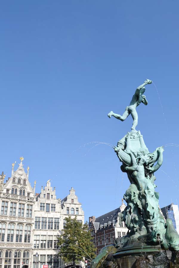
16th-century Guildhouses at the Grote Markt and the mystical Giant throwing a chopped off hand.
 

Let me start by saying that I deliberately didn’t research the trip. Well, not in depth anyway. I wanted to go with little to no expectations and experience for myself what the city had to offer. We did start a Pinterest board where we pinned all interesting looking Antwerp related pictures but for the most part I was ready to go and see with fresh eyes. And boy, I was simply blown away.

Antwerp is hip, cool and confident and can hold it’s own next to the more established cities of ‘cool’ like Copenhagen, Amsterdam or even Berlin. Being the second largest port town in Europe comes with a history of influences from around the world and it’s artistic reputation in the 17th century led by Rubens and Van Dyck is well documented.

Belgian fashion designers have led the way for decades with established figures like Dries van Noten, Ann Demeulemeester and Dirk Bikkembergs who were all part of the famous Antwerp Six who graduated from the Royal Academy of Fine Arts back in the early 1980s.

In terms of interior design Axel Vervoordt can be credited with establishing a Modern Belgian aesthetic back in the 1970s that relies on a rich palette of textures and neutral colours amongst sparsely furnished rooms with natural light being a key ingredient.

Since then Belgian design has grown from strength to strength meaning it was time for us to go and explore the scene in more depth. There were so many highlights during our 3 day trip that I’m just going to give you a flavour with my photos and I’ll elaborate on a few special finds in more detail over the coming months.


function and form, bloggers tour antwerp, Belgium, Belgian, visit antwerp, cool, hip, style, trend, design, industrial, eclectic mix, kaffeenini, design centre de winkelhaak, Eilandje, hansi ombrengt, p8 architecten, contemporary, modern, mas museum, gallery traan, veerle wenes, felix pakhuis, balls and glory, old docks, regeneration, Axel Vervoordt, Dries van Noten, Ann Demeulemeester, Dirk Bikkembergs, royal academy of fine arts, modern belgian, aesthetic, brick flooring, pr agency pentacom

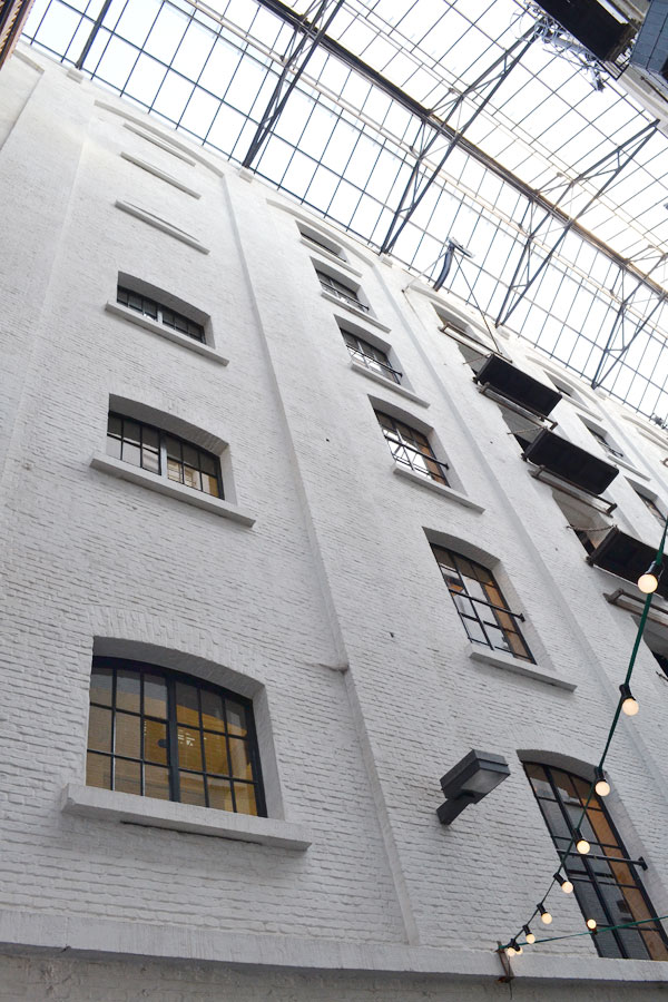
One of the first warehouses to be restored.

function and form, bloggers tour antwerp, Belgium, Belgian, visit antwerp, cool, hip, style, trend, design, industrial, eclectic mix, kaffeenini, design centre de winkelhaak, Eilandje, hansi ombrengt, p8 architecten, contemporary, modern, mas museum, gallery traan, veerle wenes, felix pakhuis, balls and glory, old docks, regeneration, Axel Vervoordt, Dries van Noten, Ann Demeulemeester, Dirk Bikkembergs, royal academy of fine arts, modern belgian, aesthetic, brick flooring, pr agency pentacom

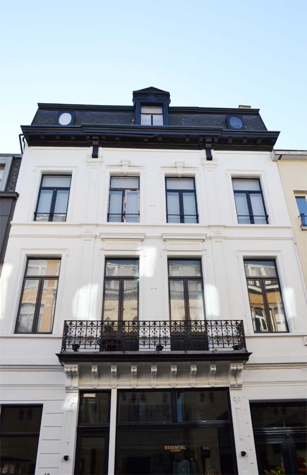
Some classic 19th century architecture in the old town.
 

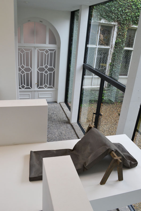
First up was a visit to Gallery Traan tucked away in the old town who exhibits objects, subjects and themes with functional and subjective approaches that sit somewhere between design, art and architecture.

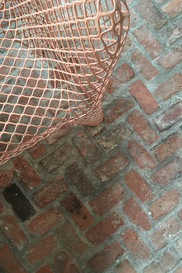
The owner Veerle Wenes was kind enough to give us a tour of the stunning multi-level gallery and her adjacent home that manages to combine modernist architecture with original period details like brick flooring and a huge ancient fireplace in her living room. The space and exhibits compliment each other so well that the line between them becomes blurred and I found myself admiring both in equal measure.

More of this exceptional space soon.


function and form, bloggers tour antwerp, Belgium, Belgian, visit antwerp, cool, hip, style, trend, design, industrial, eclectic mix, kaffeenini, design centre de winkelhaak, Eilandje, hansi ombrengt, p8 architecten, contemporary, modern, mas museum, gallery traan, veerle wenes, felix pakhuis, balls and glory, old docks, regeneration, Axel Vervoordt, Dries van Noten, Ann Demeulemeester, Dirk Bikkembergs, royal academy of fine arts, modern belgian, aesthetic, brick flooring, pr agency pentacom

We saw a lot of beautiful herringbone brick floors as above at Gallery Traan.

function-and-form-bloggers-tour-antwerp-07

The stunning space that is Gallery Traan. Currently exhibiting Johan de Wit.

function and form, bloggers tour antwerp, Belgium, Belgian, visit antwerp, cool, hip, style, trend, design, industrial, eclectic mix, kaffeenini, design centre de winkelhaak, Eilandje, hansi ombrengt, p8 architecten, contemporary, modern, mas museum, gallery traan, veerle wenes, felix pakhuis, balls and glory, old docks, regeneration, Axel Vervoordt, Dries van Noten, Ann Demeulemeester, Dirk Bikkembergs, royal academy of fine arts, modern belgian, aesthetic, brick flooring, pr agency pentacom

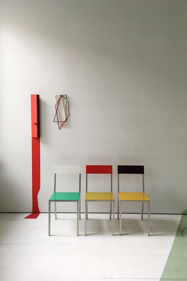
More objects and subjects by duo Muller Van Severen.

function and form, bloggers tour antwerp, Belgium, Belgian, visit antwerp, cool, hip, style, trend, design, industrial, eclectic mix, kaffeenini, design centre de winkelhaak, Eilandje, hansi ombrengt, p8 architecten, contemporary, modern, mas museum, gallery traan, veerle wenes, felix pakhuis, balls and glory, old docks, regeneration, Axel Vervoordt, Dries van Noten, Ann Demeulemeester, Dirk Bikkembergs, royal academy of fine arts, modern belgian, aesthetic, brick flooring, pr agency pentacom

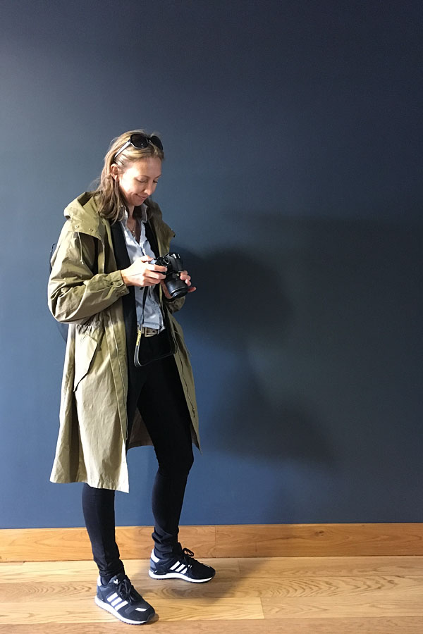
Bloggers at work. Photo by Igor Josifovic.

function and form, bloggers tour antwerp, Belgium, Belgian, visit antwerp, cool, hip, style, trend, design, industrial, eclectic mix, kaffeenini, design centre de winkelhaak, Eilandje, hansi ombrengt, p8 architecten, contemporary, modern, mas museum, gallery traan, veerle wenes, felix pakhuis, balls and glory, old docks, regeneration, Axel Vervoordt, Dries van Noten, Ann Demeulemeester, Dirk Bikkembergs, royal academy of fine arts, modern belgian, aesthetic, brick flooring, pr agency pentacom

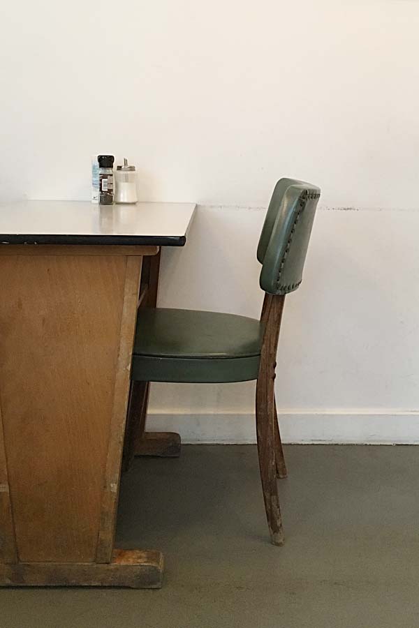
‘Happy coffee’ and great breakfast at Kaffeenini with an eclectic mix of furniture.

function and form, bloggers tour antwerp, Belgium, Belgian, visit antwerp, cool, hip, style, trend, design, industrial, eclectic mix, kaffeenini, design centre de winkelhaak, Eilandje, hansi ombrengt, p8 architecten, contemporary, modern, mas museum, gallery traan, veerle wenes, felix pakhuis, balls and glory, old docks, regeneration, Axel Vervoordt, Dries van Noten, Ann Demeulemeester, Dirk Bikkembergs, royal academy of fine arts, modern belgian, aesthetic, brick flooring, pr agency pentacom

function and form, bloggers tour antwerp, Belgium, Belgian, visit antwerp, cool, hip, style, trend, design, industrial, eclectic mix, kaffeenini, design centre de winkelhaak, Eilandje, hansi ombrengt, p8 architecten, contemporary, modern, mas museum, gallery traan, veerle wenes, felix pakhuis, balls and glory, old docks, regeneration, Axel Vervoordt, Dries van Noten, Ann Demeulemeester, Dirk Bikkembergs, royal academy of fine arts, modern belgian, aesthetic, brick flooring, pr agency pentacom

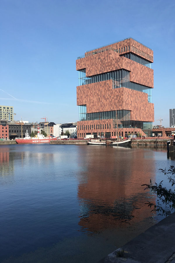
The Mas museum.


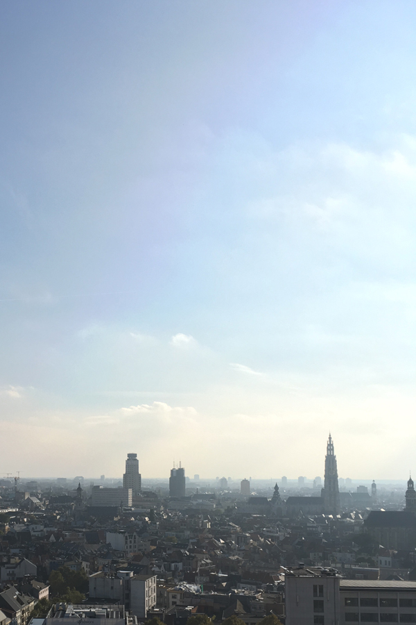
Antwerp like most port towns is in the process of regenerating their old docks which are now too small for the enormous vessels crossing the oceans and the area called Eilandje is now transforming into the hip place to be. PR agency Pentacom organised a tour for us around the Eilandje with architect Hansi Ombregt of p8 architecten who was one of the pioneers in redeveloping a house on the ‘small island’. With the recently built Mas museum overlooking the Eilandje we climbed up to the top and got a great view of Antwerp and an idea of the sheer scale of the harbour which simply dwarves the city.

I’m in love with anything old and industrial especially when blended with contemporary design and we found a wealth of converted old warehouses which now house great restaurants, bars and cafes like Felix Pakhuis and Balls & Glory. This area is only going to get better and I look forward to my next trip when I’m sure there will be more places to explore.

For now I’m going to leave you with some impressions of Antwerp but check back soon for part II with more finds and things to do.


function and form, bloggers tour antwerp, Belgium, Belgian, visit antwerp, cool, hip, style, trend, design, industrial, eclectic mix, kaffeenini, design centre de winkelhaak, Eilandje, hansi ombrengt, p8 architecten, contemporary, modern, mas museum, gallery traan, veerle wenes, felix pakhuis, balls and glory, old docks, regeneration, Axel Vervoordt, Dries van Noten, Ann Demeulemeester, Dirk Bikkembergs, royal academy of fine arts, modern belgian, aesthetic, brick flooring, pr agency pentacom

View across Antwerp toward the old town from the Mas museum.

function and form, bloggers tour antwerp, Belgium, Belgian, visit antwerp, cool, hip, style, trend, design, industrial, eclectic mix, kaffeenini, design centre de winkelhaak, Eilandje, hansi ombrengt, p8 architecten, contemporary, modern, mas museum, gallery traan, veerle wenes, felix pakhuis, balls and glory, old docks, regeneration, Axel Vervoordt, Dries van Noten, Ann Demeulemeester, Dirk Bikkembergs, royal academy of fine arts, modern belgian, aesthetic, brick flooring, pr agency pentacom

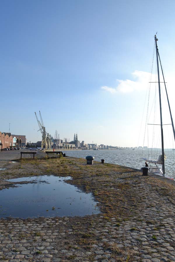
Walk along the Schelde towards the old town.

function and form, bloggers tour antwerp, Belgium, Belgian, visit antwerp, cool, hip, style, trend, design, industrial, eclectic mix, kaffeenini, design centre de winkelhaak, Eilandje, hansi ombrengt, p8 architecten, contemporary, modern, mas museum, gallery traan, veerle wenes, felix pakhuis, balls and glory, old docks, regeneration, Axel Vervoordt, Dries van Noten, Ann Demeulemeester, Dirk Bikkembergs, royal academy of fine arts, modern belgian, aesthetic, brick flooring, pr agency pentacom

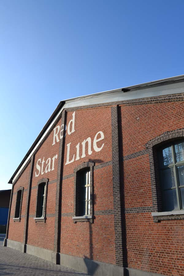
The Red Star Line museum on the Eilandje.

function and form, bloggers tour antwerp, Belgium, Belgian, visit antwerp, cool, hip, style, trend, design, industrial, eclectic mix, kaffeenini, design centre de winkelhaak, Eilandje, hansi ombrengt, p8 architecten, contemporary, modern, mas museum, gallery traan, veerle wenes, felix pakhuis, balls and glory, old docks, regeneration, Axel Vervoordt, Dries van Noten, Ann Demeulemeester, Dirk Bikkembergs, royal academy of fine arts, modern belgian, aesthetic, brick flooring, pr agency pentacom

Yours truly at the Mas museum. Photo by Ilaria Fatore.


MORE INFORMATION | Visit Antwerp
PHOTOGRAPHY | Annie Kruse unless otherwise stated


Our Function and Form Bloggers Tour Antwerp was kindly supported by City of Antwerp, Design Center De Winkelhaak, Ethnicraft, universo positivo and Notre Monde. All opinions expressed are my own.

 
Follow Stylejuicer with Bloglovin

ARCHITECTURE | THE ARK SHELTER

27 October 2016

ark shelter, architecture, architect, zero impact, design, style, minimalist, natural wood, back to nature, woodburner, philosophy, landscape, cabin, module, ecological


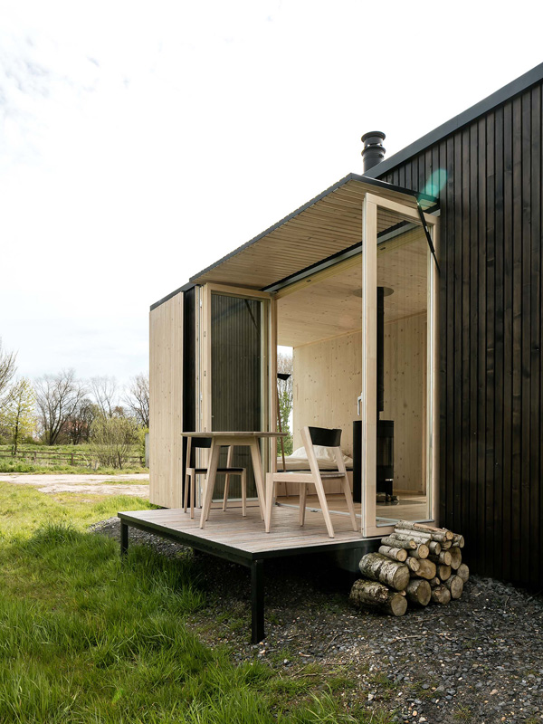
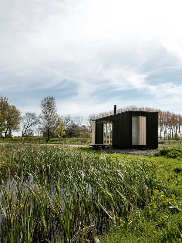
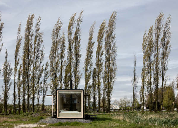
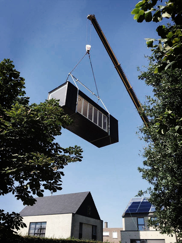
When I came across the Ark Shelter I was immediately drawn in. A mobile cabin with zero impact placed anywhere you like. Merging into the landscape, no wifi or TV just nature and the people you’re with. Hit the reset button and go back to basics.

Ironically technology has made most of our lives even more frantic with the majority of the population glued to their phones and mild anxiety attacks when there’s no wifi. So the ultimate luxury is now a life away from the stresses of everyday life, stepping off the grid and letting our mind calm down by emerging ourselves and engaging with nature. Really opening up every sense and experiencing life and what it is to be alive. I might be going a bit philosophical on you but I truly believe that we all need that engagement with nature, it keeps us sane, grounds us and heals.

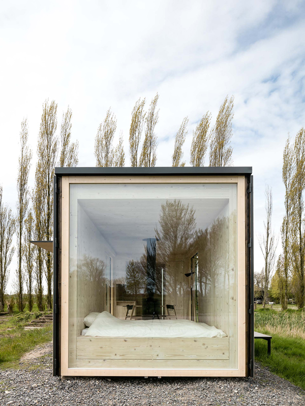
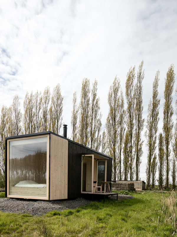
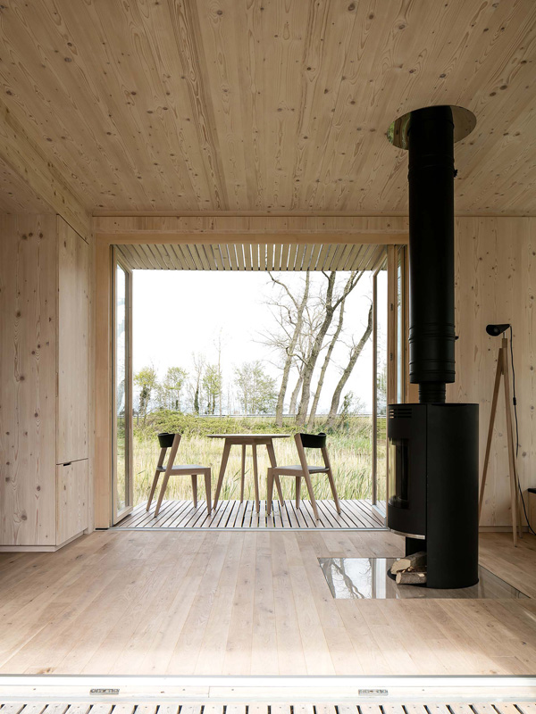
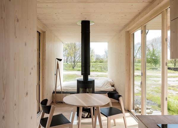
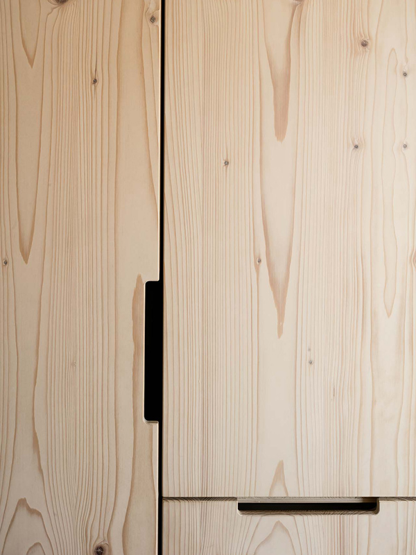
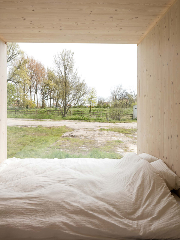
So the clever architects behind the ARK shelter have come up with this extraordinary module, clad in black on the outside and natural wood on the inside with a central woodburner and innovative space saving solutions so the minimal clean lines don’t distract from the surrounding landscape.

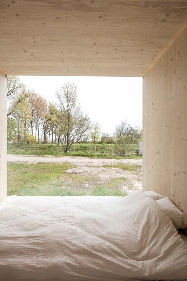
The simple constructed box has a variety of opening platforms and window options and can be extended and made to fit your specifications before being placed where ever you like. Personally I’d like mine to be set amongst the dunes on a beach and take in the ever changing light and weather from my panoramic bedroom window or sit on the sundeck with a cup of coffee, smelling the salty air and listening to the wind and sounds of the sea.

To read more about ARK’s philosophy head over here and be inspired.

 
ark shelter, architecture, architect, zero impact, design, style, minimalist, natural wood, back to nature, woodburner, philosophy, landscape, cabin, module, ecological

ark shelter, architecture, architect, zero impact, design, style, minimalist, natural wood, back to nature, woodburner, philosophy, landscape, cabin, module, ecological

ark shelter, architecture, architect, zero impact, design, style, minimalist, natural wood, back to nature, woodburner, philosophy, landscape, cabin, module, ecological

ark shelter, architecture, architect, zero impact, design, style, minimalist, natural wood, back to nature, woodburner, philosophy, landscape, cabin, module, ecological

ark shelter, architecture, architect, zero impact, design, style, minimalist, natural wood, back to nature, woodburner, philosophy, landscape, cabin, module, ecological

ark shelter, architecture, architect, zero impact, design, style, minimalist, natural wood, back to nature, woodburner, philosophy, landscape, cabin, module, ecological

ark shelter, architecture, architect, zero impact, design, style, minimalist, natural wood, back to nature, woodburner, philosophy, landscape, cabin, module, ecological

ark shelter, architecture, architect, zero impact, design, style, minimalist, natural wood, back to nature, woodburner, philosophy, landscape, cabin, module, ecological

ark shelter, architecture, architect, zero impact, design, style, minimalist, natural wood, back to nature, woodburner, philosophy, landscape, cabin, module, ecological

ark shelter, architecture, architect, zero impact, design, style, minimalist, natural wood, back to nature, woodburner, philosophy, landscape, cabin, module, ecological

ark shelter, architecture, architect, zero impact, design, style, minimalist, natural wood, back to nature, woodburner, philosophy, landscape, cabin, module, ecological


MORE INFORMATION & PHOTOGRAPHY | Ark Shelter with thanks
 
Follow Stylejuicer with Bloglovin
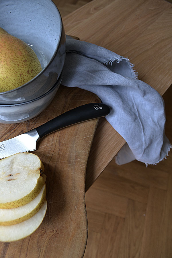
COX AND COX FOR THE HOME

24 October 2016

eclectic, beautiful, handpicked, homeware, unique, individual, inspirational, home accessories, lightling, rugs, storage, decorative, hand-selected, christmas, decor, home, style, styling, oak, nordic inspired


Eclectic online homewares brand Cox And Cox launched back in 2011 and have slowly but steadily evolved into a niche market place for unique products aimed at customers looking to decorate their home with individual pieces that can’t be found on the highstreet.

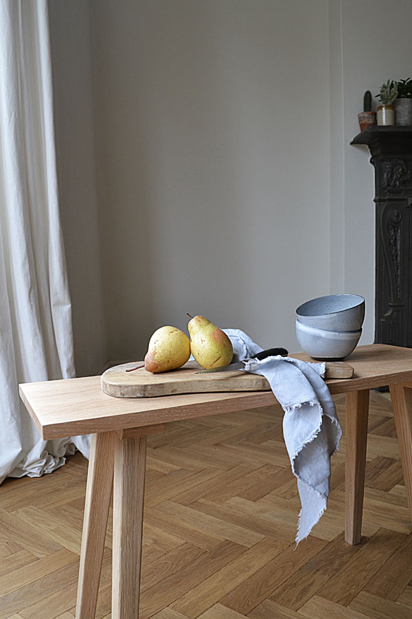
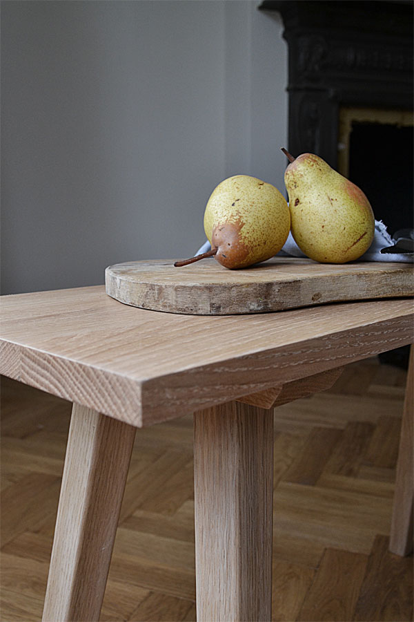
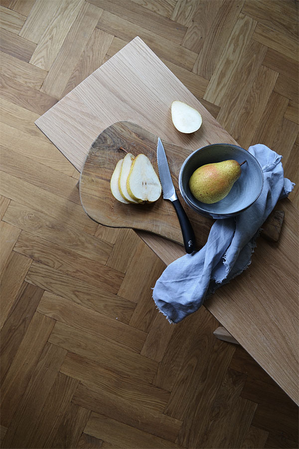
A lot of their designs are Nordic inspired with simple contemporary shapes and exceptional quality as this beautiful solid oak bench I was lucky enough to try out. I love the versatility of it and so far it has been used as a side table, plant stand, foot stool and shoe rack. The top is lightly varnished so you don’t have to worry about stains when leaving your coffee mug or glass of red on there and the simple construction and classic shape means we will live with this piece for a long time.

With Christmas just round the corner – only 9 weeks to go, eek – check out their online store for unique and hand-selected pieces to decorate your home with.

I can feel another post coming up… but let’s get Halloween out of the way first before we kick off the festive season.

 
eclectic, beautiful, handpicked, homeware, unique, individual, inspirational, home accessories, lightling, rugs, storage, decorative, hand-selected, christmas, decor, home, style, styling, oak, nordic inspired

eclectic, beautiful, handpicked, homeware, unique, individual, inspirational, home accessories, lightling, rugs, storage, decorative, hand-selected, christmas, decor, home, style, styling, oak, nordic inspired

eclectic, beautiful, handpicked, homeware, unique, individual, inspirational, home accessories, lightling, rugs, storage, decorative, hand-selected, christmas, decor, home, style, styling, oak, nordic inspired


MORE INFORMATION | Cox And Cox
PHOTOGRAPHY | Annie Kruse
 
This is a sponsored post in collaboration with Cox Annd Cox. I only work with products I love and all opinions are my own.
 
Follow Stylejuicer with Bloglovin
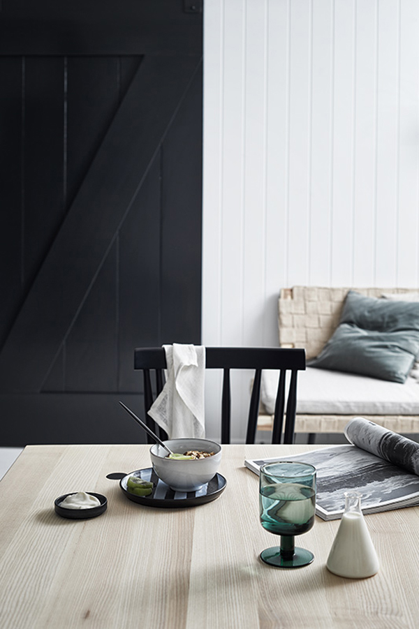
MOOD BOARD | HALLOWEEN INSPO

22 October 2016

halloween inspo, pumpkin, dressing up, inspiration, style, trend, kids, trick or treat, bat, witch, stormtrooper, darth vader
 

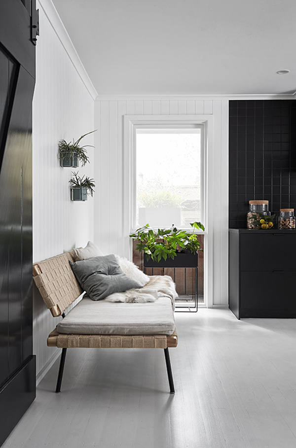
We might be still a few days off Halloween but you wouldn’t know living round here.

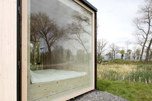
The boys have been excited and counting down since the beginning of the month and can’t wait to go trick or treating. Just leaves us to decide on the outfit… Stormtrooper and Darth Vader or Witch and Bat? Mind you they did come out with some seriously scary combinations thanks to our unisex dressing up box and apparently the Hulk does like to sport a tutu sometimes… Right?

Our neighbours will be scared!


NOTE | All shots used on the Halloween inspo mood board via my Pinterest boards
 
Follow Stylejuicer with Bloglovin