As a creative person designing for yourself is hard, really hard. Most creatives are their own worst critic and I’m no exception. It’s easy to get overwhelmed and procrastinate but the times I did get stuck I found it helped to just push on with other parts of the job researching production processes, suppliers and online shopping platforms. I may even have bought a thing (or twenty) online – all in the name of research obviously.
My inspiration mostly comes from visual clues but it also helps me to totally let go of the subject and concentrate on something completely different like meeting and chatting with friends, yoga, going for walks or just binging on Netflix. Somehow I’ve got this inner conviction that the *right* solution will come to me sooner or later which helps me to stay calm – well, most of the time at least. Experience has a lot to do with it and working as a graphic designer for the retail and service sector for the past 15 years has given me a good understanding of what’s involved. The challenge was to put it all into action for my own brand.
There were hundreds of permutations racing through my mind during the early months of the design process, most of which I could disregard after a quick sketch or mock up in illustrator but this mildly obsessive process has made me 100% confident about the designs, their quality and longevity.
The hardest part was narrowing down the graphics as I found it hard to be objective about them after a while – I love(d) them all! So I did a very unscientific straw pull and asked some designer friends, potential stockists, instagrammers and business mammas for their opinion. Their feedback was invaluable and I have to mention Kim from Design+Life+Kids whose support was amazing and gave me reassurance that I was on the right track. She is now also our first stockist in the U.S. so if you’re based there head over to her shop for some WBG goodies.
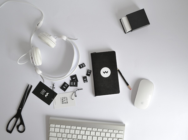
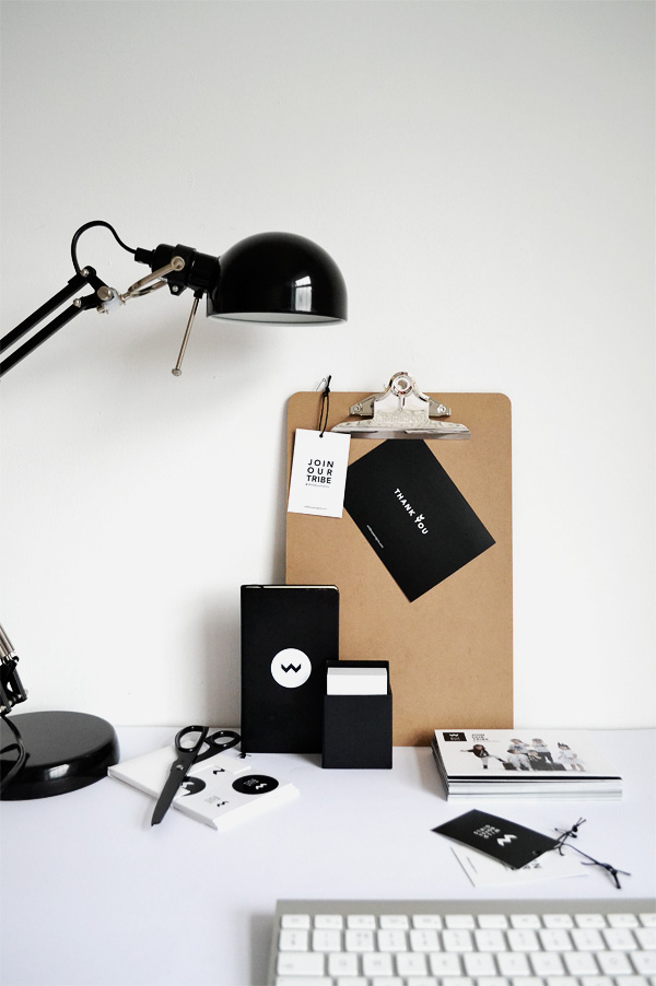
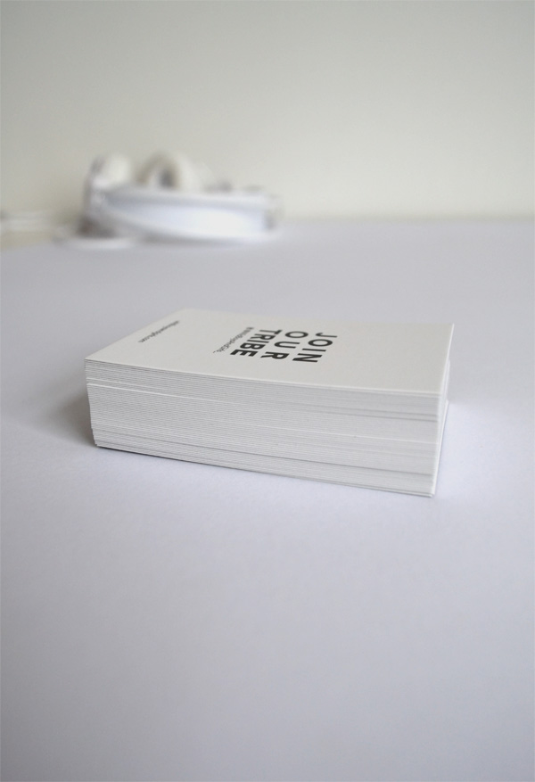
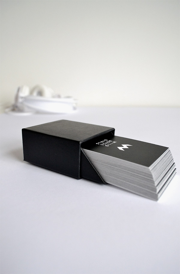
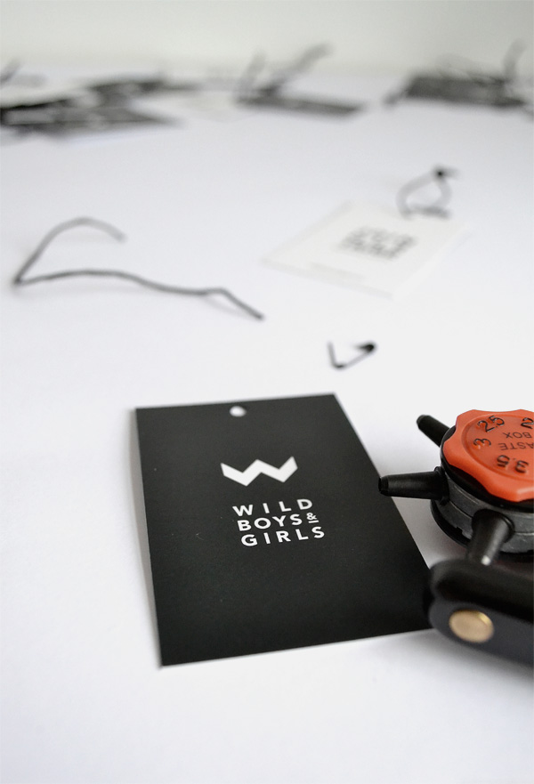
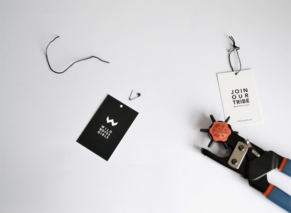
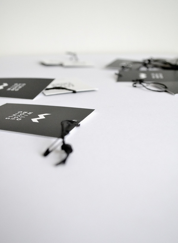
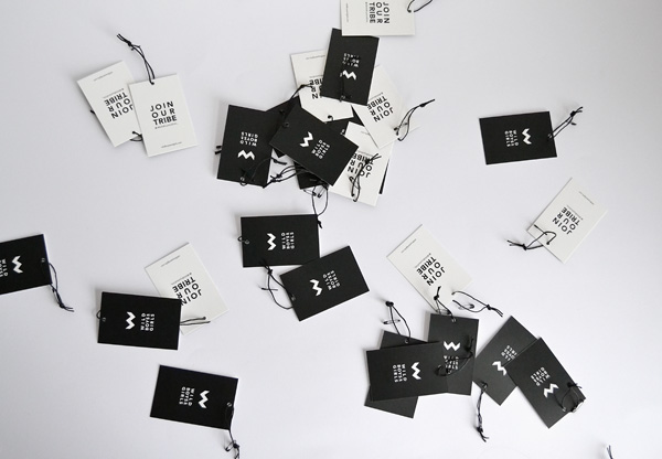
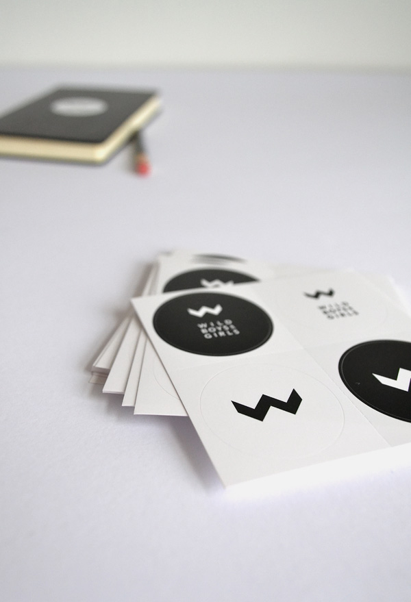
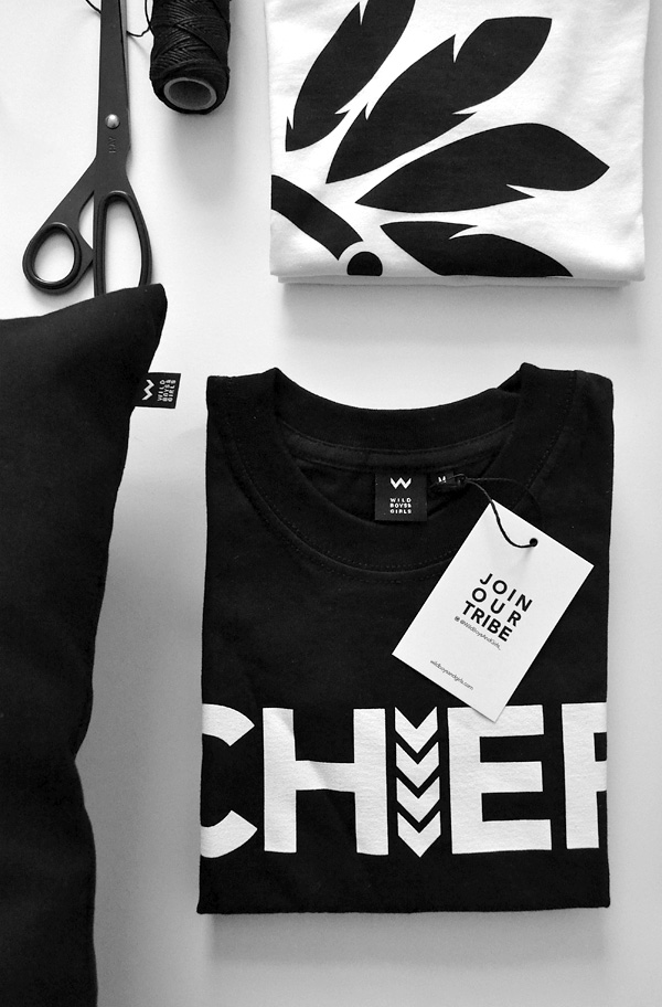
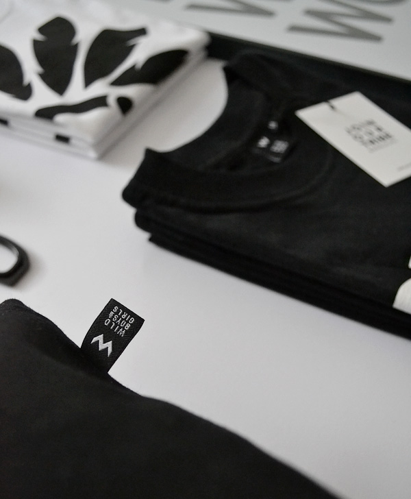
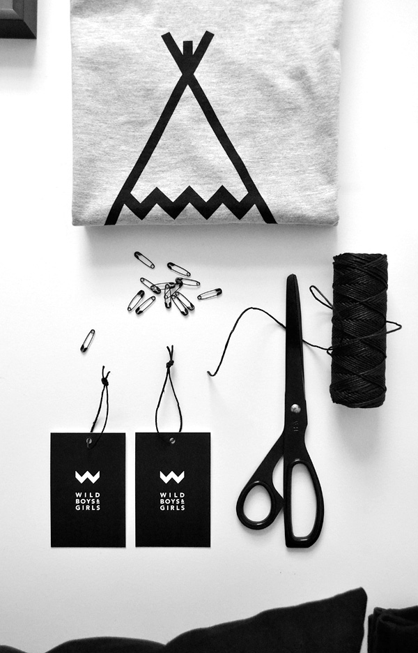
The logo design was something I worked on in parallel to the tshirt graphics. I already had a sense of how it had to feel, even smell and taste if you like. I wanted a logo mark that could be subtly incorporated or dissected into the graphics as an additional *hidden* clue to reward those who’d spot it. I just had to bring it to life visually and apply it to the additional marketing material and packaging.
MORE INFORMATION | Wild Boys and Girls
PHOTOGRAPHY | Annie Kruse
Follow Stylejuicer with Bloglovin

