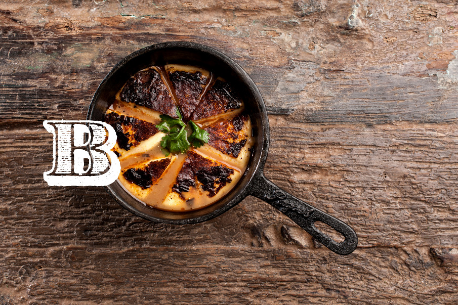
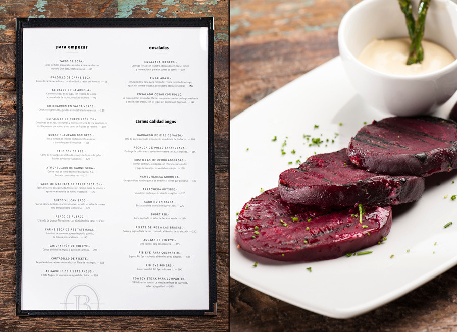
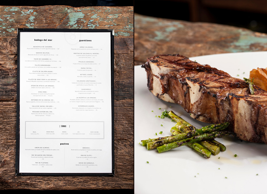
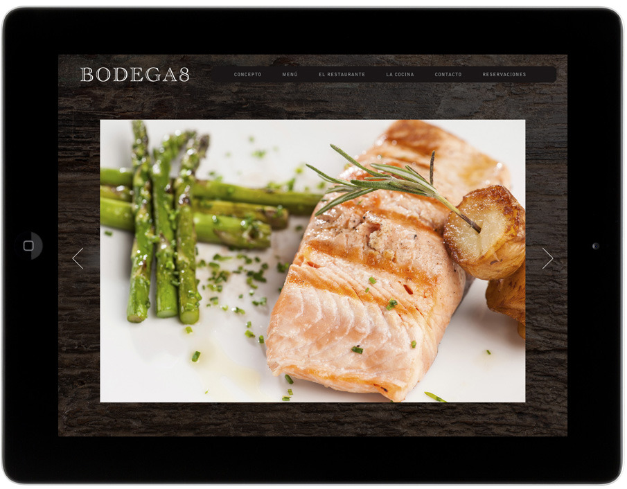
Firstly, let me warn any vegetarians amongst my readers! There is mouth-watering photography of rare meat on display. A delicious project for every sense.
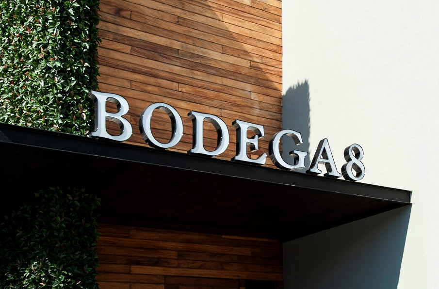
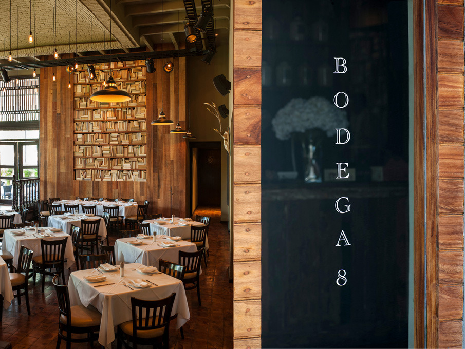
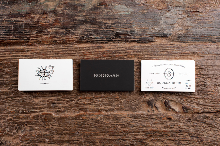
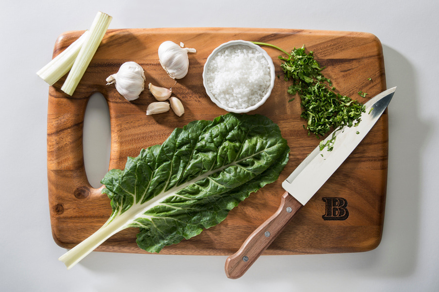
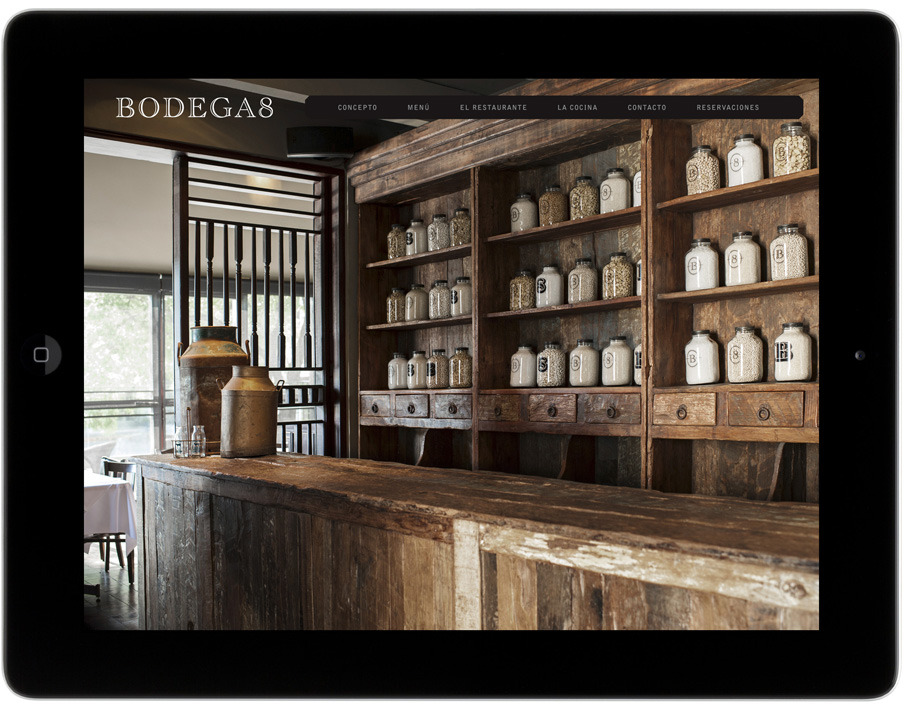
Mexican design agency La Tortilleria is one of my favourite studios and I’ve got a feeling I’ll be featuring them again. I’m showing (off) their branding work for Bodega Ocho here which is so different and beautiful that it had to be one of my first features on this blog.
As I wouldn’t be able to do their work justice I’ll let them explain for themselves the concept behind Bodega Ocho:
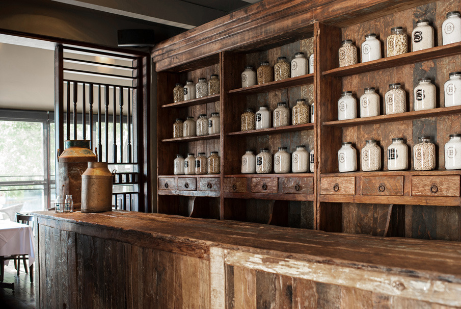
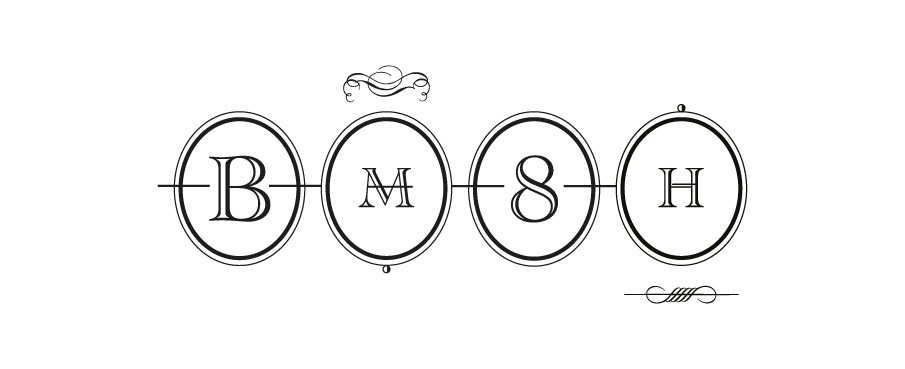
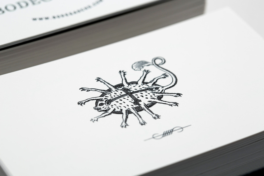
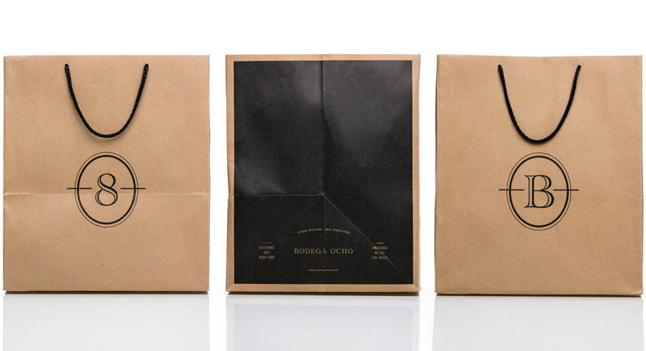
Bodega Ocho required an image that emphasized its intriguing character, full of mystery, in a relaxed atmosphere. For that reason, our goal was to create distinctive, highly graphic black and white work, something uncomplicated but unique. The final product allowed us to use different variants of the logo, applied to different items and fabrics. From its business stationery to its shopping bags, from its fabric napkins to its distinctively embossed mason jars. We developed a stylish yet fresh identity, to make sure Bodega Ocho’s image left an imprint on its client’s minds forever.
Enjoy and I hope you’re inspired!
More information | La Tortilleria
Client | Bodega Ocho


Gorgeous place. Want to hit it up.
This is the same old thing. Its just something pretty-hipster, but it doesnt has meaning, relevance its superficial and empty. They settled for the first “hipster” solution.
Hi Jessica, I feel I have to chip in here. Of course everybody is entitled to their opinion and this comment is obviously made from your perspective. As a design professional I have to say that relevance and meaning are often not immediately obvious and only on closer inspection become apparent. This subtlety makes good design work stand out and become great.
I have not been part of the client brief and no doubt long process La Tortilleria went through with Bodega 8. But from experience I can promise you that this process was not an easy one and every font, icon or application has been carefully thought about and analysed. I’d be interested to find out how you would have approached the brief?