Category Archives: Home & Interior

AIDA 2013 – AUSTRALIAN INTERIOR DESIGN AWARDS

7 July 2013

I hope you weren’t expecting a synopsis about Verdi’s opera or a cruise ship. As you’ve probaly worked out by now AIDA is short for Australian Interior Design Awards and I’d like to show you four of this year’s winners today.
 
And boy, would I LOVE to a) live in THAT loft, b) go to THAT coffee shop, c) work at THAT office and d) my kids to go to THAT kindergarten. I’m consumed by interior design envy.


WINNER BEST RESIDENTIAL DECORATION & BEST INTERNATIONAL DESIGN

Two awards for Nexus Designs this year for their interior design of this huge NYC loft apartment. Here is how they describe their project and what the jury had to say:

Project description

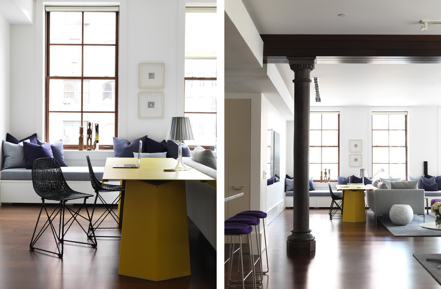
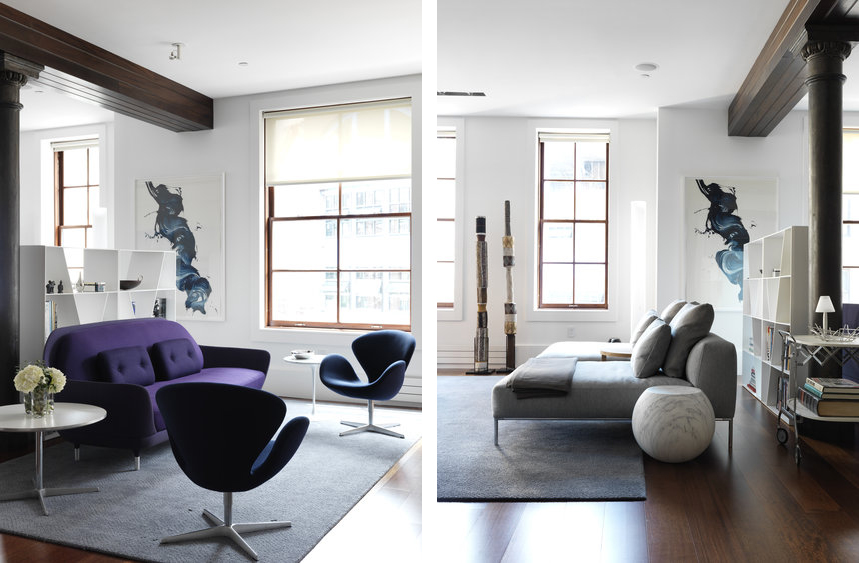
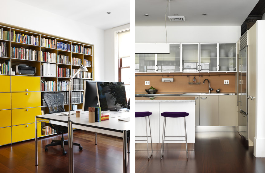
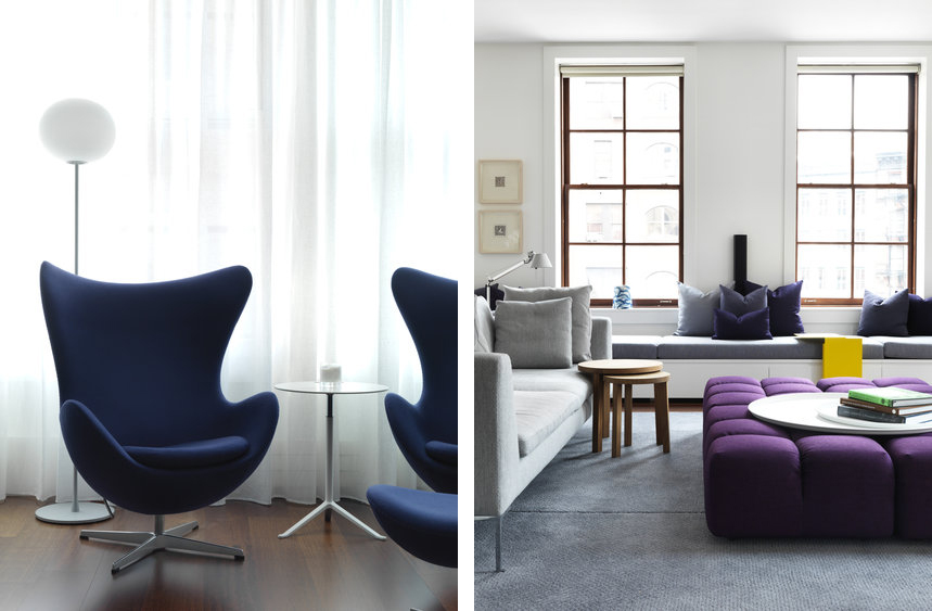
Inspired by a colour palette based on the NSW Blue Mountains, This vast NYC loft apartment provides an oasis for our client’s hectic professional lives. The open plan loft space was cleverly designed and divided into three distinct areas providing the client with multiple living, dining and library zones.

Jury Citation

This interior demonstrates a highly sophisticated use of colour, with a brave and masterful control of the opposite palettes of purple and yellow. The spaces are fun and relaxed but executed with sophistication and restraint. Furniture items are perfectly scaled to suit the proportions of the spaces in which they are placed. This loft features decoration that is more than just surface and texture – it achieves sculptural, three-dimensional spaces through thoughtful furniture placement.

Vogue Living

Photography Jonny Valiant

Vogue Living

Photography Jonny Valiant

Photography | Jonny Valiant
More information | Australian Interior Design Awards 2013


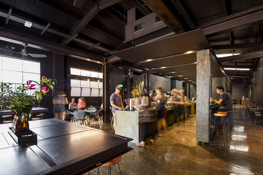
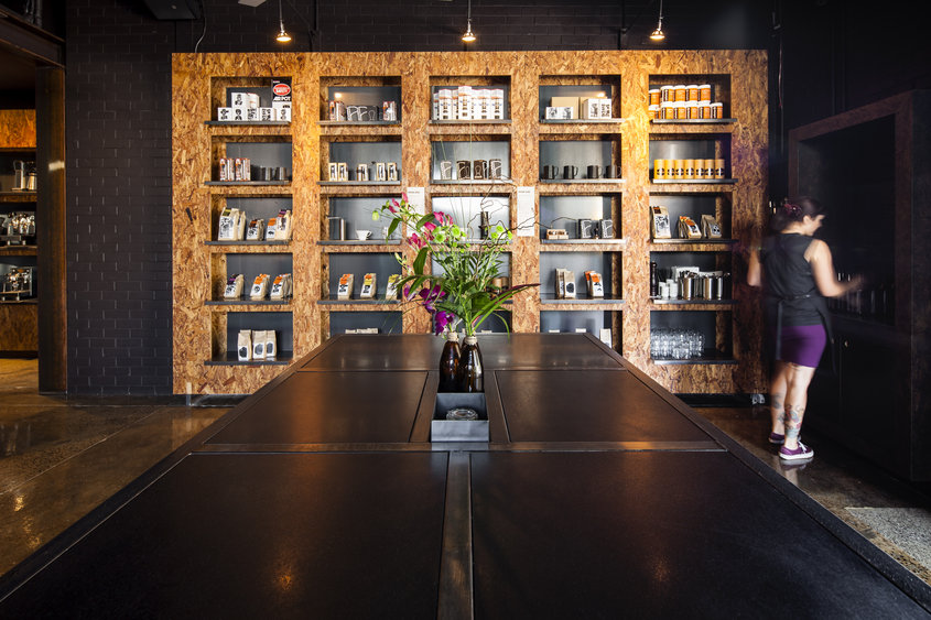
WINNER HOSPITALITY DESIGN

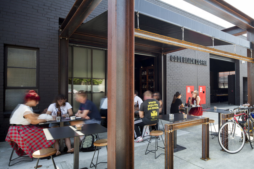
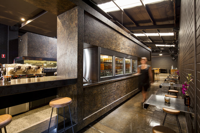
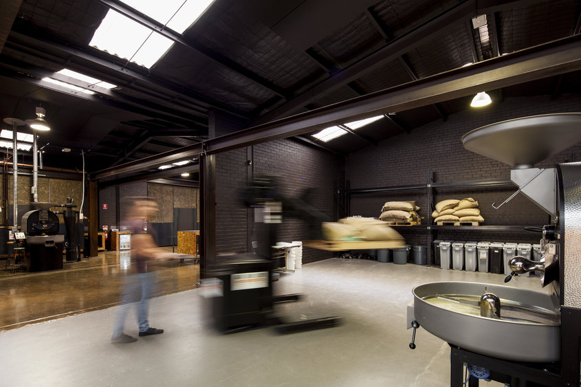
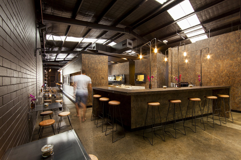
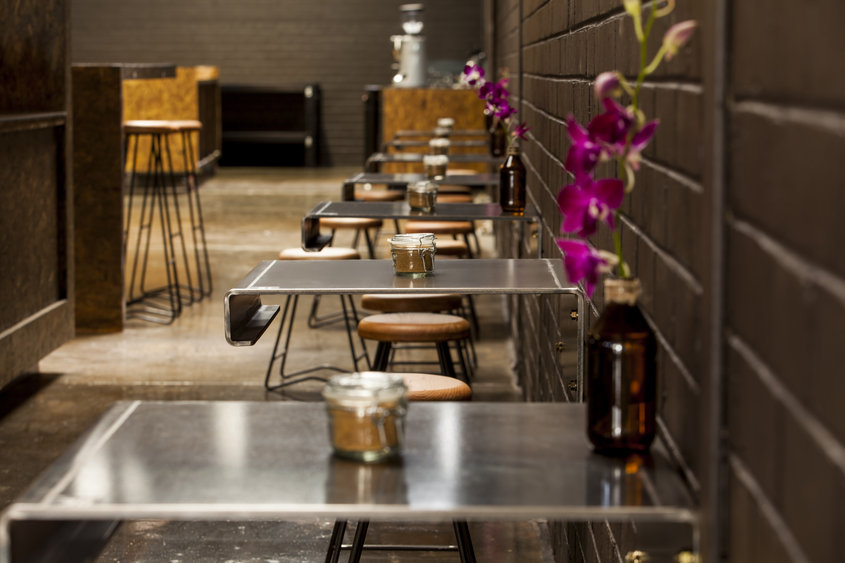
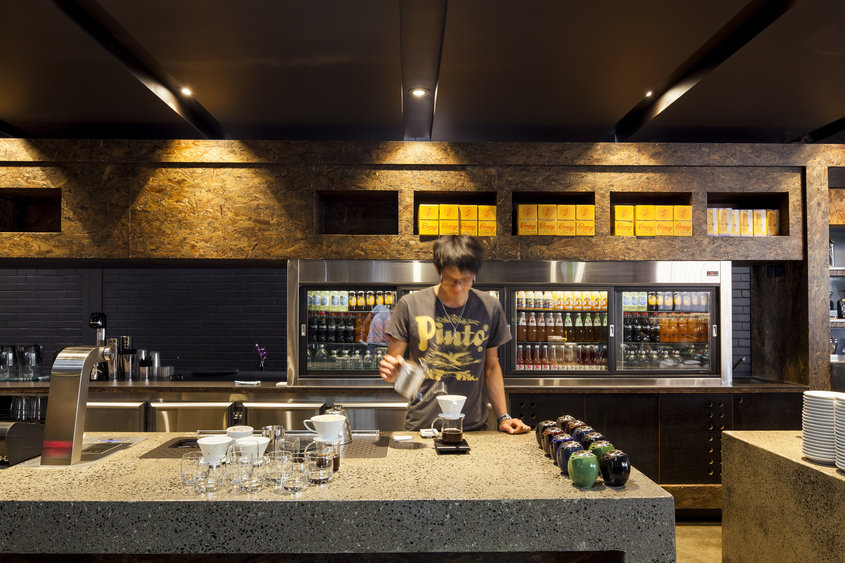
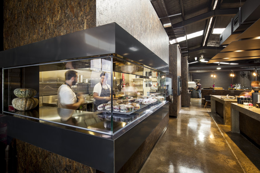
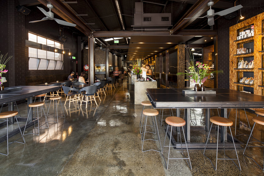
Zwei Interiors Architecture took this project to the limit and won with their ‘ode to the coffee bean’! Here is how they describe their project and what the jury had to say:

Project description

Code Black Coffee is the new roastery and headquarters of the Melbourne based Cafenatics operations. With the roasting process on full display and a strong use of raw black steel, stained OSB board and concrete, the space communicates an almost reverential ode to the coffee bean.

Jury Citation

The interiors of Code Black Coffee retain and enhance the essence of the enclosing structure in a lustrous and vibrant manner. Clever planning allows distinct activities of the Code Black Coffee business to complement each other within the combined spaces. The resulting transparency of operation activates the space and reveals all of Code Black’s operations in a relaxed and inviting manner. The designers have executed adept manipulation of raw and rustic materials, quality detailing and a holistic honesty in their approach to brand strategy.

022187_codeblack-10

022189_codeblack-09

022191_codeblack-08

022195_codeblack-07

022197_codeblack-06

022200_codeblack-05

022202_codeblack-04

022203_codeblack-03

022205_codeblack-02

Photography Michael Kai

Photography | Michael Kai
More information | Australian Interior Design Awards 2013


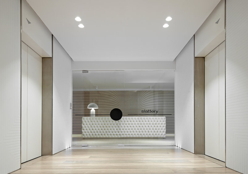
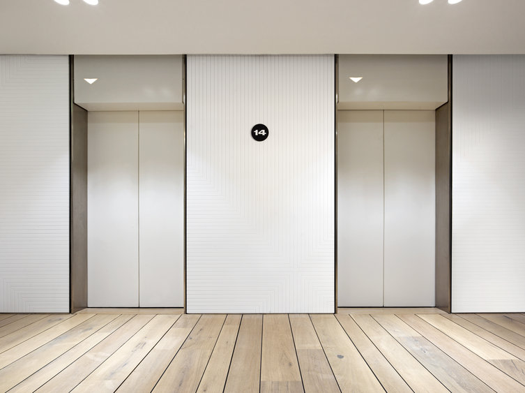
WINNER WORKPLACE DESIGN

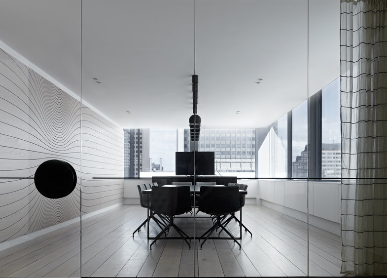
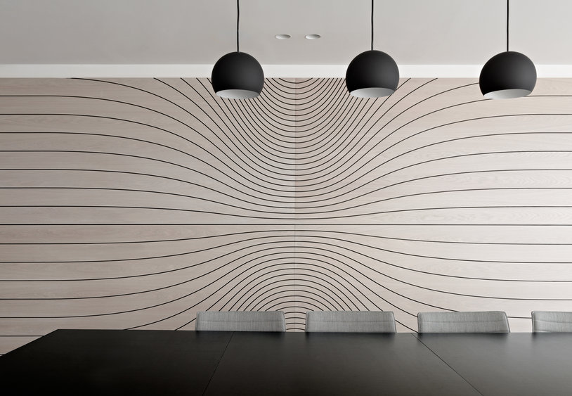
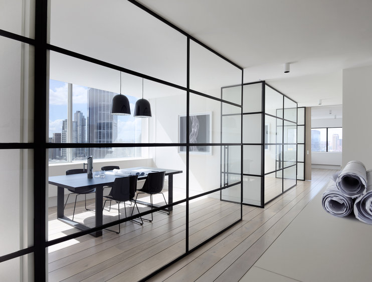
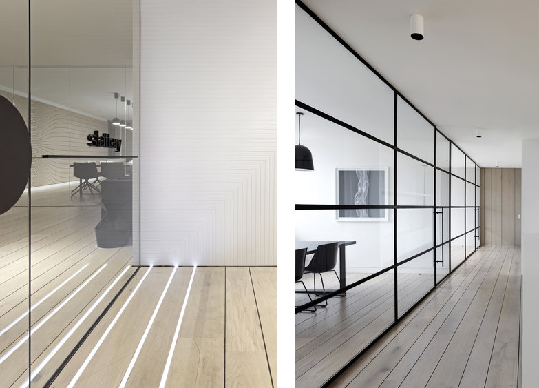
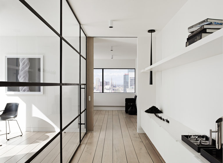
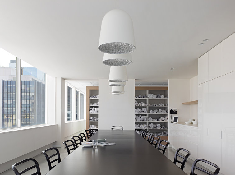
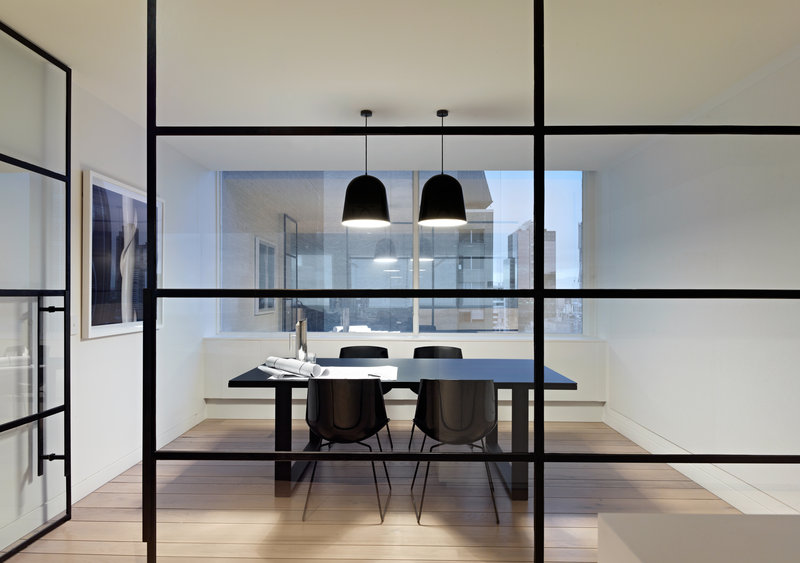
Elenberg Fraser managed to convince their client Slattery to re-design their office space according to the 1982 science fiction film Tron. A bold move but one that ultimately paid off and I LOVE it! Here is how they describe their project and what the jury had to say:

Project description

Slattery’s new fitout embraces the innovation and luxury of the uniforms and vehicles of Tron Legacy. Blonde timber floors flow up onto the walls, embedded graphics offer linear curves, and black, steel frames bring a touch of New York loft style to this high-key, white, light space.

Jury Citation

This is clearly a standout office. In this project, a sophisticated white palette is enriched with a subtle pattern applied to the walls, seductive lighting and the select introduction of fine black elements – from the thin steel-framed glazing used along corridors, to a punch of black on the ceiling in the form of a circular light. It requires great skill to use a domestic palette in an office environment, without having it feel residential. This is truly an office everyone would love to work in.

019117_01_of_10

019121_02_of_10

019125_04_of_10

019126_05_of_10

019128_06_of_10

019130_07_of_10 via Stylejuicer

019132_08_of_10

019133_09_of_10

Peter Clarke Photography

Photography | Peter Clarke
More information | Australian Interior Design Awards 2013


WINNER SUSTAINABILITY DESIGN

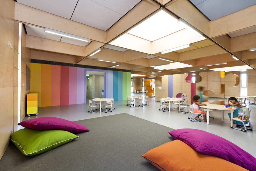
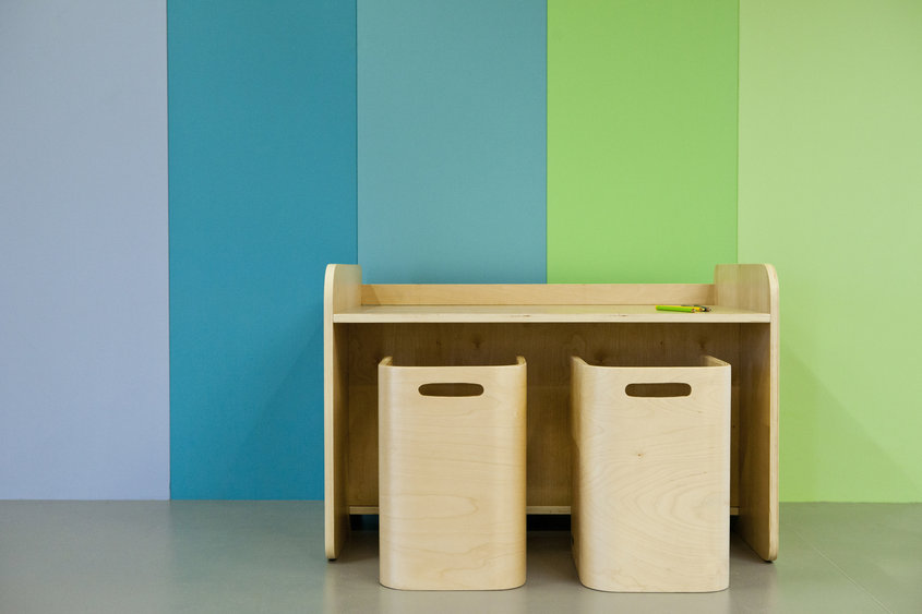
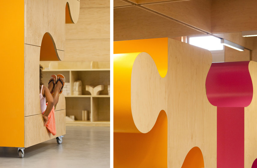
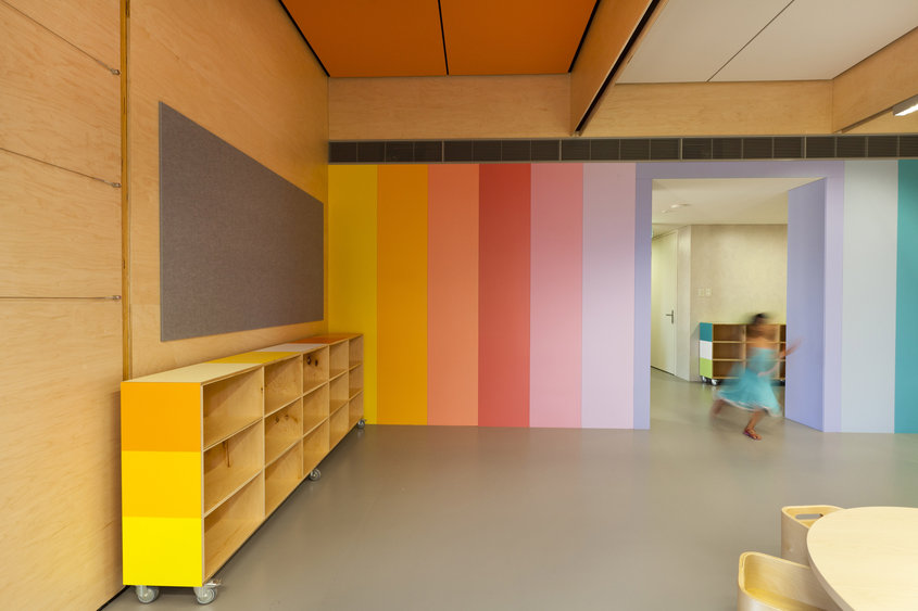
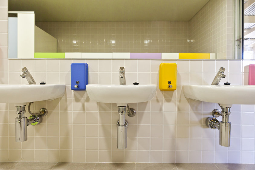
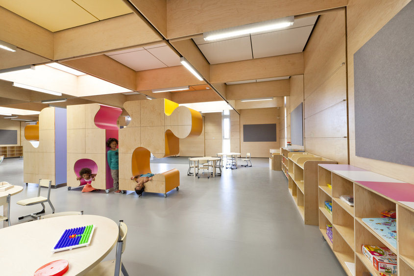
Brooking Design Architects came up with a beautiful and sustainable interior design concept for John Septimus Roe Anglican Community School (JSRACS) Kindergarten. Here is how they describe their project and what the jury had to say:

Project description

This project demonstrates a clear commitment to sustainability and its practical application. The project’s attention to materials selection, benign finishes, energy efficiency, natural light and double glazing all highlight a coherent suite of environmental features intelligently addressed through good design.

Jury Citation

A purpose built kindergarten teaching space founded on eco-design principles. With references to a Nordic style of design, the use of abundant natural light, birch plywood linings and the various expressionist colourful cabinetry forms results in an exciting space that promotes learning that is devoid of any institutional rhetoric.

018535_01_of_10

018549_06_of_10

018546_05_of_10 via Stylejuicer

018542_02_of_10

018565_08_of_10

Heather Robbins Photography

Photography | Heather Robbins
More information | Australian Interior Design Awards 2013
 
Enjoy and I hope you’re inspired!

ANNIE_signature

VINTAGE 1950s SEASIDE SHACK IN NEW ZEALAND

1 July 2013

779685-1_lp

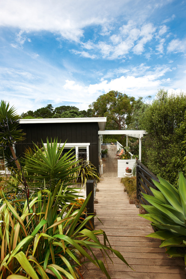
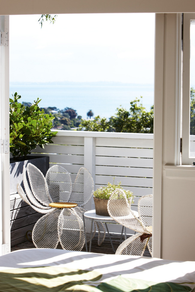
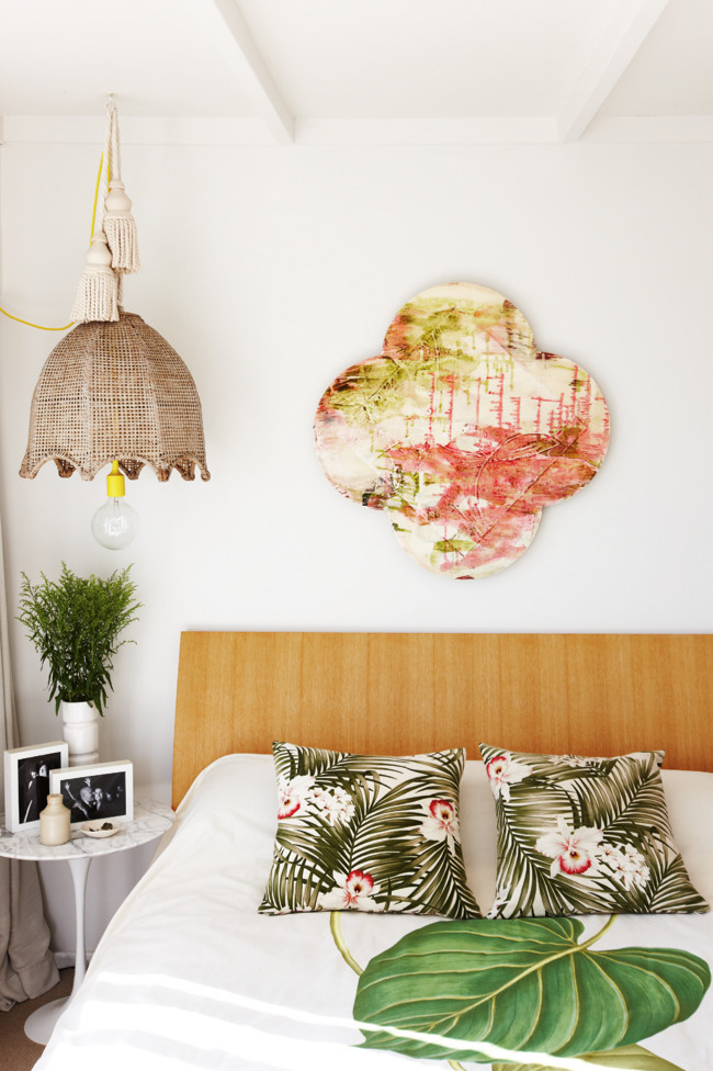
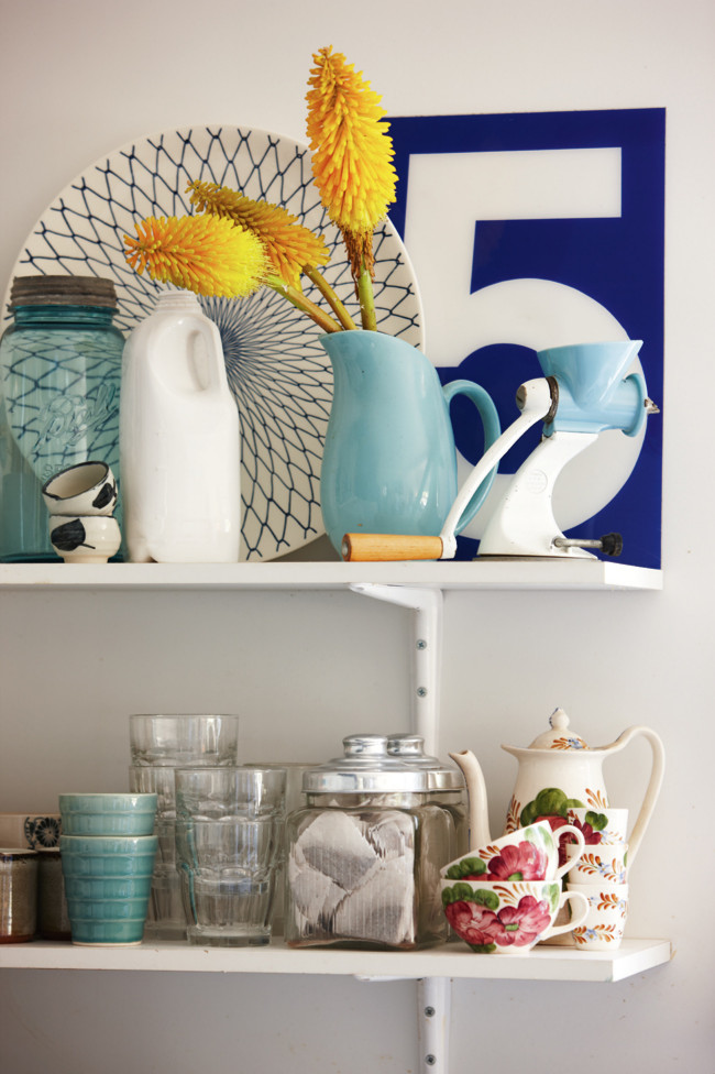
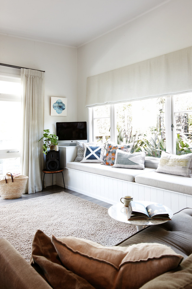
This modern and inspiring seaside shack belongs to stylist Anna Church and is nestled in the picturesque cove of New Zealand’s Waiheke Island.

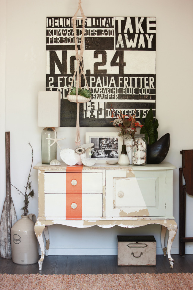
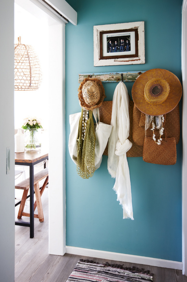
Anna takes inspiration from her surrounds and has painted the hallway in a shade of turqouise echoing the colours of the sea. A girl after my own heart she says “I love to achieve a look on a budget,” and she customises roadside and beachcomb finds. “I like elegant, layered interiors, with a bit of quirk mixed in,” says Anna of the bedroom which has a tropical feel with an artwork by Waiheke artist Emma Wright. Anna says “it’s nautical, but not in an obvious way.


779683-1_lp

779681-1_lp

779679-1_lp

779677-1_lp

779675-1_lp

779673-1_lp


ANNIE_signature
 
Photography | Kevin Emirali
More information | Homelife

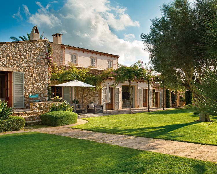
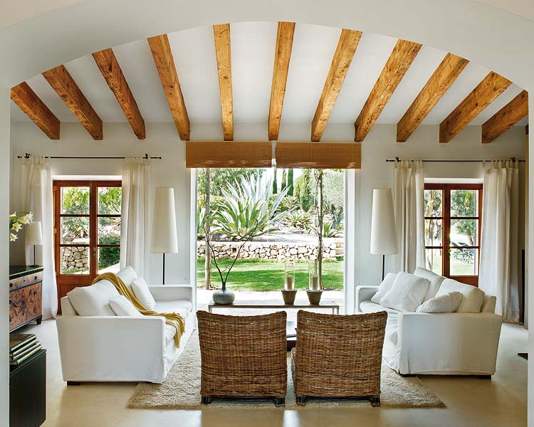
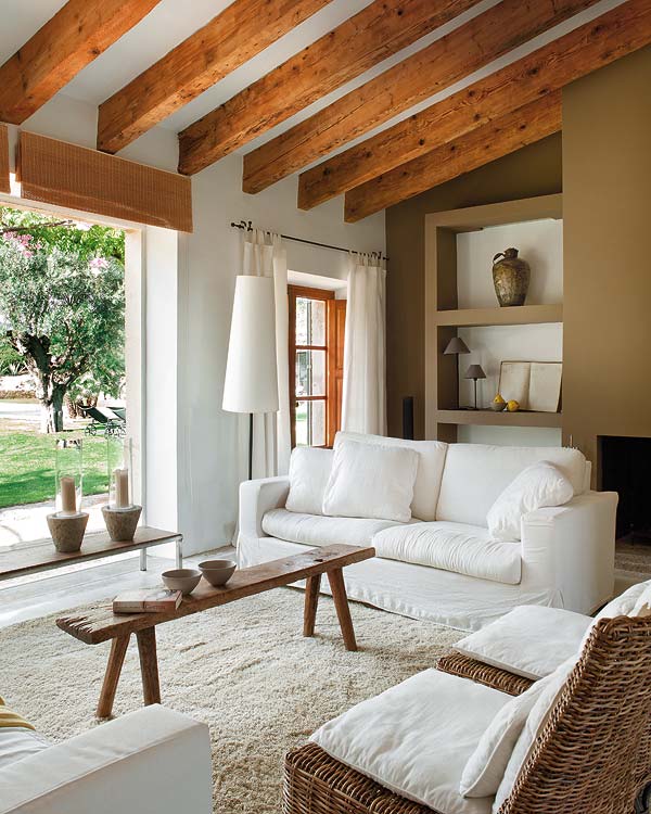
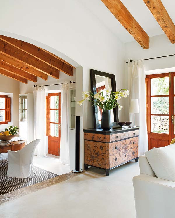
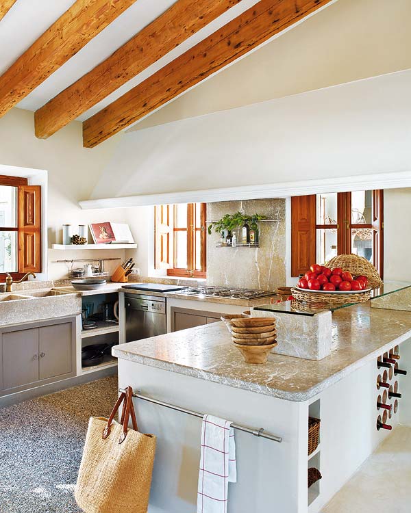
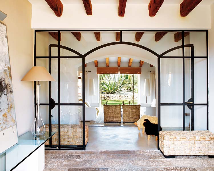
Completely rebuilt by architect Laura Ziron this restored finca combines spacious modern living with a warm and neutral colourpalette.

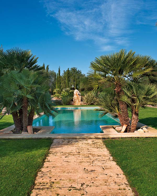
The house used to be an ancient building that fell into disrepair. It’s owners could have taken the easy route and started from scratch but they wanted to restore the finca and turn it into a modern home using some of the original materials like recovered beams and wooden doors and floors. The mix of styles works well for this family residence and the beautiful gardens include a series of essential shady outdoor areas for the summer months.

I wish I could dive in that pool right now!
410_2_1g

410_2_3g

410_2_4g

410_2_5g

410_2_6g

410_2_7g

410_2_9g

Enjoy and happy Wednesday!

ANNIE_signature

More information | nuevo-estilo.es

RESTORED, RECLAIMED, RECYCLED – VICTORIAN FAMILY HOME

24 June 2013

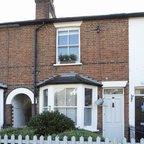
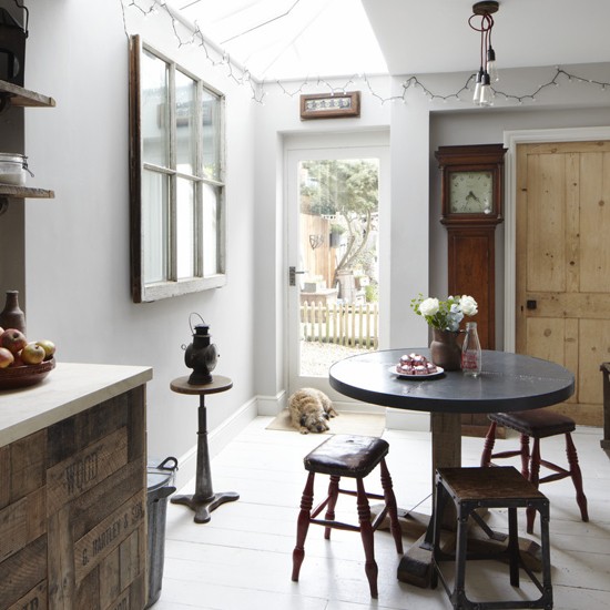
This lovingly transformed three-bedroom Victorian terraced house in Hertfordshire is packed with character.
 
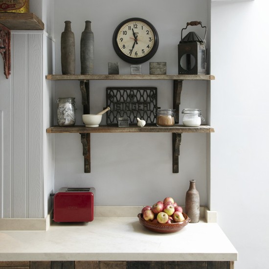
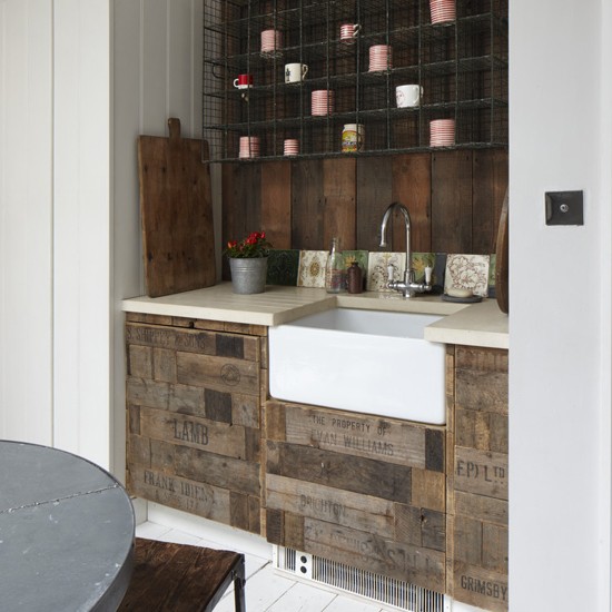
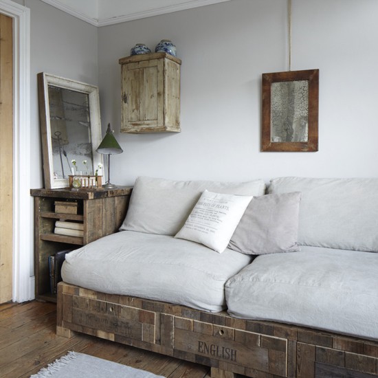
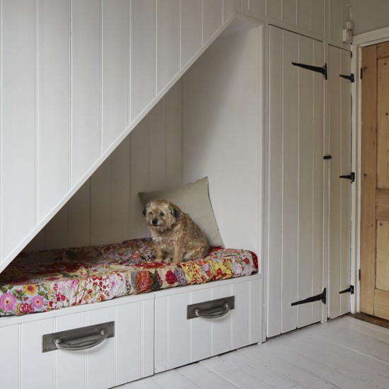
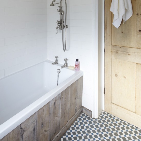
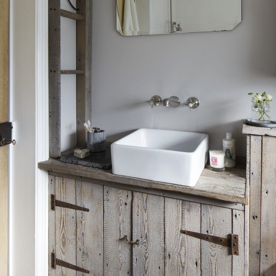
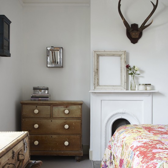
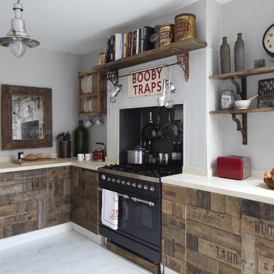
The owners restored the old floorboards, used recycled fruit crates as kitchen cabinet doors and even built their own sofa because they couldn’t find one they liked. Now that’s hands on! I particularly like the clever use of under-stairs space for storage and creating a snug for hiding away. Vintage pieces like an old suitcase, pictures frame and antlers add to the reclaimed feel. A beautiful conherent look that won’t date.

Exterior--vintage-house--Ideal-Home

dining-room--vintage-house--Ideal-Home

kitchen-shelves--vintage-house--Ideal-Home

kitchen-dresser--vintage-house--Ideal-Home

living-room--vintage-house--Ideal-Home

living-area--vintage-house--Ideal-Home

understairs--vintage-house--Ideal-Home

bathroom--vintage-house--Ideal-Home

bathroom-basin--vintage-house--Ideal-Home

bedroom--vintage-house--Ideal-Home

childs-bedroom--vintage-house--Ideal-Home

kitchen--vintage-house--Ideal-Home
 
Enjoy and happy Thursday!

ANNIE_signature
 
Photographs by Heather Hobhouse
More information | housetohome.co.uk

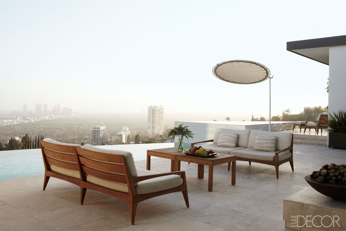
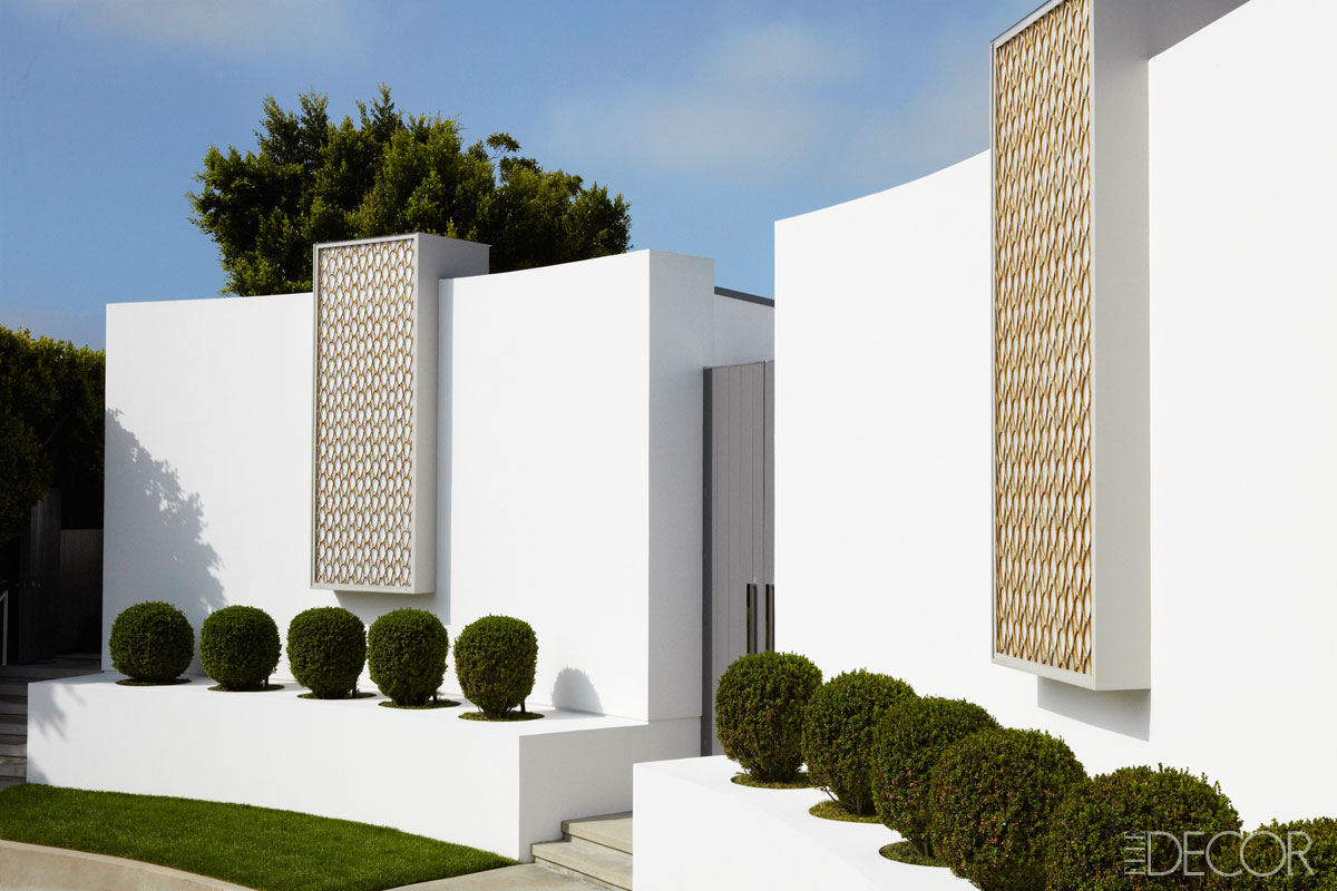
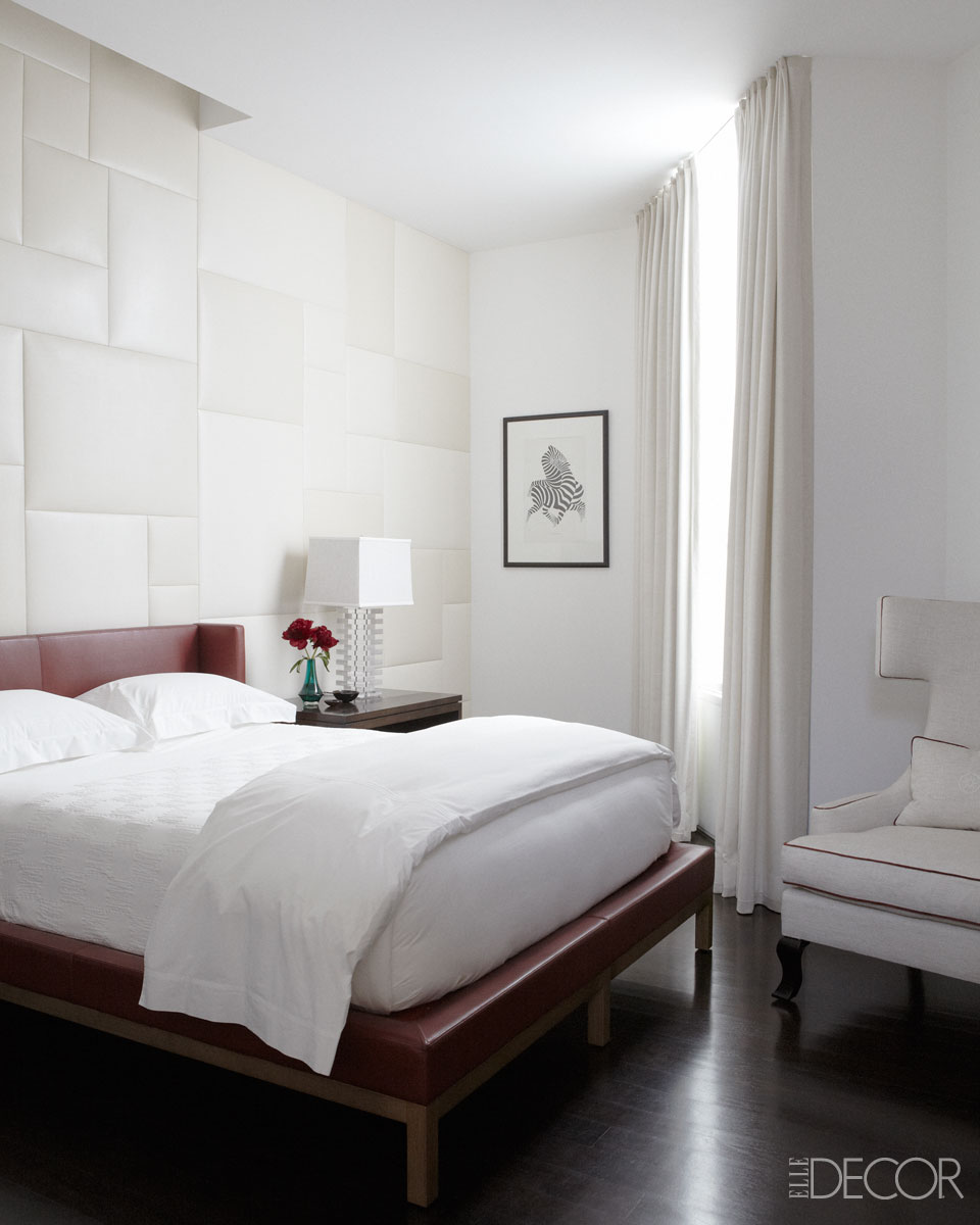
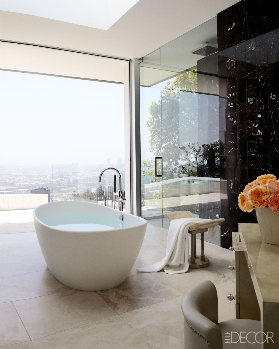
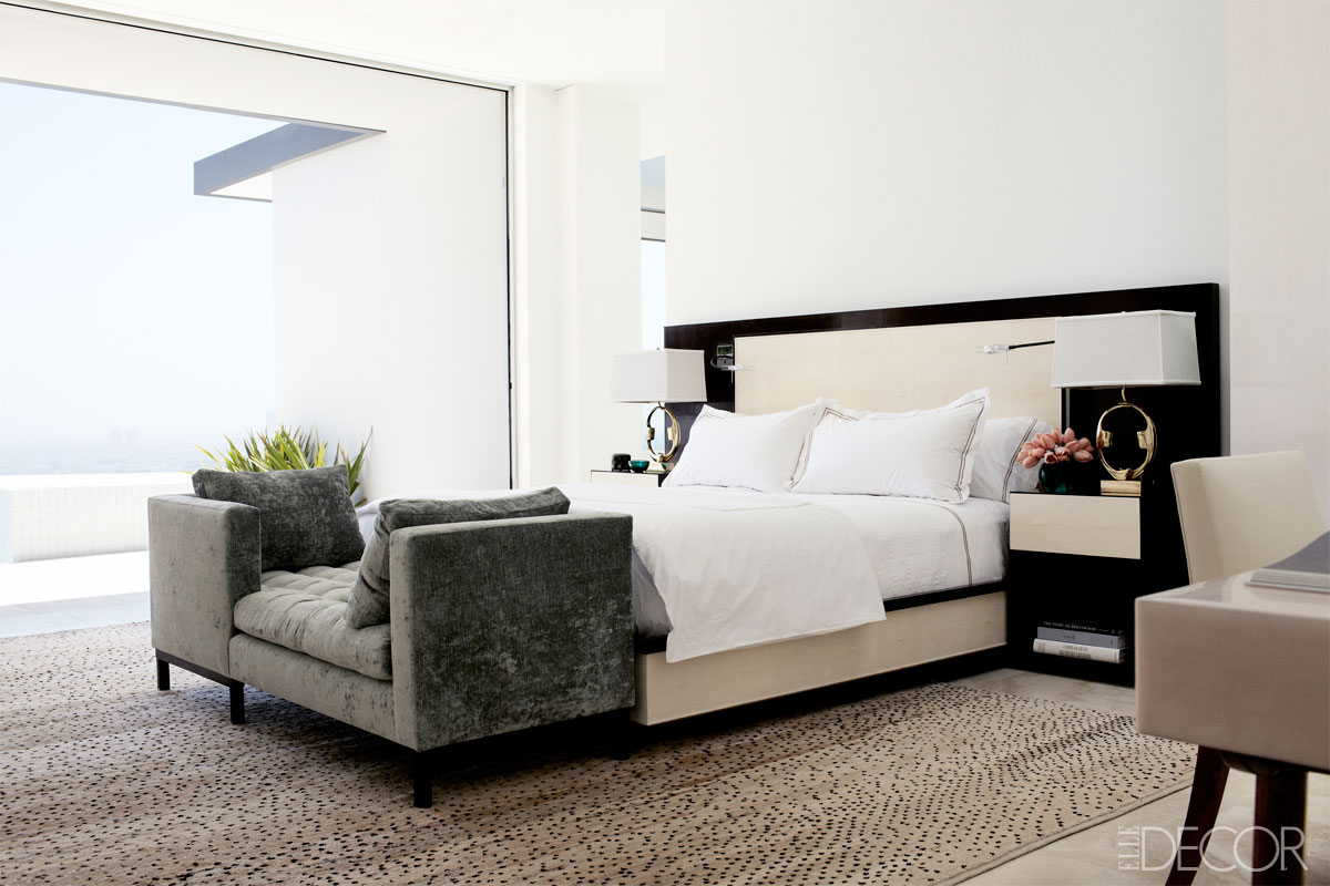
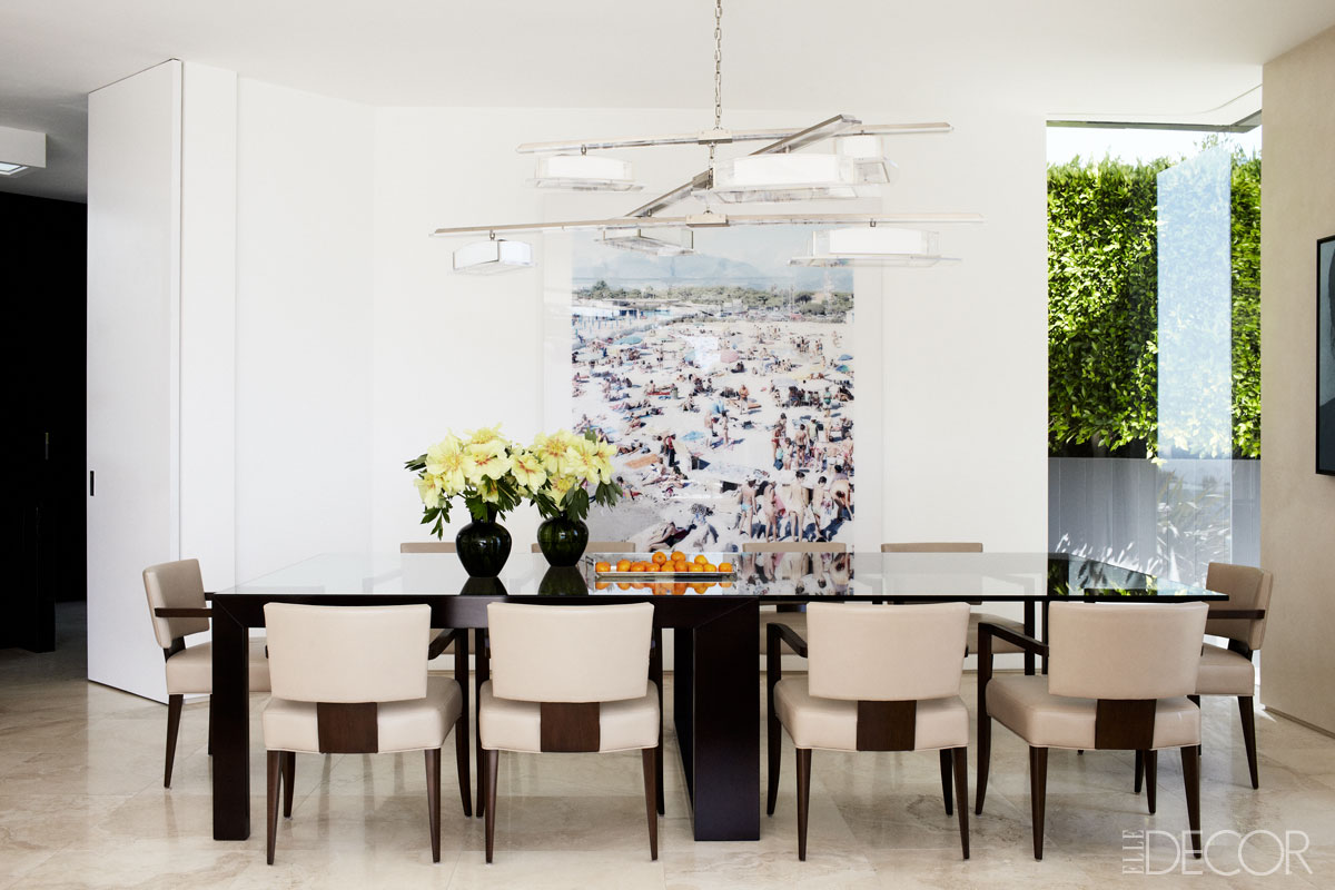
When entertaining is your passion, your house is your stage. What better location than the Hollywood Hills with a view of Los Angeles? The clients gave designer Chad Eisner a clear brief for updating their 1970s house. It had to be modern with nods to the past, in particular Art Deco and incorporate their love of Africa.
 
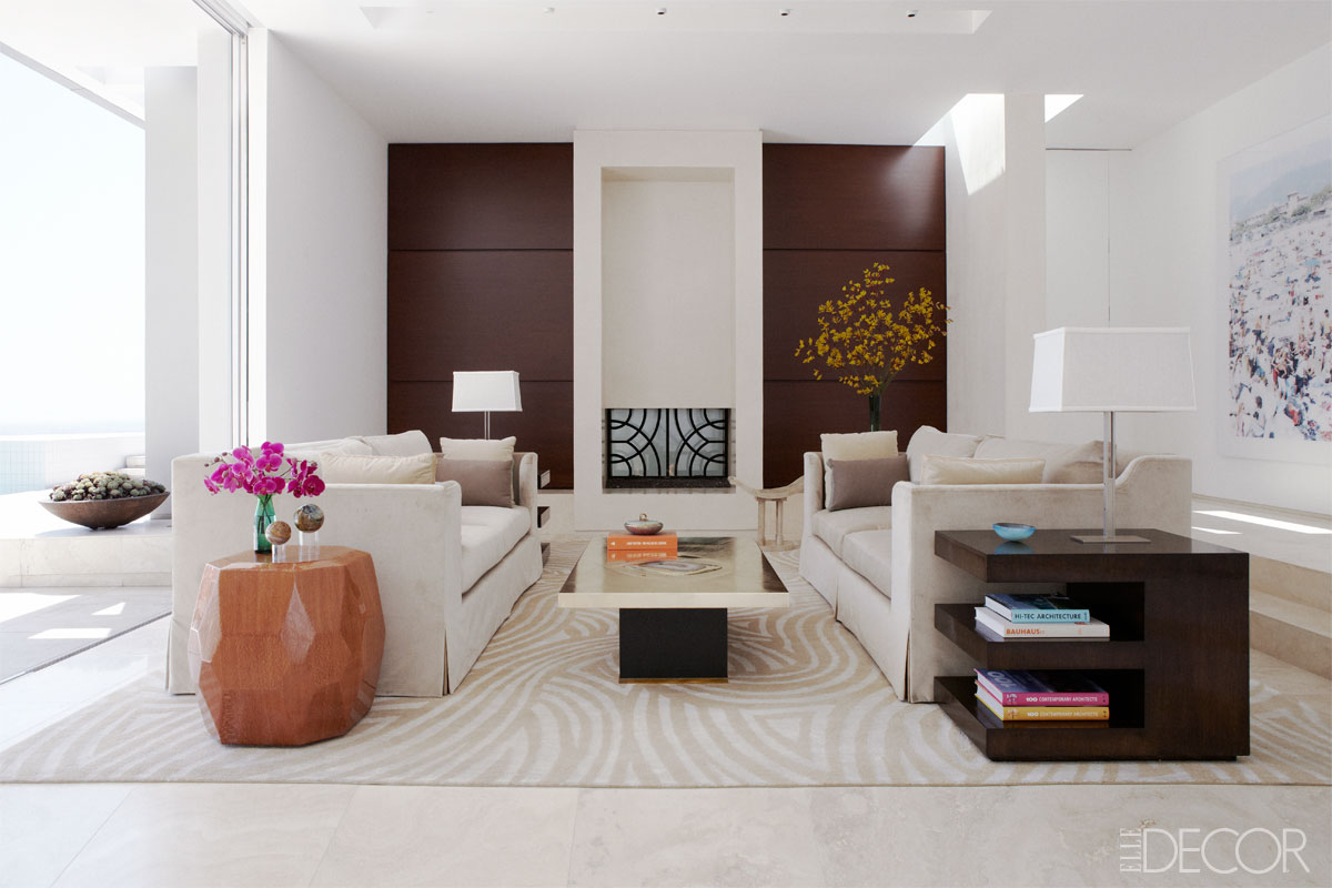
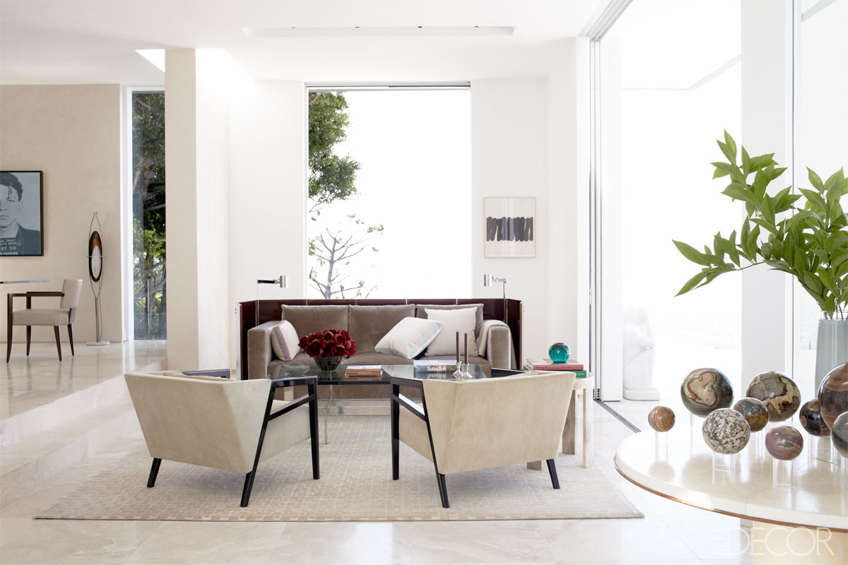
Chad also managed to give the salon a pre-war French feel that’s romantic and sexy. You could argue that the colour palette is a dull beige and brown but Chad explains: ‘The tone-on-tone color scheme was another nod to Africa. Plus we didn’t want to distract from the views. But there are very subtle hints of color in the fabrics, in the pillows and the welting, which is one of the ways you can warm up or cool down a space with a tight palette. There are light blues and pale lavenders and even some understated rose hues.’
All fabrics were carefully chosen to stimulate the sense of touch and most of the upholstery is velvet and suede. To balance the man-made with the natural, he chose a nubby raw silk for the curtains and the Mansour Modern rugs have hemp in the weave, which gives a little roughness to the refinement. Some of the furniture is customised which is not always as expensive as you think recommends Chad and the unique factor gives it that extra bit of wow which is important to keep your clients happy. Most importantly none of the interior design distracts from the leading character: the beautiful view which serves as a gorgeous backdrop for Chad’s clients successful entertaining.
 

chad-eisner-EDC-03-13-9-xln

chad-eisner-EDC-03-13-2-xln

chad-eisner-EDC-03-13-6-xln

chad-eisner-EDC-03-13-3-xln

chad-eisner-EDC-03-13-5-xln

chad-eisner-EDC-03-13-7-xln

chad-eisner-EDC-03-13-8-xln

chad-eisner-EDC-03-13-1-xln
 
Enjoy and happy Friday!

ANNIE_signature
 
Photography Joe Schmelzer

More information | Elle Decor