Category Archives: Home & Interior

SMALL SPACES: STYLISH RETRO APARTMENT IN COPENHAGEN

28 August 2013

I’ve recently taken stock of my interior posts and feel that I need to counter balance all those huge, impeccable, glamorous interiors and homes which – let’s face it – are unattainable to most of us.

So today I’ll be starting a new series featuring SMALL SPACES that are cleverly designed and decorated, maximising space and from which we can all take inspiration for our own homes – unless you’re a multi-millionaire or Victoria Beckham. But don’t worry that doesn’t mean that you won’t get your property eye-candy of infinity pools, kitchens the size of tennis courts and statement staircases anymore. I just want to broaden my selection a bit and make the experience more pleasurable for you.

copyright-Claudi-Capion-Copenhagen-Apartment-via-stylejuicer-02

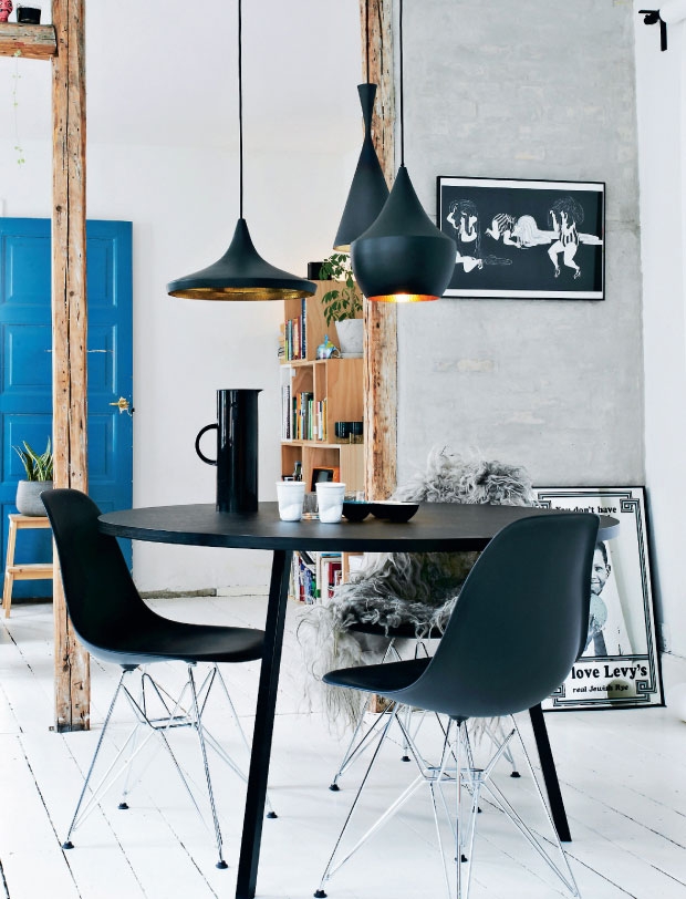
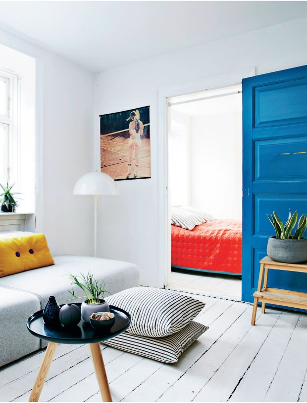
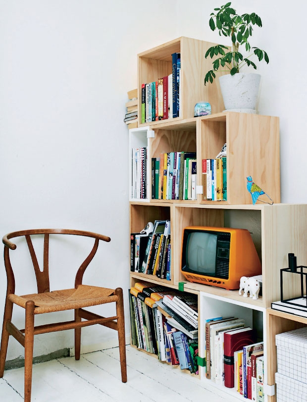
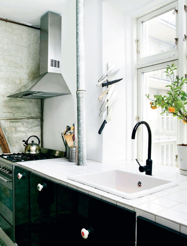
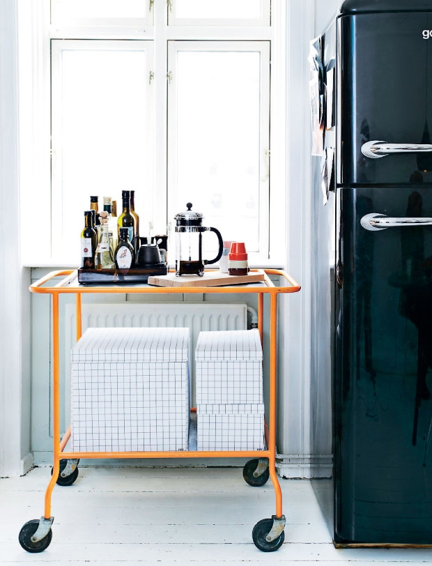
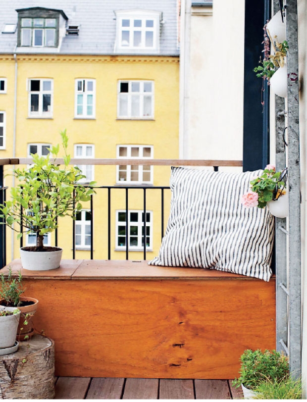
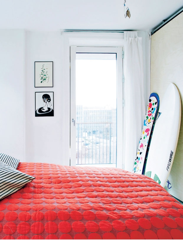
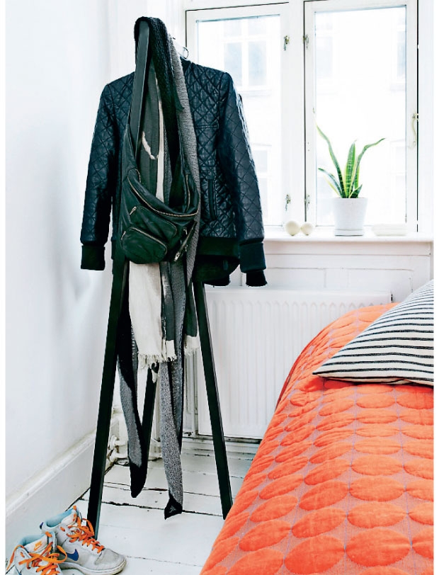
I came across this cute little apartment in Copenhagen on Danish site Femina, the online presence of the same name women’s magazine. The apartment is 69 m2 (740 sq ft) and has been lovingly renovated and opened up by photographer Benita Marcussen and her partner Niels Frøhlke an app developer.

I love their deco mix of retro, IKEA and statement pieces (especially the shiny black fridge). The iconic 70ies photo of a female tennis player without any knickers injects some humour and reminds me of my own tennis club when I was growing up and that exact same print had pride of place in the clubhouse. The use of bold colours amongst a mainly neutral colour palette draws the eye in and sanded wooden pillars, exposed brick and zinc pipes give interesting textures to the space. Benita tells me that they are currently changing the flooring and the kitchen and I wonder if I can persuade her to take a few shots of the updated space. I’ll let you know!

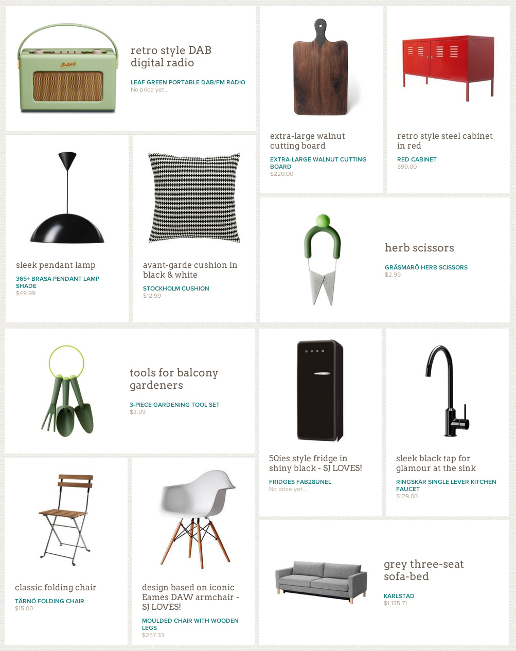
Now, scroll down to create the look with STYLEJUICER.

copyright-Claudi-Capion-Copenhagen-Apartment-via-stylejuicer-01

copyright-Claudi-Capion-Copenhagen-Apartment-via-stylejuicer-03

copyright-Claudi-Capion-Copenhagen-Apartment-via-stylejuicer-04

copyright-Claudi-Capion-Copenhagen-Apartment-via-stylejuicer-05

copyright-Claudi-Capion-Copenhagen-Apartment-via-stylejuicer-06

copyright-Claudi-Capion-Copenhagen-Apartment-via-stylejuicer-07

small spaces copenhagen apartment via stylejuicer

CREATE THE LOOK WITH STYLEJUICER ON LUVOCRACY.COM

When seeing creative little spaces like Benita and Niels’s apartment I’m always curious where they got their decor from and how to create the look in my own home. For that reason I’m trialling a site called luvocracy.com where I put collections together that you can view and from which you can purchase if you like. I’ve got to stress that this is not a sponsored link and I’m interested what you think about the opportunity to ‘shop the look’. Email me at annie [at] stylejuicer.com for feedback or leave a comment below.

To browse the collection on luvocracy.com just click the link.

stylejuicer on luvocracy Copenhagen Apt 01

Enjoy and I hope you’re inspired!

Annie Signature Stylejuicer

More information | Femina
Photography | Claudi + Capion

LIVING IN A SCULPTURE – OSCAR NIEMEYER’S STRICK HOUSE

26 August 2013

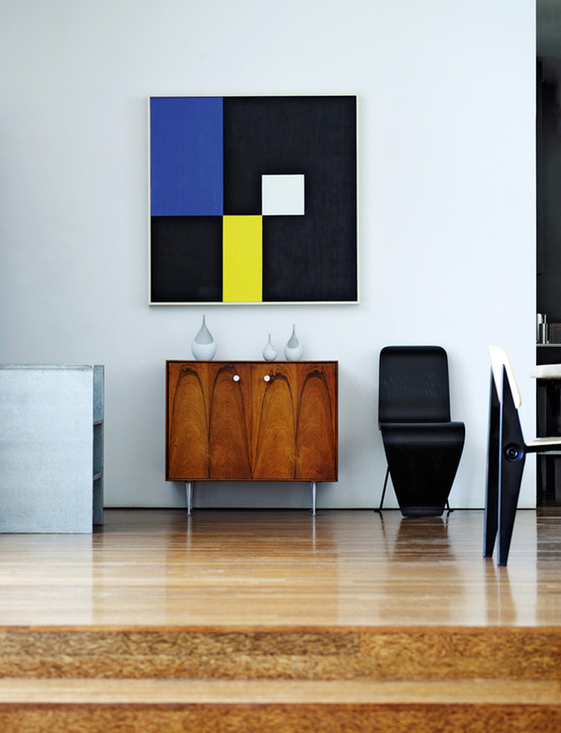
Gabrielle and Michael Boyd are avant-garde collectors and enthusiasts and have been on a quest to live in an environment that’s a comprehensive, from the furniture to the house.

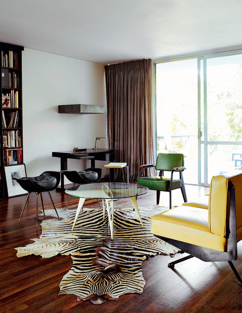
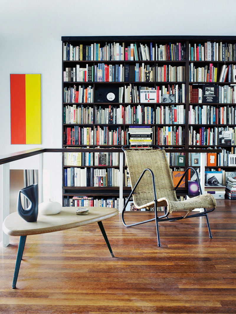
They had managed to accumulate a vast library of modernist books and avant-garde furniture and had already bought and restored three previous house before they came across Oscar Niemeyer’s Strick House, his only residential home outside Brazil.

Oscar Niemeyer is of course the legendary Brazilian visionary and architect of the capital Brasília who also worked collaboratively with other architects on the United Nations building in New York. He was however banned from even entering the country for his residential commission by film director Joseph Strick and his wife Anne because of his associations with the communist party and the house was designed via aerial photographs and topographical surveys. Niemeyer never actually visited the site and it was built by letter and phone calls – hard to imagine in this day of email, skype and mobile phones.
copyright-michael-boyd-niemeyer-house-via-stylejuicer-13

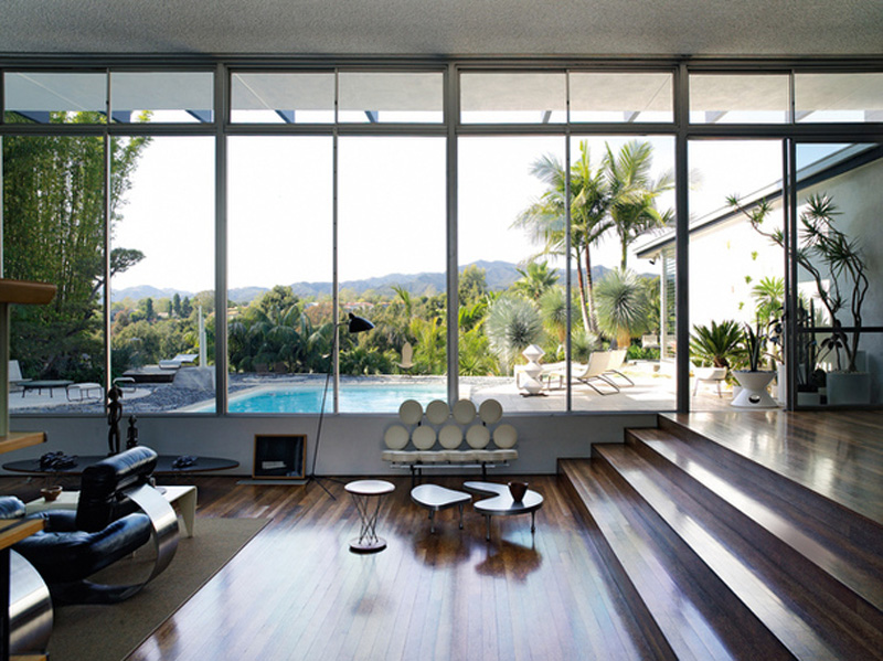
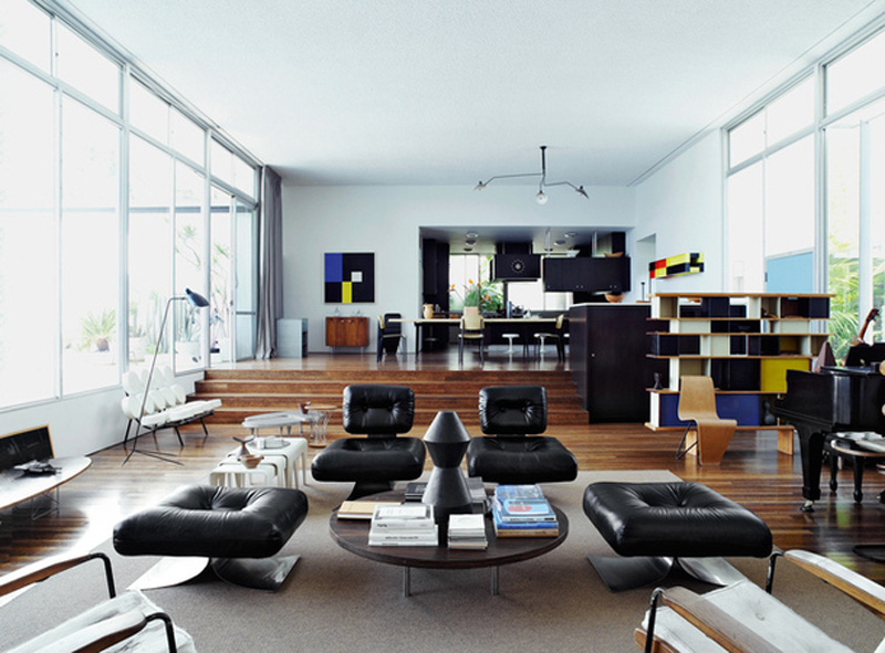
The 4,600 sq ft house sits upon the Santa Monica hillside overlooking the fairways of the Riviera Country Golf Club and is built in a T shape. As Anne Strick recalls they were very specific about the details with a high ceiling in the public spaces, low in the private and level changes in the living area. When the Boyds purchased the property in 2002 it had become destabilized by seismic shifts in land values and needed some attention. Luckily it is a well-built house which didn’t need restructuring but mainly cosmetic updates.
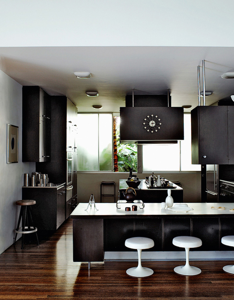
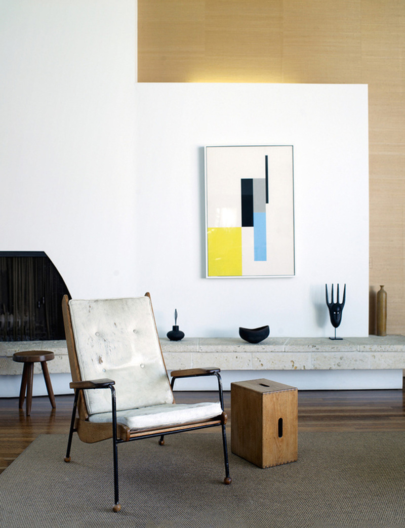
Much to the Boyd’s delight the T shaped layout works perfectly for a family with the stem of the T defining the main living area including kitchen and dining terrace and a fireplace at the far end. The fun part was furnishing the house where the couple could chose from their vast collection of mid-century pieces, keeping the more fragile ones for the library.

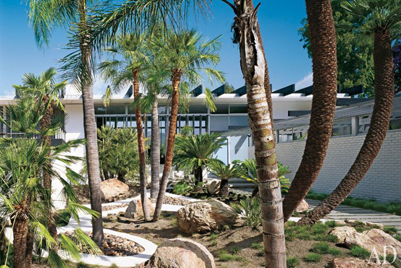
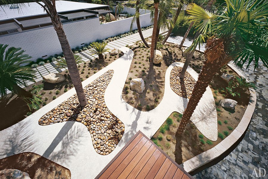
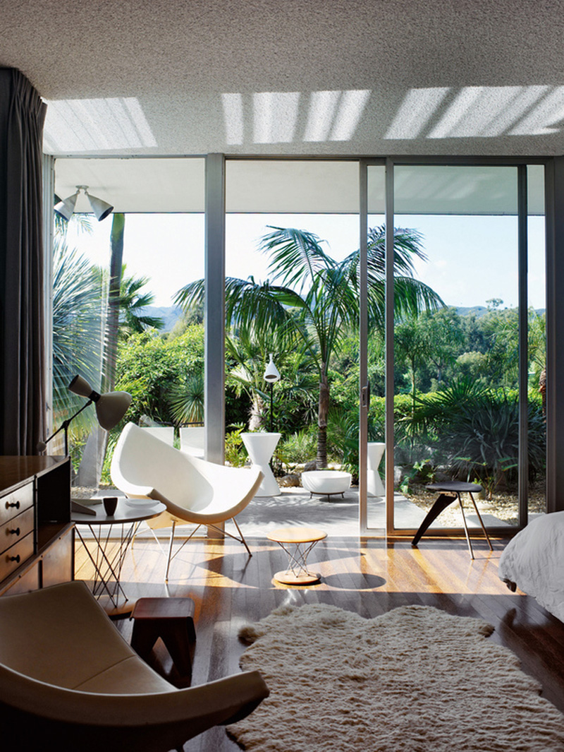
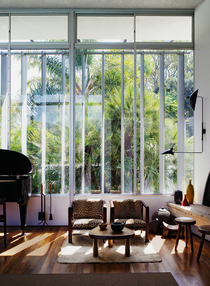
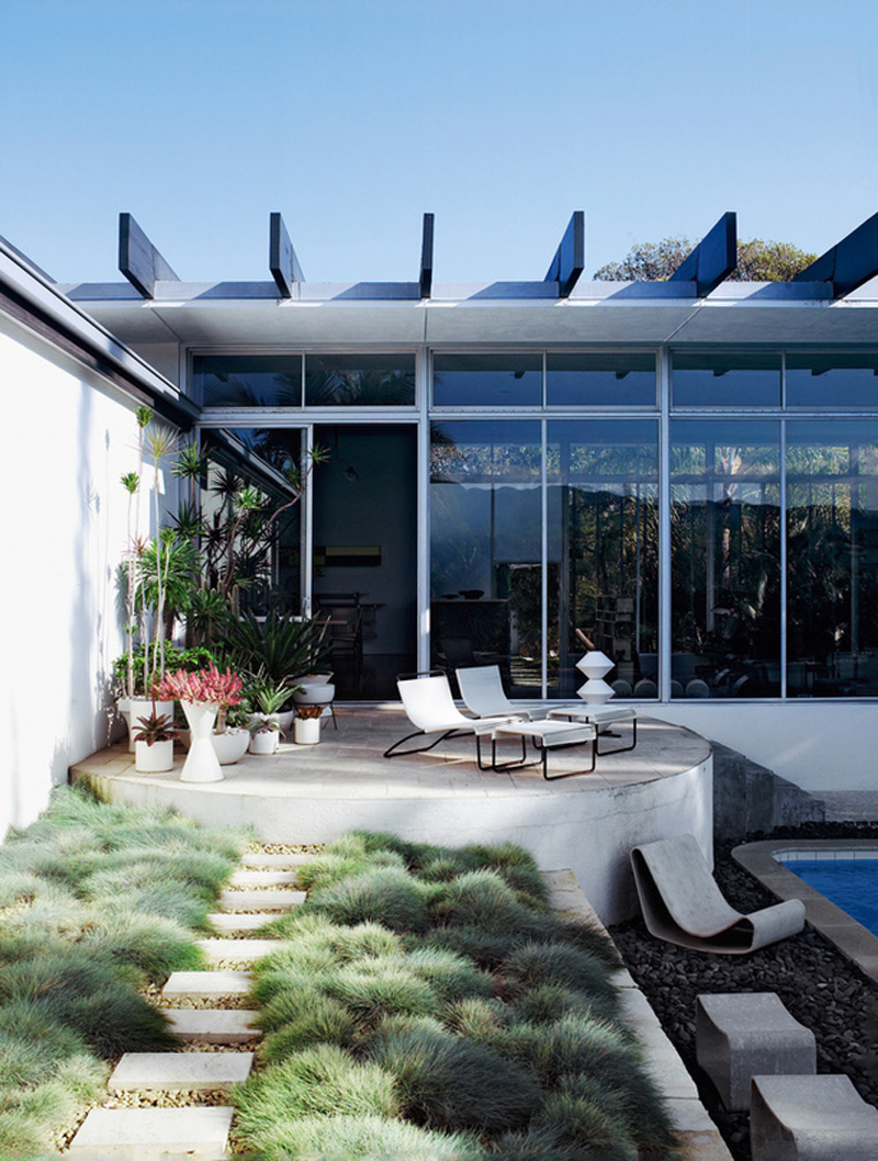
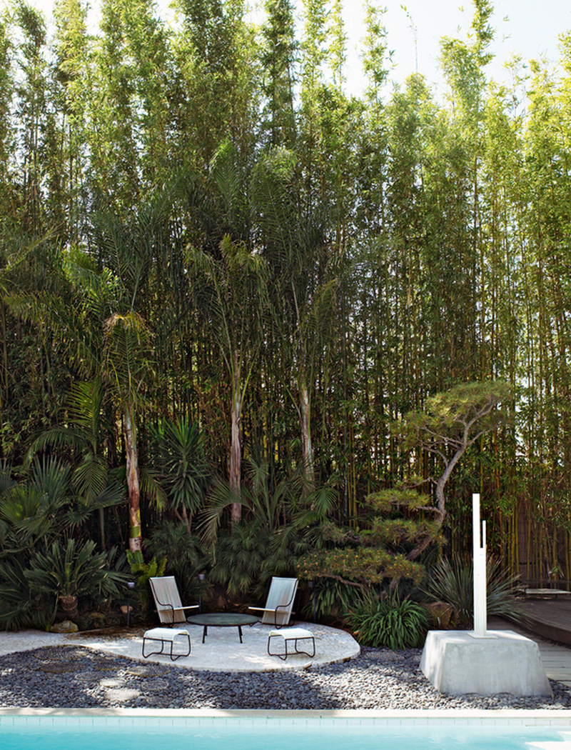
The garden design was another important element for the Boyds as the meaning of the design was based on inside-outside living and they wanted to bring out the sense that this is a Niemeyer building with a feeling of the Brazilian landscape. So now palms and ferns populate a front and back garden paved with curved paths that wind between ink-drop formations.

Michael and Gabrielle Boyd are delighted with their home and sum it up by saying:

We’re living in a sculpture, and the sculpture works perfectly. It’s minimal, clean and Constructivist but actually functions as a residence. The design makes us live differently. When we’re inside, we’re outside with the plants.

If you’re interested in avant-garde and mid-century modernism take a look at Alex Bruces blog The Importance of Being Modernist.

copyright-michael-boyd-niemeyer-house-via-stylejuicer-14

copyright-michael-boyd-niemeyer-house-via-stylejuicer-01

copyright-michael-boyd-niemeyer-house-via-stylejuicer-02

copyright-michael-boyd-niemeyer-house-via-stylejuicer-03

copyright-michael-boyd-niemeyer-house-via-stylejuicer-04

copyright-michael-boyd-niemeyer-house-via-stylejuicer-05

copyright-michael-boyd-niemeyer-house-via-stylejuicer-06

copyright-michael-boyd-niemeyer-house-via-stylejuicer-10

copyright-michael-boyd-niemeyer-house-via-stylejuicer-11

copyright-michael-boyd-niemeyer-house-via-stylejuicer-12

copyright-michael-boyd-niemeyer-house-via-stylejuicer-09

copyright Strick House by Oscar Niemeyer via stylejuicer

Enjoy and I hope you’re inspired!

Annie Signature Stylejuicer

More information | Boyd Design
Architect | Oscar Niemeyer
Photography | via Architectural Digest

TIDE HOUSE ST IVES – INTERIOR INSPIRATION FOR COASTAL LIVING

23 August 2013

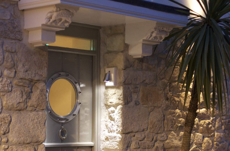
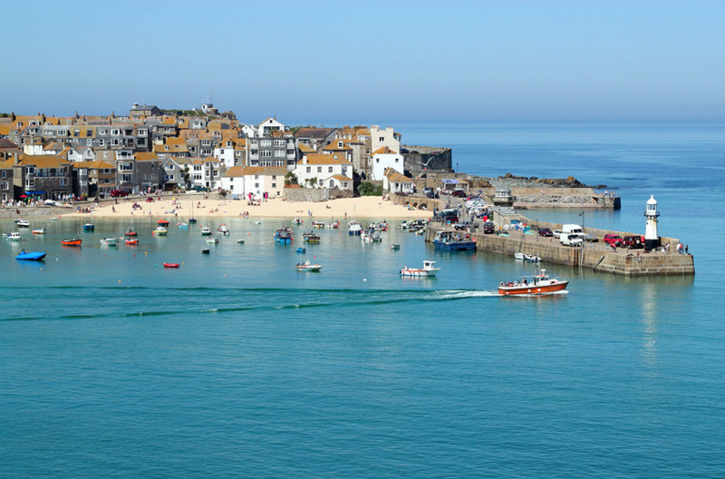
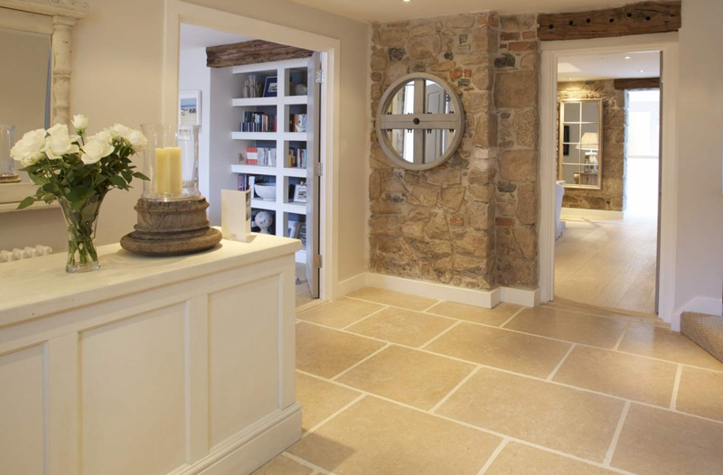
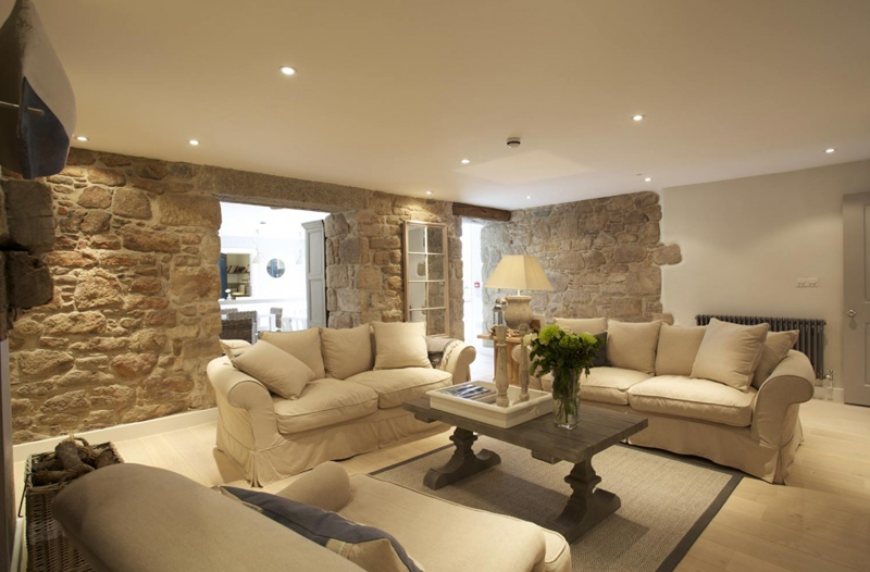
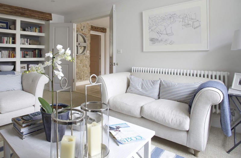
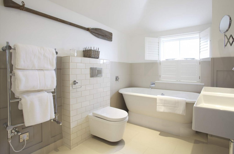
Whilst indulging myself in day-dreaming about my next luxury mini-break I came across the gorgeous Tide House in St Ives, Cornwall which dates back to 1540. ‘What? 1540?’ I hear my American friends exclaim. And yes, that’s 225 years before the War of Independence, 80 years before the Mayflower landed and in those days nothing west of the Mississippi was explored. But I digress.

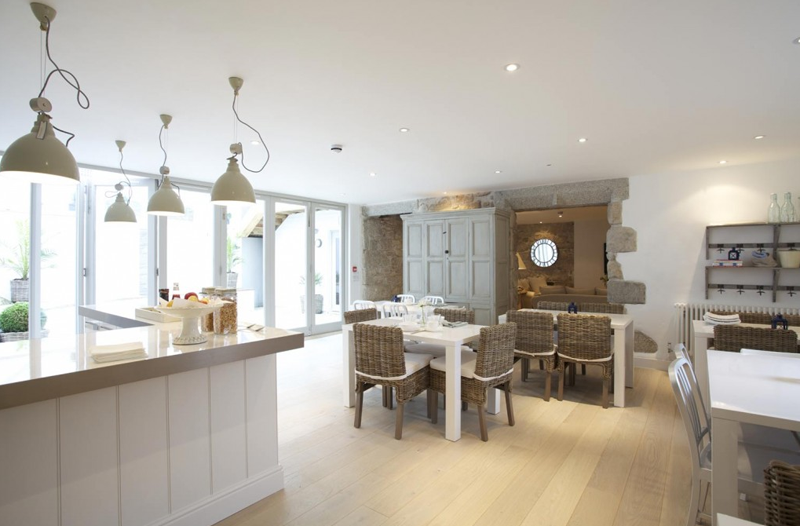
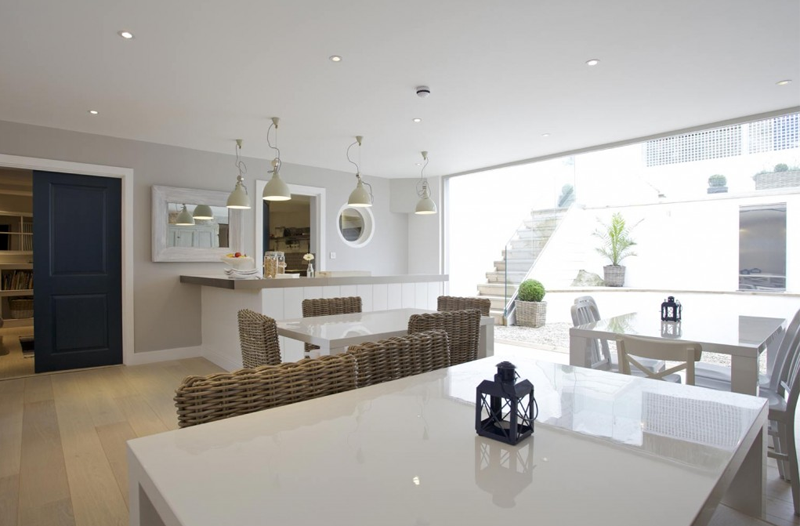
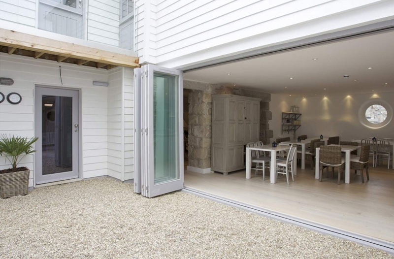
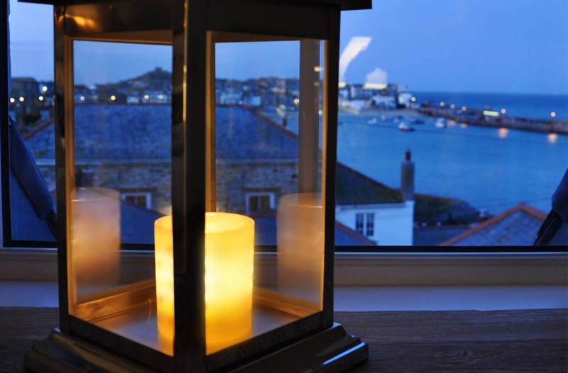
Back to the Tide House and it’s rich history as the oldest hotel in St Ives, a smart coastal town at the south west tip of the British Isles. Cornwall is a bit of a posh get-away for the Brits, especially Londoners and can get as busy as Oxford Street during the summer months. However the scenery and Cornish coast line are breathtakingly beautiful and there are plenty of beaches, rock pools and old ruins to explore which make it popular with families. I’ve not been to The Tide House which claims to be both family-friendly and a romantic retreat but I adore the look and feel of the place and I could see myself there at any time of year. Plus their photos fit perfectly onto my ‘Coastal Living’ board on Pinterest for my future coastal retreat.

copyright Tide House St Ives via stylejuicer.com

In 2011 Suzy and David Fairfield bought the hotel and spent 18 months restoring it into a home from home with friendly and informal service. Suzy’s skills as an interior designer come through in her choice of beautiful warm and tactile luxury furnishings and the coastal details and chalky colour palette are tasteful without being overwhelming. Each one of the six bedrooms is individually styled and Suzy’s artwork – she has a degree in illustration from Brighton College of Art – is on display in some of the rooms. I love the mix of materials and the combination of old and new and can tell just from looking at the photos that the couple is passionate about their place. They have achieved their vision of creating a home from home where people come to relax yet feel they are staying somewhere special.

LOCAL POINTS OF INTERST:

by Suzy and David Fairfield via Alastair Sawday’s

• St Ives has seven different great beaches to explore and enjoy
• St Ives is world famous for its connection with artists – some great galleries to see plus, of course, Tate St Ives
Barbara Hepworth museum and sculpture garden is really worth a visit
The Minack Theatre, Cornwall’s world famous open air theatre – a stunning place to see
• The iconic St Michael’s Mount – a stroll across the tidal causeway or a short boat hop from nearby Marazion
• Some of the best coastal walking in the UK, including the spectacular Hell’s Mouth to Godrevy and St Ives to Zennor

Sounds just like my cup of tea!

copyright Tide House St Ives via stylejuicer.com

copyright TideHouse Cornwall via stylejuicer.com 20

copyright TideHouse Cornwall via stylejuicer.com 23

copyright TideHouse Cornwall via stylejuicer.com 04

copyright TideHouse Cornwall via stylejuicer.com 01

copyright TideHouse Cornwall via stylejuicer.com 28

copyright TideHouse Cornwall via stylejuicer.com 08

copyright TideHouse Cornwall via stylejuicer.com 10

copyright TideHouse Cornwall via stylejuicer.com 09

copyright TideHouse Cornwall via stylejuicer.com 24

copyright TideHouse Cornwall via stylejuicer.com 06

copyright TideHouse Cornwall via stylejuicer.com 07

copyright TideHouse Cornwall via stylejuicer.com 25

copyright TideHouse Cornwall via stylejuicer.com 26

copyright TideHouse Cornwall via stylejuicer.com 18

copyright Tide House St Ives via stylejuicer.com

Enjoy and I hope you’re inspired!

Annie Signature Stylejuicer

More information & photography | Tide House St Ives, Cornwall

NO OXYMORON – A SUMMER COTTAGE IN BROOKLYN, NYC

12 August 2013

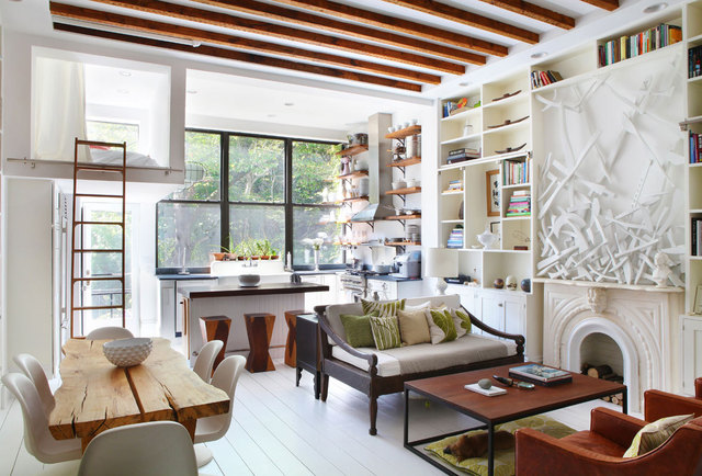
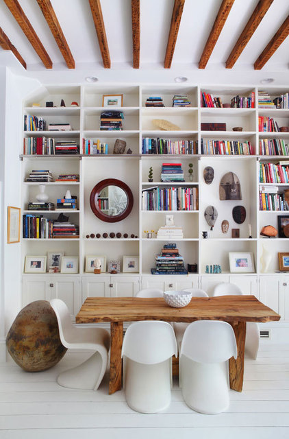
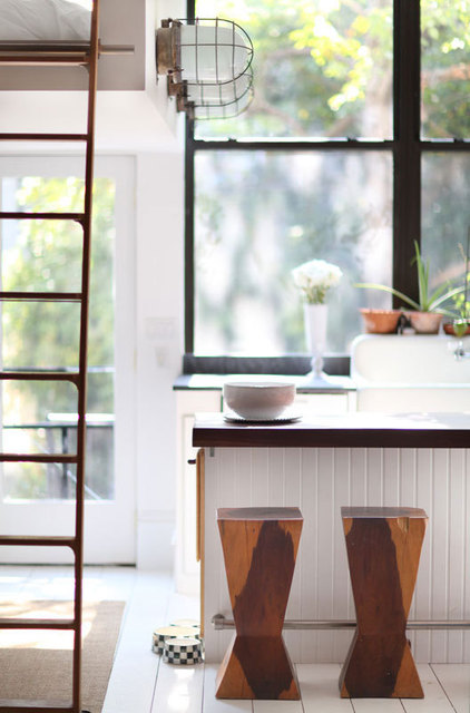
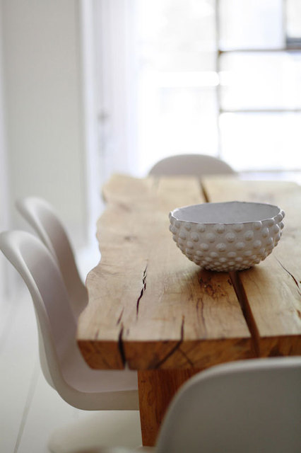
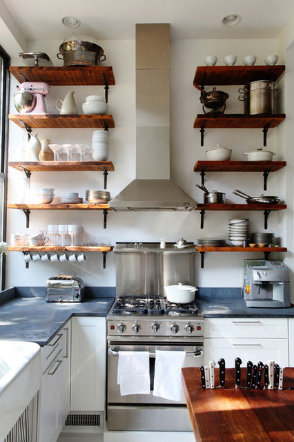
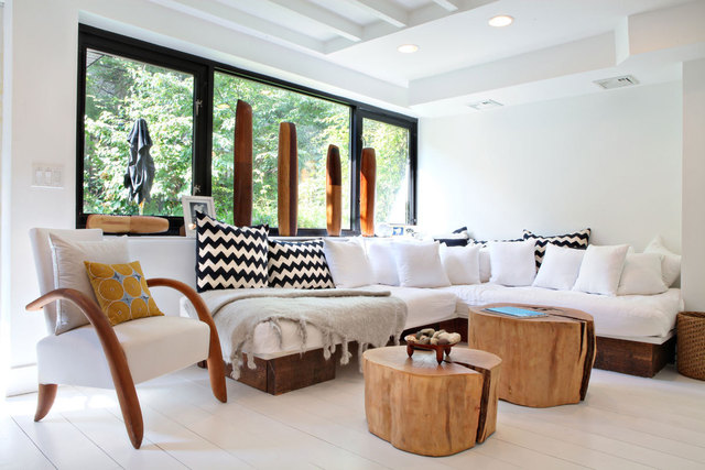
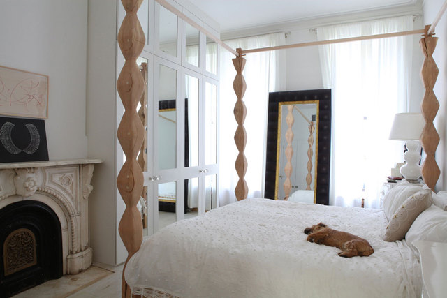
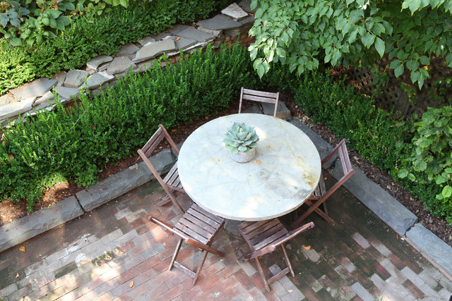
A summer cottage and Brooklyn are not normally two words associated with each other but artists Lyndsay Caleo, a jewellery designer, and Fitzhugh Karol a woodworker/sculptor have achieved just that with their first renovation project.
 
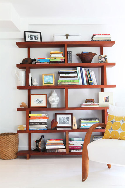
When I first read about their summer cottage in Brooklyn I was impressed by their eclectic style, clever layout and neutral colour palette with handcrafted pieces of furniture.
 
The artistic couple say in their own words:

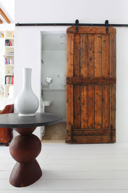
It’s all about creating a departure. We both grew up in the country and we designed the house to be an escape from the city. We designed the layout based on our needs, how we lived and what we had. Our design philosophy involves playing with the balance between new and old. We mix architectural elements that were created 100 years ago with furniture we make, natural elements and modern designs.

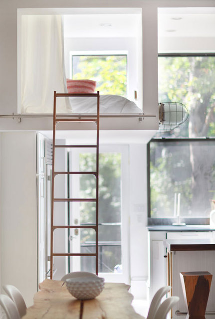
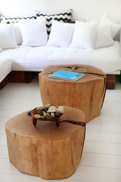
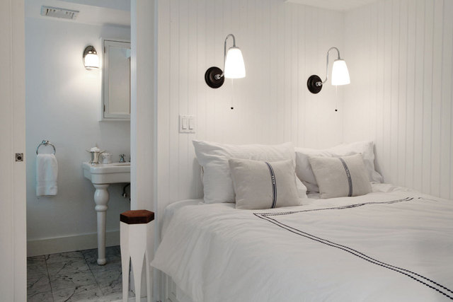
We love classically Scandinavian simplicity – particularly old summer cottages. Materials are a huge inspiration. Whether it be an old salvaged chunk of wood or a stack of white linens, materials are often what drive the vision for a space and sometimes stumbling across an object will send us in a new direction on a particular project. We also use light a lot of as a medium and we always try to move light into all corners of a project using the layouts, glass panels and whites.

Lyndsay and Fitzhugh also work for the Brooklyn Home Company, a family-run cooperative of artists and builders committed to creating world-class and innovative living spaces in Brooklyn.

LizV_BKHome_01_rect640

LizV_BKHome_03_rect640

LizV_BKHome_20_rect640

LizV_BKHome_05_rect640

LizV_BKHome_09_rect640

LizV_BKHome_07_rect640

LizV_BKHome_11_rect640

LizV_BKHome_12_rect640

LizV_BKHome_14_rect640

LizV_BKHome_15_rect640

LizV_BKHome_04_rect640

LizV_BKHome_17_rect640

LizV_BKHome_21_rect640

LizV_BKHome_18_rect640

LizV_BKHome_19_rect640

LizV_BKHome_27_rect640

LizV_BKHome_22_rect640

LizV_BKHome_24_rect640

LizV_BKHome_25_rect640

LizV_BKHome_28_rect640
 
Enjoy and I hope you’re inspired!

ANNIE_signature
 
Photography | Liz Vidyarthi
More information | The Brooklyn Home Company

JESSICA HELGERSON’S INTERIOR DESIGN FOR PORTLAND HOME

7 August 2013

Jessica Helgerson Interior Design was featured on one of my favourite blogs Design*Sponge and I fell in love with her style straight away. She creates beautifully subtle and interesting interiors through her choice of materials, colours and decorative elements.

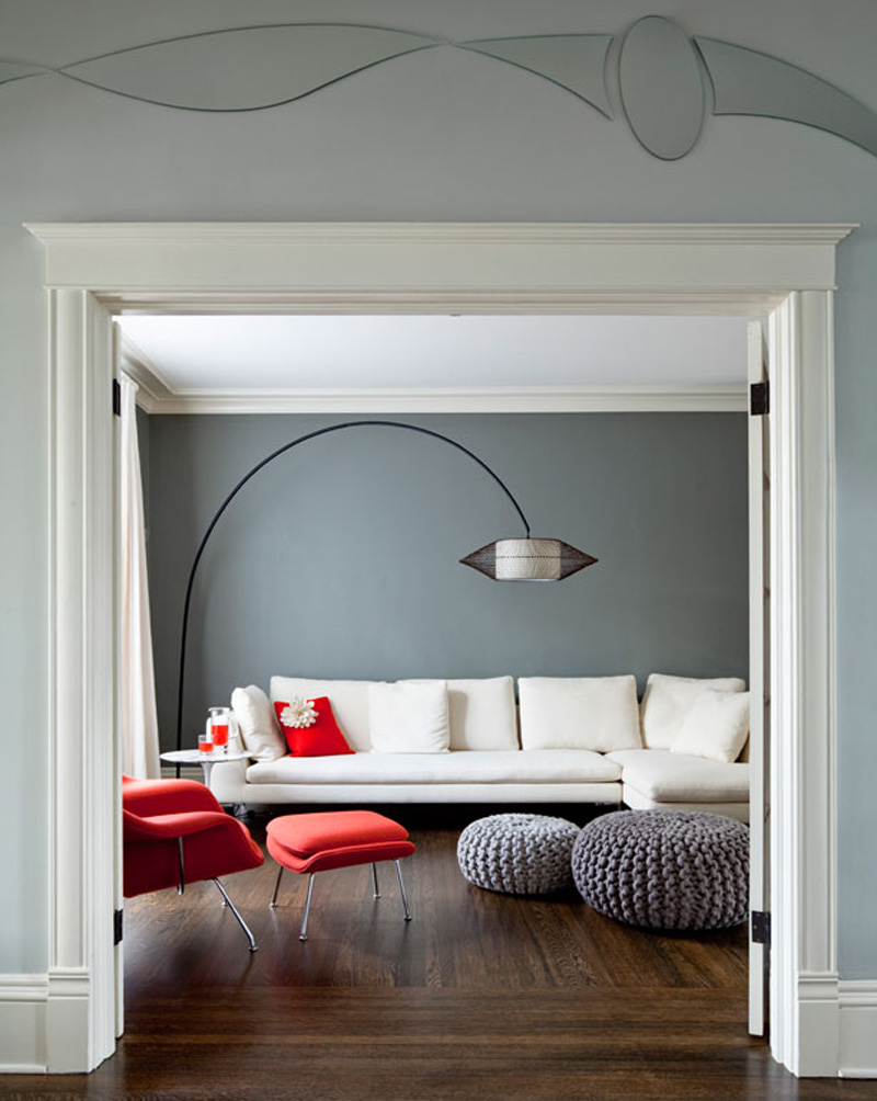
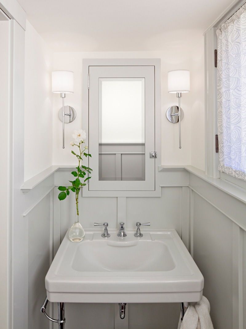
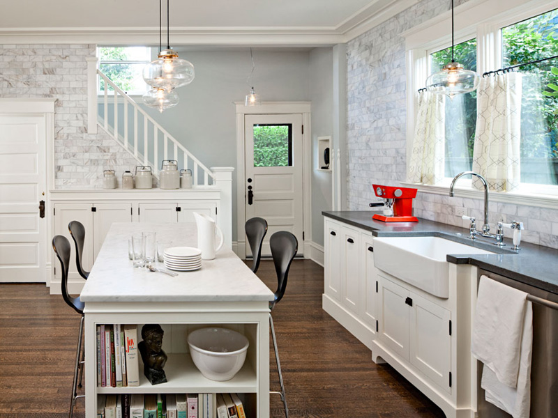
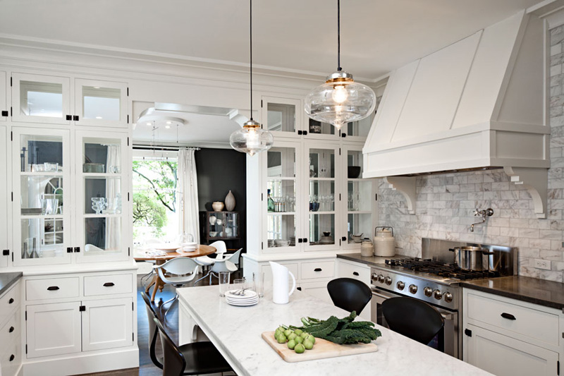
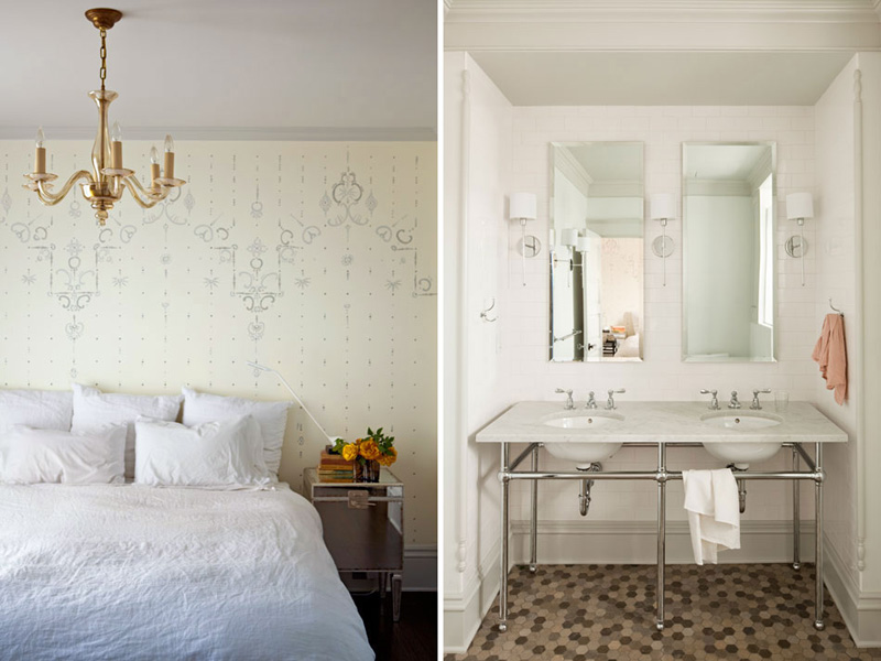
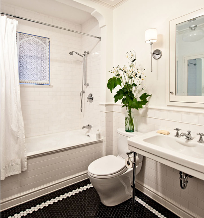
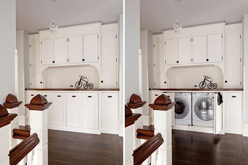
This Turn-Of-The-Century family home in Portland needed remodelling to get a better flow serving modern family living. The kitchen was opened up to the dining room and excess space from a spare bedroom was borrowed to create a master bathroom, complete with double sinks and a generously sized shower. For me the most successful transformation is the formerly dim attic studio space with it’s white walls and floors and four new skylights that flood the space with light. But the piece-de-resistance has to be the cleverly customised cupboard at the top of the stairs concealing a washer, dryer and storage space. Storage doesn’t come much more sophisticated than this.

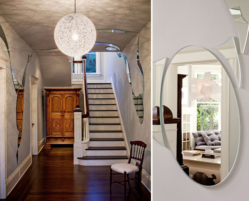
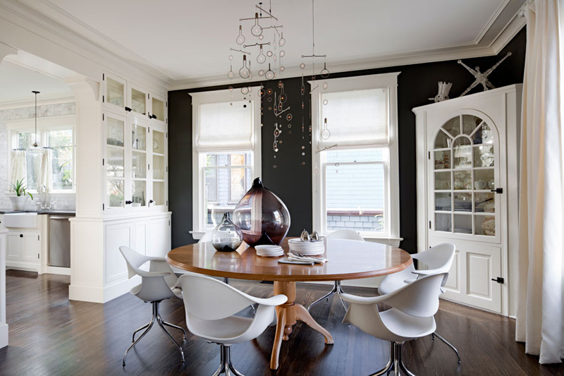
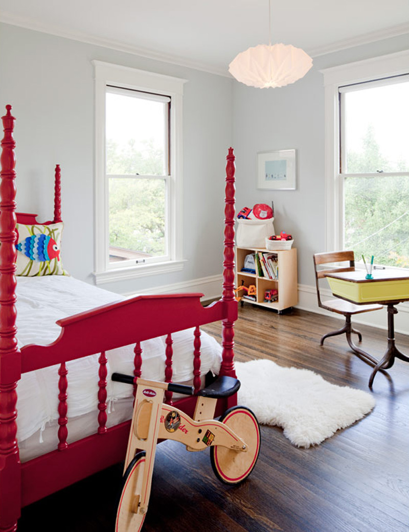
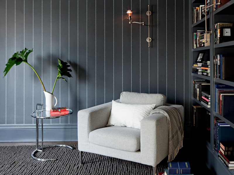
What I love about Jessica’s design for this family home is the subtle use of whites and greys throughout the house which creates continuity as well as contrast. She used a light grey wall colour for the entry area, leading into a medium grey living room and a dramatically dark grey dining room and library. A clever way of drawing the visitor in and an appropriate choice for the different uses of each room.

Another trick she applied is the use of organic shaped mirrors along the entry walls reflecting snippets of the interior and leading making the visitor curious to explore more.

Overall, the period features and dimensions have been kept intact and the house has been brought into the 21st Century with this fresh, bright and functional interior design. A success story that was awarded the 2011 Northwest Design Award for a whole house interior design budget below $400,000.

Copyright-Turn-Of-Century-Modern-JHID-01

Copyright-Turn-Of-Century-Modern-JHID-02

Copyright-Turn-Of-Century-Modern-JHID-03

Copyright-Turn-Of-Century-Modern-JHID-04

Copyright-Turn-Of-Century-Modern-JHID-05

Copyright-Turn-Of-Century-Modern-JHID-06

Copyright-Turn-Of-Century-Modern-JHID-07

Copyright-Turn-Of-Century-Modern-JHID-08

Copyright-Turn-Of-Century-Modern-JHID-09

Copyright-Turn-Of-Century-Modern-JHID-10

Copyright-Turn-Of-Century-Modern-JHID-11

Copyright Jessica Helgerson Interior Design
Enjoy and I hope you’re inspired!

Annie Signature Stylejuicer

More information | Jessica Helgerson Interior Design
Photography | Lincoln Barbour