Category Archives: Home & Interior

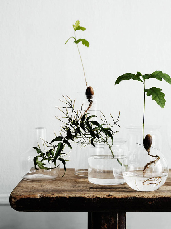
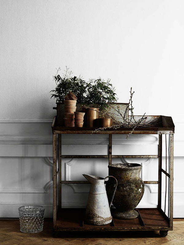
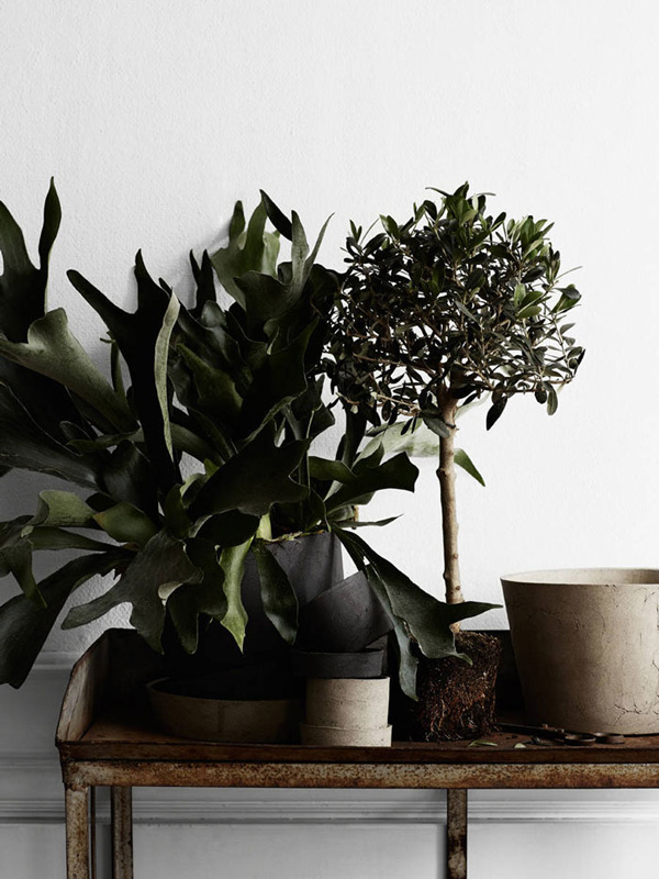
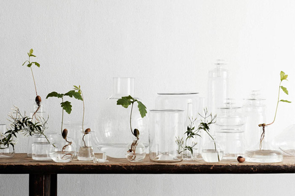
BEAUTIFUL STYLING WITH PLANTS

19 March 2015

beautiful, styling, plants, in the home, urban jungle bloggers, judith de graaff, igor josif, lotta agaton, kristofer Johnsson, book, colourful, spring, greens, trend, style, decor, home

I’m a huge fan of Swedish stylist Lotta Agaton and often dive into her book Colourful for some interior and styling inspiration. It’s pure eye candy for me and always leaves me feeling calm and relaxed – bit like a yoga class for the eye without any exercise.

With Spring edging ever closer I’m thinking of introducing some greenery into the home which is quite a big deal as I’m not particularly good at keeping plants alive. Plus the permanent danger from 4 little hands picking off leaves and digging up the soil fills me with dread… oh that mess!

Ok, I can get over that. Especially after spotting Lotta’s beautiful styling with plants captured by Kristofer Johnsson for Swedish Residence Magazine. Simply gorgeous.

If you’re thinking of introducing some plants into your home head over to Urban Jungle Bloggers run by my blogging buddies Judith and Igor. Between them they’ve got more than 4 green thumbs and lots of stylish ideas of how to decorate your home with some greens.
 

beautiful, styling, plants, in the home, urban jungle bloggers, judith de graaff, igor josif, lotta agaton, kristofer Johnsson, book, colourful, spring, greens, trend, style, decor, home

beautiful, styling, plants, in the home, urban jungle bloggers, judith de graaff, igor josif, lotta agaton, kristofer Johnsson, book, colourful, spring, greens, trend, style, decor, home

beautiful, styling, plants, in the home, urban jungle bloggers, judith de graaff, igor josif, lotta agaton, kristofer Johnsson, book, colourful, spring, greens, trend, style, decor, home

 
STYLING | Lotta Agaton
PHOTOGRAPHY | Kristofer Johnsson
 
Follow Stylejuicer with Bloglovin

PASTEL SHADES IN VICTORIAN TERRACE

6 March 2015

pastel, shades, colour, spring, melbourne, australia, victorian terrace, fiona lynch, interior designer, style, trend, interior design, custom made furniture, cabinetry, photography, Brooke Holm, styling, Marsha Golemac

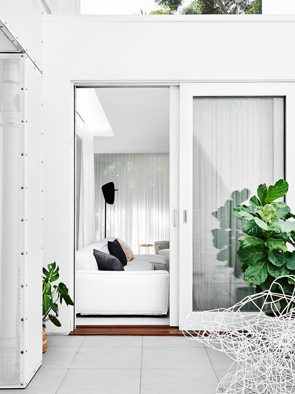
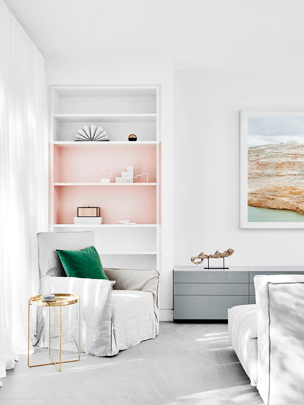
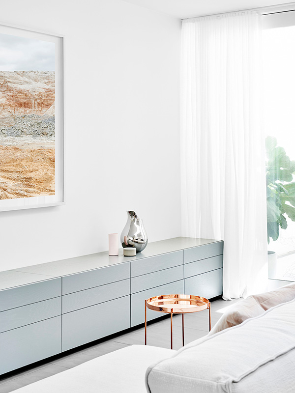
Spring is almost here and it makes me lust after pastel shades like in this Melbourne home. The Victorian terrace has been remodelled by interior designer Fiona Lynch and the living area is now one large easy living space flooded with light thanks to the sheer curtains.

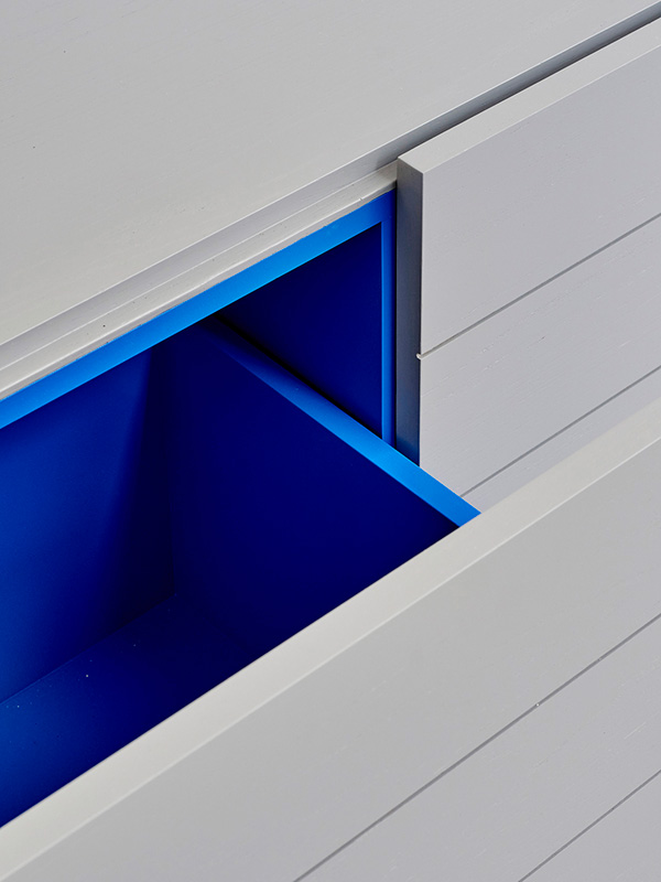
How cool are the grey custom made cabinets with blue lined drawers!?

Head over to EST to see the full home tour.
 

pastel, shades, colour, spring, melbourne, australia, victorian terrace, fiona lynch, interior designer, style, trend, interior design, custom made furniture, cabinetry, photography, Brooke Holm, styling, Marsha Golemac

pastel, shades, colour, spring, melbourne, australia, victorian terrace, fiona lynch, interior designer, style, trend, interior design, custom made furniture, cabinetry, photography, Brooke Holm, styling, Marsha Golemac

pastel, shades, colour, spring, melbourne, australia, victorian terrace, fiona lynch, interior designer, style, trend, interior design, custom made furniture, cabinetry, photography, Brooke Holm, styling, Marsha Golemac

pastel, shades, colour, spring, melbourne, australia, victorian terrace, fiona lynch, interior designer, style, trend, interior design, custom made furniture, cabinetry, photography, Brooke Holm, styling, Marsha Golemac

 
VIA | EST Magazine with thanks
PHOTOGRAPHY & STYLING | unmistakably by Aussie power photography/styling duo Brooke Holm and Marsha Golemac
 
Follow Stylejuicer with Bloglovin
PERFECTLY STYLED SWEDISH APARTMENT

2 March 2015

gothenburg, sweden, kitchen, cabinetry, carpentry, estate agency, entrance, styling, perfectly styled, soft colour palette, vintage, mid-century, shaker style, dining table, style, trend

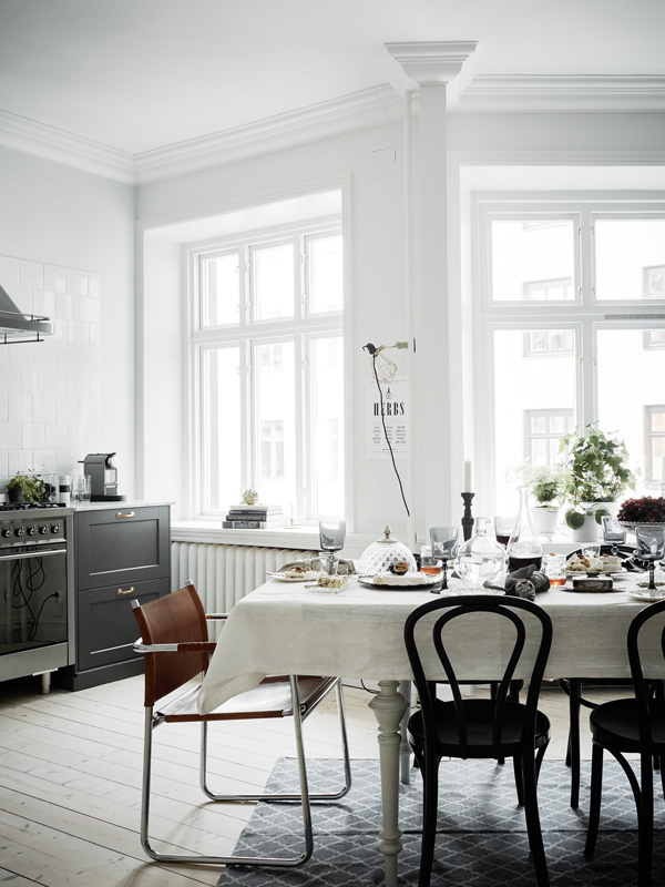
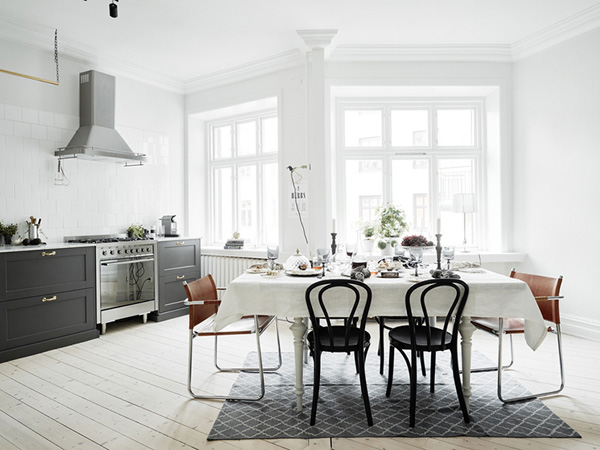
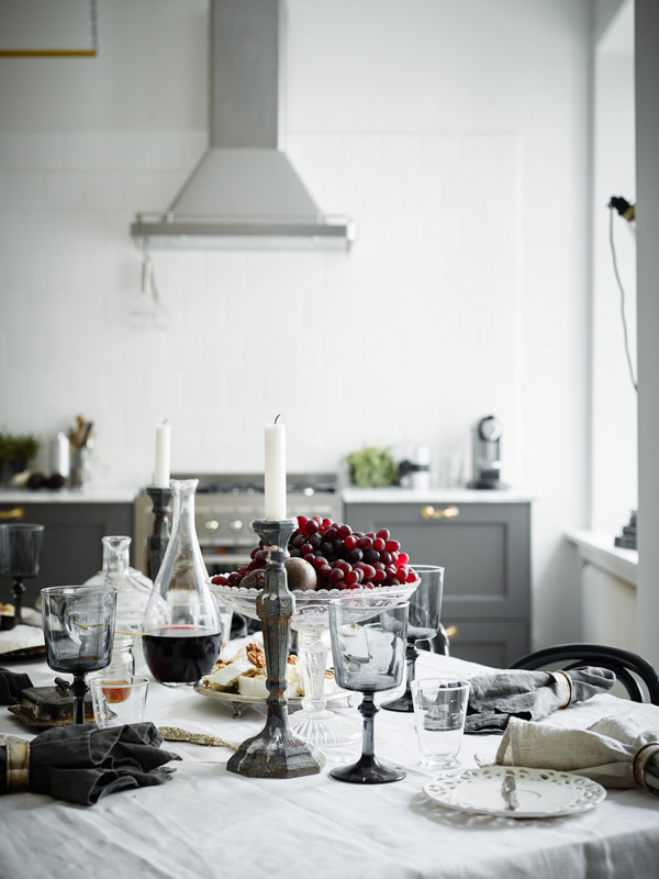
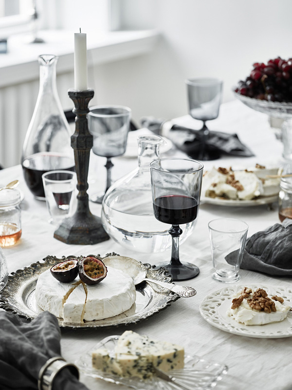
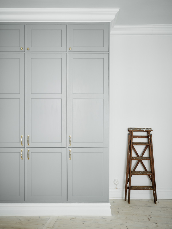
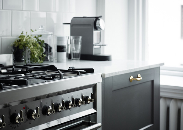
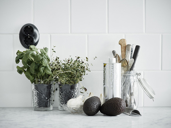
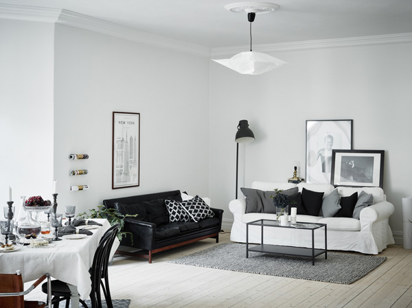
Argh! I don’t like Monday mornings so I’m swooning over this beautiful Swedish apartment which I found via real estate agency Entrance. It’s gorgeous, right!? The bad news is, it’s sold. The good news is that you can see it here on the blog.

I wish they’d put this much effort into selling houses over here in the UK. How much more enticing if you see a tidy, clutter-free and lived-in environment that’s styled to perfection. It immediately triggers the ‘yes, I want that lifestyle and yes, I’m going to outbid whoever stands in my way.’ response. No? Doesn’t have the same effect on you? Maybe it’s just me and my mild OCD.

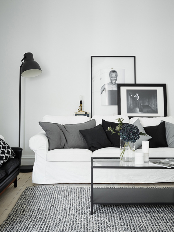
I just want to sit down at that table and tuck into the lovely cheeses and help myself to a glass or two of red before collapsing on the white sofa and probably nodding off reading the papers.

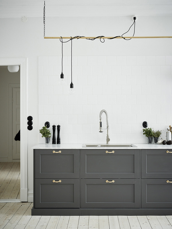
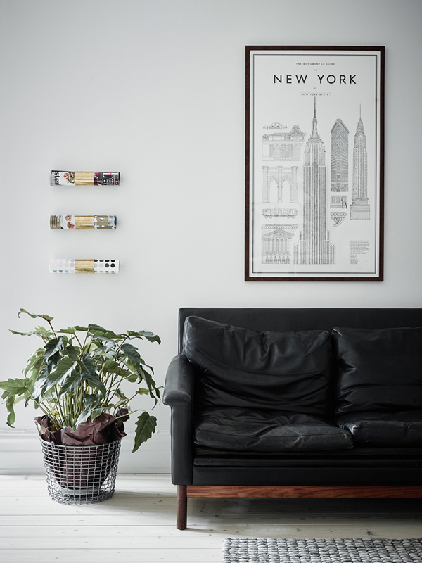
I particularly love the black leather sofa which looks like a vintage mid-century piece and works beautifully with the surrounding soft greys and whites. Now the open-plan kitchen dining area has to be my favourite though with the dark grey cabinetry and I even like the brass door handles – not normally something I’d go for but it works with the Shaker style for the wood work. And how cool is the DIY string lighting above the sink!? Reminds me of a futuristic version of an old fashioned drying rack. Genius!


gothenburg, sweden, kitchen, cabinetry, carpentry, estate agency, entrance, styling, perfectly styled, soft colour palette, vintage, mid-century, shaker style, dining table, style, trend

gothenburg, sweden, kitchen, cabinetry, carpentry, estate agency, entrance, styling, perfectly styled, soft colour palette, vintage, mid-century, shaker style, dining table, style, trend

gothenburg, sweden, kitchen, cabinetry, carpentry, estate agency, entrance, styling, perfectly styled, soft colour palette, vintage, mid-century, shaker style, dining table, style, trend

gothenburg, sweden, kitchen, cabinetry, carpentry, estate agency, entrance, styling, perfectly styled, soft colour palette, vintage, mid-century, shaker style, dining table, style, trend

gothenburg, sweden, kitchen, cabinetry, carpentry, estate agency, entrance, styling, perfectly styled, soft colour palette, vintage, mid-century, shaker style, dining table, style, trend

gothenburg, sweden, kitchen, cabinetry, carpentry, estate agency, entrance, styling, perfectly styled, soft colour palette, vintage, mid-century, shaker style, dining table, style, trend

gothenburg, sweden, kitchen, cabinetry, carpentry, estate agency, entrance, styling, perfectly styled, soft colour palette, vintage, mid-century, shaker style, dining table, style, trend

gothenburg, sweden, kitchen, cabinetry, carpentry, estate agency, entrance, styling, perfectly styled, soft colour palette, vintage, mid-century, shaker style, dining table, style, trend

gothenburg, sweden, kitchen, cabinetry, carpentry, estate agency, entrance, styling, perfectly styled, soft colour palette, vintage, mid-century, shaker style, dining table, style, trend

gothenburg, sweden, kitchen, cabinetry, carpentry, estate agency, entrance, styling, perfectly styled, soft colour palette, vintage, mid-century, shaker style, dining table, style, trend

 
PHOTOGRAPHY | Jonas Berg for Entrance
 
Follow Stylejuicer with Bloglovin

A CALM AND PURE HOME IN CAPE TOWN

25 February 2015

calm, pure, home, cape town, south africa, est magazine, isuu, online magazine, make up artist, Algria Ferreira-Watling, monastery, zen, bare, walls, floors, white washed, interior design, styling, trend, style, decor, muted colour palette, less is more

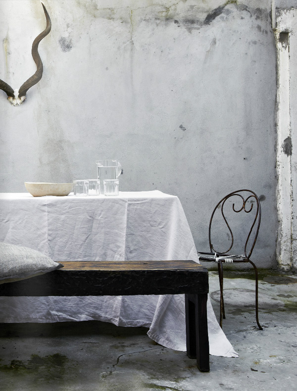
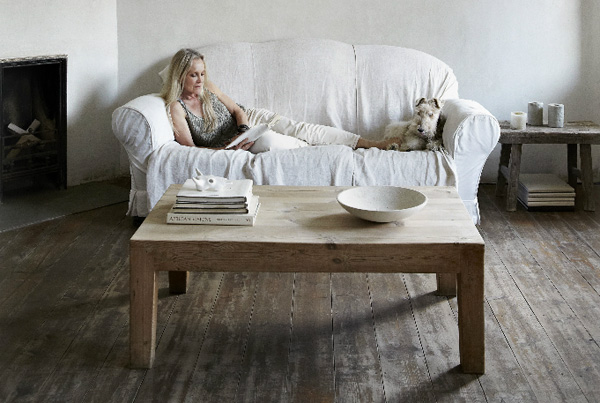
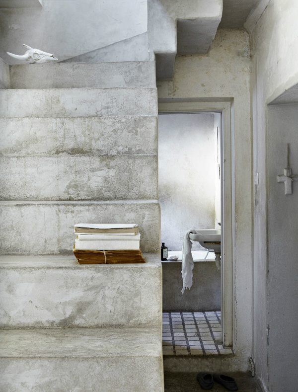
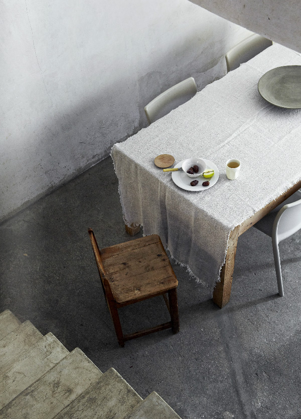
After a week of far too much work and too little time to play I’m finally back to blogging and want to share this amazing home in Cape Town with you which I discovered via one of my favourite online magazines EST.

It’s the home of make-up artist Algria Ferreira-Watling who by her own admission comes from a poor background and never dreamt of living in a palace. She says she has never needed things but instead has always wanted to live in a little house with the peaceful feel of a monastery.

A truly admirable and humbling approach to decorating, interior design and styling and in fact to the rest of the world’s drive to consumerism. Her place feels very Zen like and utterly calm and pure with bare walls and floors in a muted earthy colour palette.

Looking at her place made me take a step back and remind myself that less is more. *Sigh* but I do so like some new shoes…


calm, pure, home, cape town, south africa, est magazine, isuu, online magazine, make up artist, Algria Ferreira-Watling, monastery, zen, bare, walls, floors, white washed, interior design, styling, trend, style, decor, muted colour palette, less is more

calm, pure, home, cape town, south africa, est magazine, isuu, online magazine, make up artist, Algria Ferreira-Watling, monastery, zen, bare, walls, floors, white washed, interior design, styling, trend, style, decor, muted colour palette, less is more

calm, pure, home, cape town, south africa, est magazine, isuu, online magazine, make up artist, Algria Ferreira-Watling, monastery, zen, bare, walls, floors, white washed, interior design, styling, trend, style, decor, muted colour palette, less is more

calm, pure, home, cape town, south africa, est magazine, isuu, online magazine, make up artist, Algria Ferreira-Watling, monastery, zen, bare, walls, floors, white washed, interior design, styling, trend, style, decor, muted colour palette, less is more

calm, pure, home, cape town, south africa, est magazine, isuu, online magazine, make up artist, Algria Ferreira-Watling, monastery, zen, bare, walls, floors, white washed, interior design, styling, trend, style, decor, muted colour palette, less is more

 
PHOTOGRAPHY | Greg Cox with thanks
 
Follow Stylejuicer with Bloglovin
MODERN RUSTIC | DANISH COTTAGE

16 February 2015

modern rustic, danish, denmark, cottage, kitchen, style, trend, interior design, styling, handmade, wooden, dining table, metal chairs, sheep skin, exposed beams, brick wall, muted, shades of grey, organic, curved, traditional display cabinet

Hello peeps! Did you all survive Valentines Day? Did you feel it? Yeah, me neither. Give me a modern rustic Danish cottage any day but on demand romance… nah, not enough spontaneity for me.

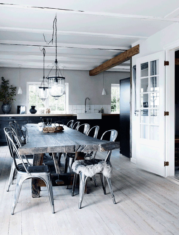
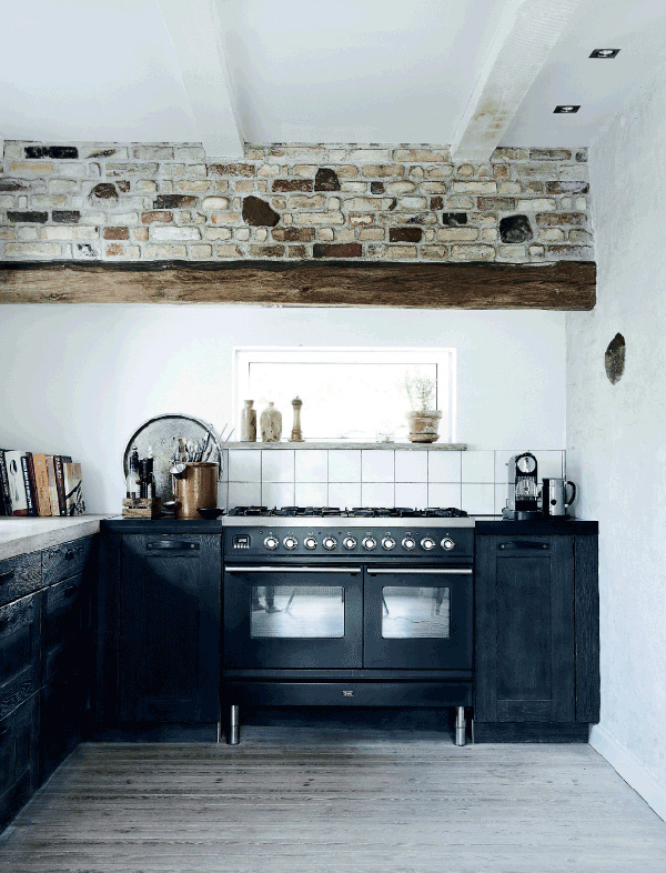
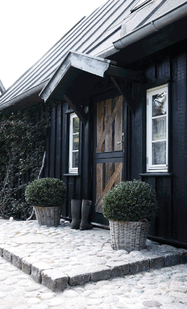
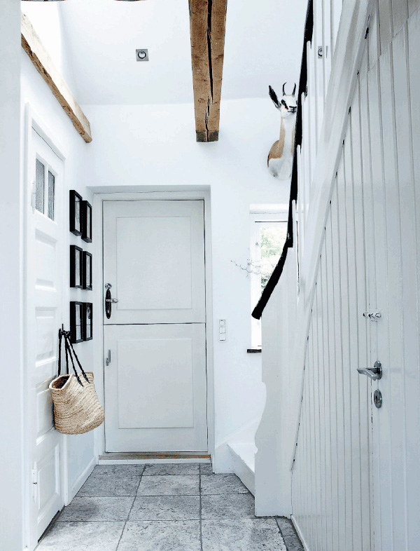
So, isn’t this place fabulous? Kitchens sell houses, right!? I would buy this one without even looking around the rest of the house. That heavy, handmade wooden dining table with organic curvy edges that still show the shape of the tree, those metal chairs with fluffy sheep skins, the muted shades of grey (no, haven’t seen the movie or read the books and don’t intend to) and exposed beams and brick wall – I’m all over that. Beautiful! And a perfect fit for the black clad cottage with it’s typical steep metal roof.

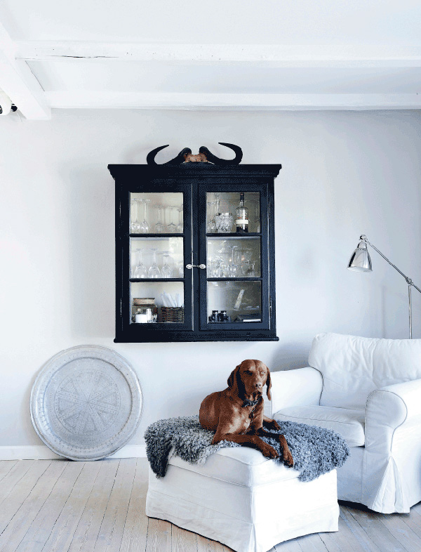
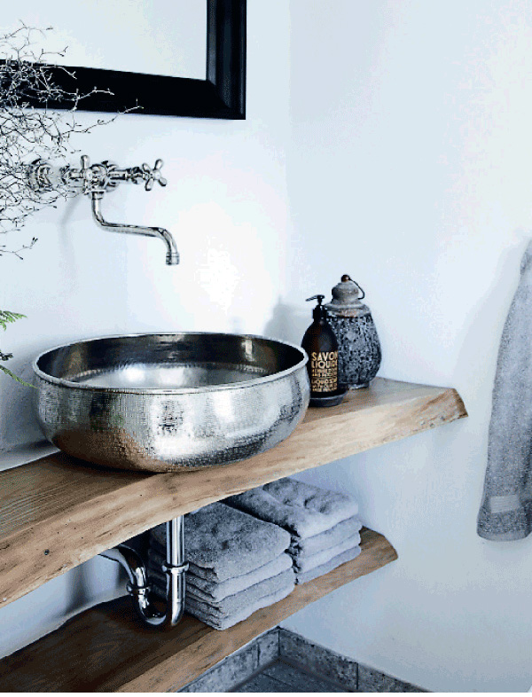
There are some more gems around the rest of the house like the curved wooden boards in the bathroom used as shelving and support for the sink. I also like the bull horns sitting on top of a traditional display cabinet and how cute is the dog sitting patiently underneath!?

Wishing you a great start to the week.


modern rustic, danish, denmark, cottage, kitchen, style, trend, interior design, styling, handmade, wooden, dining table, metal chairs, sheep skin, exposed beams, brick wall, muted, shades of grey, organic, curved, traditional display cabinet

modern rustic, danish, denmark, cottage, kitchen, style, trend, interior design, styling, handmade, wooden, dining table, metal chairs, sheep skin, exposed beams, brick wall, muted, shades of grey, organic, curved, traditional display cabinet

modern rustic, danish, denmark, cottage, kitchen, style, trend, interior design, styling, handmade, wooden, dining table, metal chairs, sheep skin, exposed beams, brick wall, muted, shades of grey, organic, curved, traditional display cabinet

modern rustic, danish, denmark, cottage, kitchen, style, trend, interior design, styling, handmade, wooden, dining table, metal chairs, sheep skin, exposed beams, brick wall, muted, shades of grey, organic, curved, traditional display cabinet

modern rustic, danish, denmark, cottage, kitchen, style, trend, interior design, styling, handmade, wooden, dining table, metal chairs, sheep skin, exposed beams, brick wall, muted, shades of grey, organic, curved, traditional display cabinet

modern rustic, danish, denmark, cottage, kitchen, style, trend, interior design, styling, handmade, wooden, dining table, metal chairs, sheep skin, exposed beams, brick wall, muted, shades of grey, organic, curved, traditional display cabinet

 
VIA | Femina
PHOTOGRAPHY | Mette Wotkjær with thanks
 
Follow Stylejuicer with Bloglovin