Category Archives: Home & Interior

PALMA | HIDDEN TREASURES

11 April 2016

Palma, palma de mallorca, hidden treasures, viveca, concept store, la molienda, coffee shop, plamas best coffee, aesthetic, interior, style, styling, trend, antiques, handcrafted, craftsmanship, artisan, location finding, restoration services, industrial lighting, stripped back interior, white washed, spanish
 

You may have noticed my absence on here over the last week or so but we went on a much longed for Easter break to one of our favourite places: Palma de Mallorca.

Not everything turned out as we expected – I’m going to spare you the details of our filthy townhouse and the stress it caused – but you’ve got to look on the bright side and not only did the boys love their unbridled time on the beach but Mama also got some precious time to herself and met up with local resident Mary whom I met on Instagram just over a year ago.

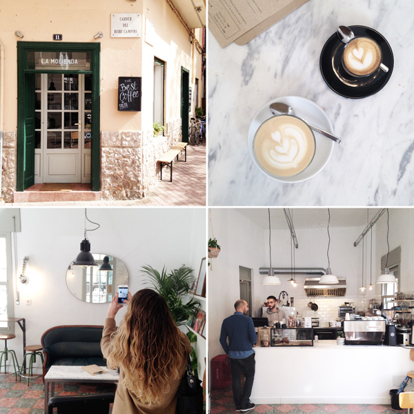
It’s always a little nerve wrecking to meet people in real life whom you’ve only ever shared friendly emojis and some jokes with but we got on great straight away and arranged to meet up at one of Palma’s cutest little coffee places, La Molienda.

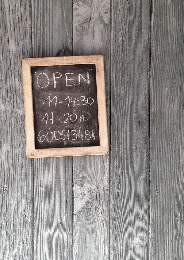
Just a short stroll north of Placa del Rei on the corner of Carrer del Bisbe Campins is this tiny corner cafe with some shaded seating outside and a large antique sofa and some stools inside proudly serving Palma’s best coffee. I can absolutely vouch for their quality coffee and was totally enchanted by the stripped back white washed interior with a touch of industrial lighting and gorgeous original floor tiles.
 

Palma, palma de mallorca, hidden treasures, viveca, concept store, la molienda, coffee shop, plamas best coffee, aesthetic, interior, style, styling, trend, antiques, handcrafted, craftsmanship, artisan, location finding, restoration services, industrial lighting, stripped back interior, white washed, spanish

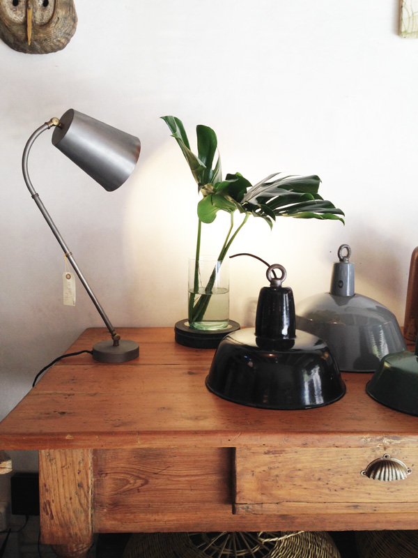
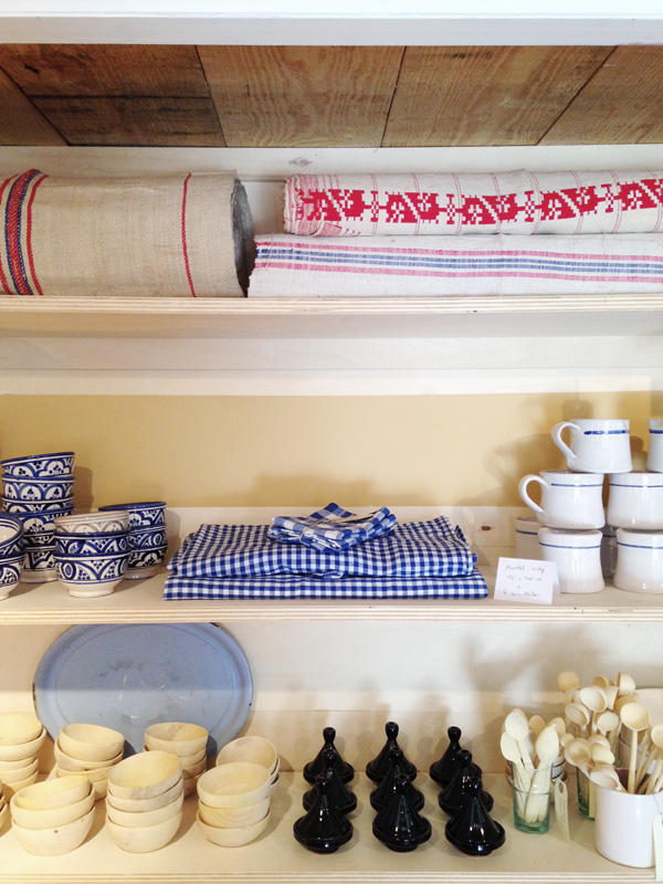
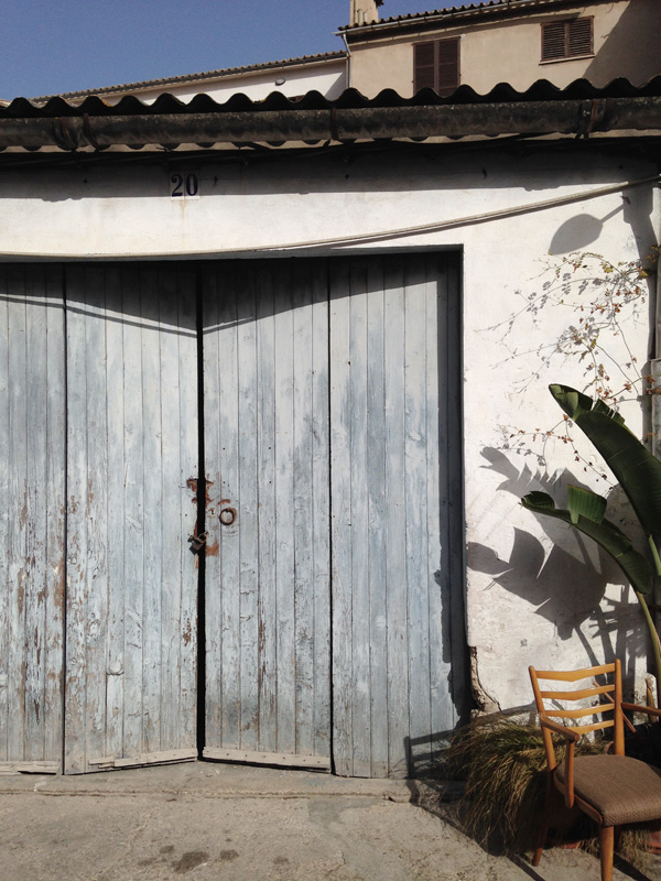
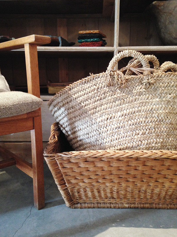
Mary runs her own online store Es Bolic and I figured out pretty quickly that we share a common aesthetic and love for everything interior related and artisan so she showed me one of her favourite haunts hidden away in the old town in a back yard of old garages that house a mix of small businesses from yoga studio, art gallery and bike repair shop to the enchanting ViVeCa with their selection of antiques and handcrafted textiles, ceramics and furniture.

It’s an amazing treasure trove of unique finds and carefully curated mostly Spanish goods run by sisters Camilla and Carla. But ViVeCa is much more than a shop it’s a concept that also offers location finding and restoration services as well as landscape design, be it in Palma’s city centre or in the country. Check out their Instagram account to see some of the gems they come across.

I loved their selection and whilst Mary and the girls had a chat in what sounded extra fast Spanish I couldn’t stop myself from snapping away.

If you’re ever in this wonderful city make sure you stop by.

 
Palma, palma de mallorca, hidden treasures, viveca, concept store, la molienda, coffee shop, plamas best coffee, aesthetic, interior, style, styling, trend, antiques, handcrafted, craftsmanship, artisan, location finding, restoration services, industrial lighting, stripped back interior, white washed, spanish

Palma, palma de mallorca, hidden treasures, viveca, concept store, la molienda, coffee shop, plamas best coffee, aesthetic, interior, style, styling, trend, antiques, handcrafted, craftsmanship, artisan, location finding, restoration services, industrial lighting, stripped back interior, white washed, spanish

Palma, palma de mallorca, hidden treasures, viveca, concept store, la molienda, coffee shop, plamas best coffee, aesthetic, interior, style, styling, trend, antiques, handcrafted, craftsmanship, artisan, location finding, restoration services, industrial lighting, stripped back interior, white washed, spanish

Palma, palma de mallorca, hidden treasures, viveca, concept store, la molienda, coffee shop, plamas best coffee, aesthetic, interior, style, styling, trend, antiques, handcrafted, craftsmanship, artisan, location finding, restoration services, industrial lighting, stripped back interior, white washed, spanish

Palma, palma de mallorca, hidden treasures, viveca, concept store, la molienda, coffee shop, plamas best coffee, aesthetic, interior, style, styling, trend, antiques, handcrafted, craftsmanship, artisan, location finding, restoration services, industrial lighting, stripped back interior, white washed, spanish

Palma, palma de mallorca, hidden treasures, viveca, concept store, la molienda, coffee shop, plamas best coffee, aesthetic, interior, style, styling, trend, antiques, handcrafted, craftsmanship, artisan, location finding, restoration services, industrial lighting, stripped back interior, white washed, spanish

Palma, palma de mallorca, hidden treasures, viveca, concept store, la molienda, coffee shop, plamas best coffee, aesthetic, interior, style, styling, trend, antiques, handcrafted, craftsmanship, artisan, location finding, restoration services, industrial lighting, stripped back interior, white washed, spanish

Palma, palma de mallorca, hidden treasures, viveca, concept store, la molienda, coffee shop, plamas best coffee, aesthetic, interior, style, styling, trend, antiques, handcrafted, craftsmanship, artisan, location finding, restoration services, industrial lighting, stripped back interior, white washed, spanish


MORE INFORMATION | La Molienda coffee shop, ViVeCa Palma concept store
PHOTOGRAPHY | Annie Kruse
 
Follow Stylejuicer with Bloglovin

STYLING TREND | BEIGE

1 April 2016

styling, trend, beige, josefin haag, residence, kristofer johnsson, photography, swedish design, craftsmanship, locally produced, style
 

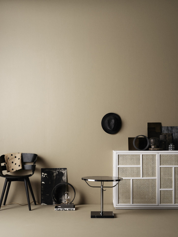
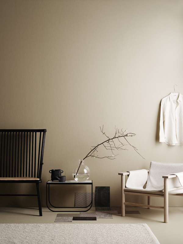
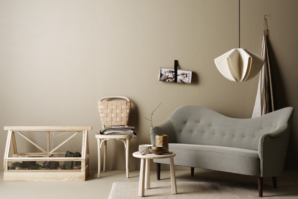
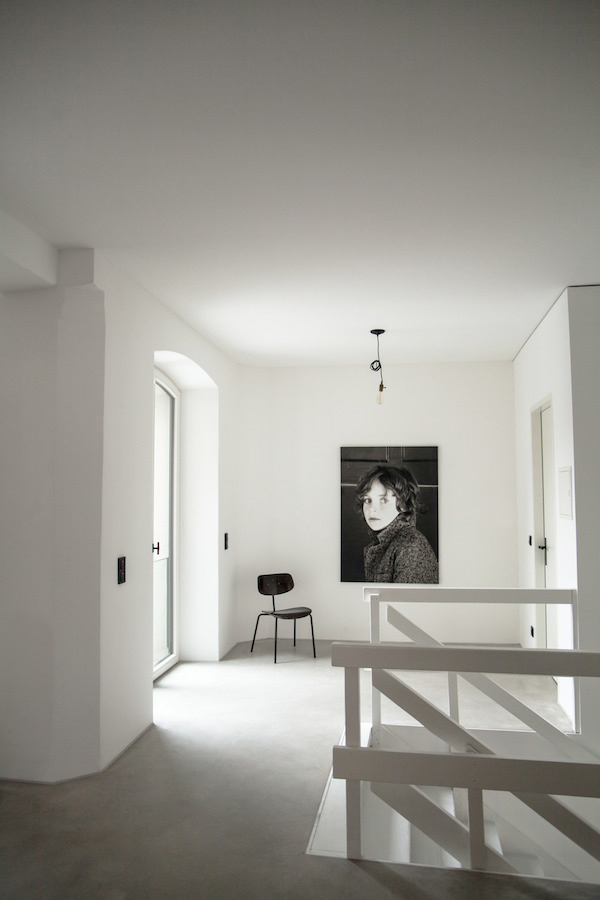
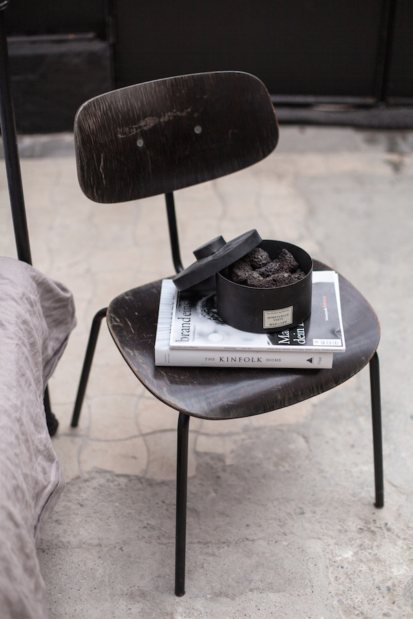
I’ve been seeing quite a bit of beige around lately which is not normally my favourite colour but I’m smitten with this styling by Josefin Haag for Residence.

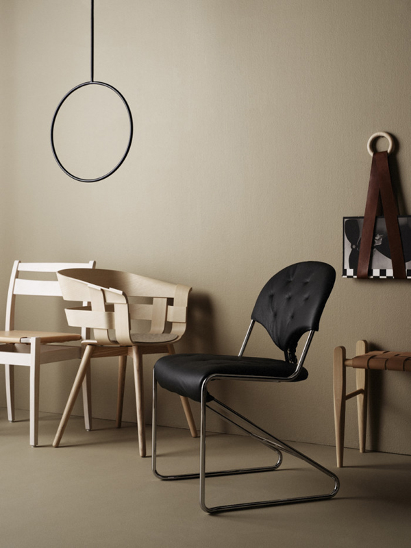
Beige has been updated and used in a new and fresh way by adding black contrasting pieces and also sleek minimal designs in natural materials like birch. It has a very sophisticated and affordable luxury vibe to it and I might have to rethink my prejudice against beige.

The story was shot by Kristofer Johnsson for the Residence Bookazine and is titled Made in Sweden with every piece of furniture shown made by Swedish designers and craftsmen, mostly locally produced.

I dunno – they just got it the Scandis.

 
styling, trend, beige, josefin haag, residence, kristofer johnsson, photography, swedish design, craftsmanship, locally produced, style

styling, trend, beige, josefin haag, residence, kristofer johnsson, photography, swedish design, craftsmanship, locally produced, style

styling, trend, beige, josefin haag, residence, kristofer johnsson, photography, swedish design, craftsmanship, locally produced, style

 
STYLING | Josefin Haag
PHOTOGRAPHY | Kristofer Johnsson
 
Follow Stylejuicer with Bloglovin
INTERIORS CRUSH | AT HOME IN A FACTORY

14 March 2016

interiors crush, renovated, refurbished, recycled, converted, old factory hall, germany, interior design, style, styling, live work space, monochrome, collectors items, flea market finds, vintage pieces, junk shops, decor, mixing old and new, architects, craftsmanship, metalsmith, wertvoll fotografie, petra reger
 

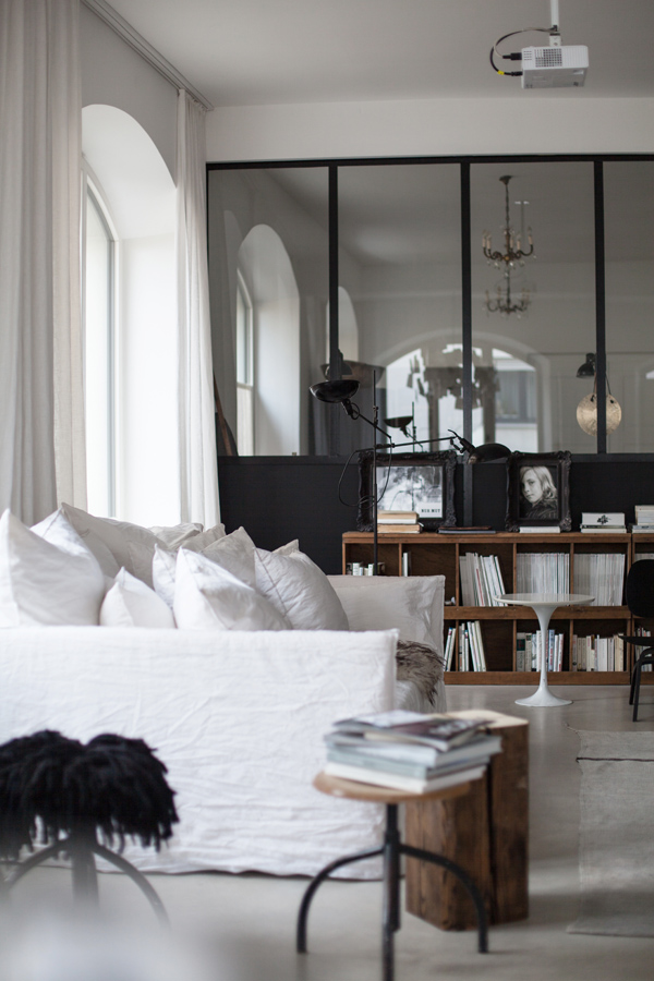
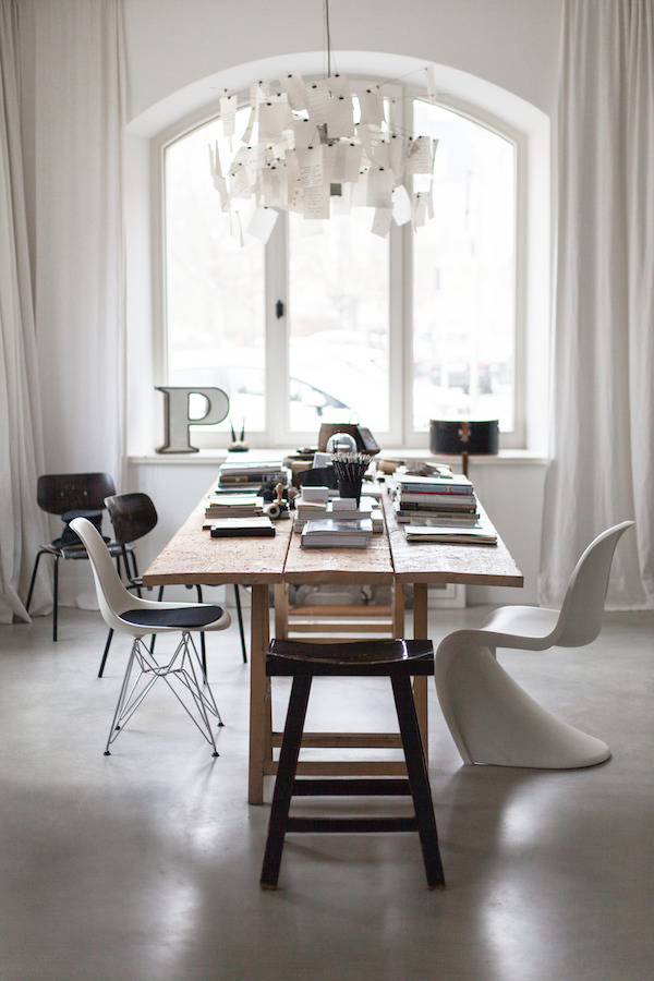
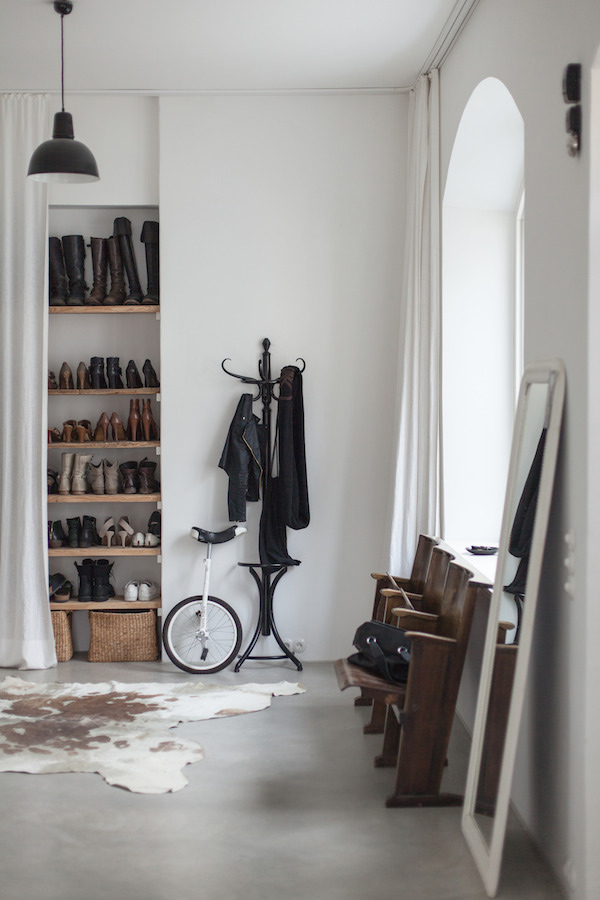
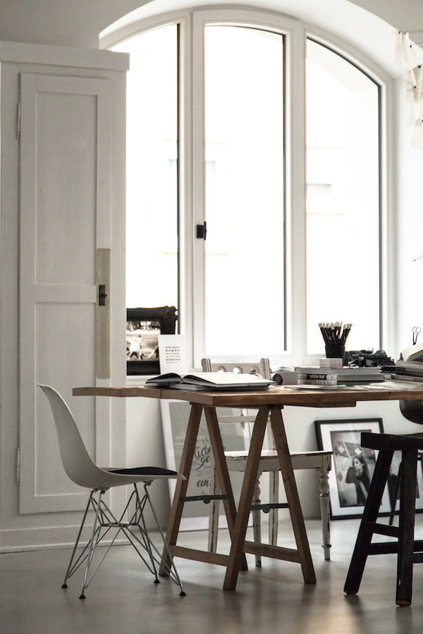
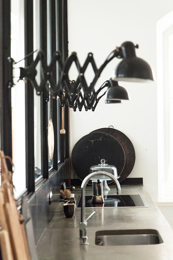
I haven’t featured an interiors crush for ages and today’s is even more special as it’s the home of one of my Wild Boys & Girls customers German photographer Petra Reger who runs her studio Wertvoll Fotografie from a converted factory in Southern Germany.

I’m proud to say she’s been a Stylejuicer reader for a while and I caught up with her to find out more about this amazing project.

First up, I’m dying to know how you managed to get hold of such a beautiful property. It looks like it was a huge project. What was the original condition like?

I first came across the factory hall 23 years ago when I moved into a flat opposite. Coincidentally my future husband Eddie also lived in a shared flat across the road and the factory hall has always been my dream home.

After our return from living abroad for many years we bought an old Art Nouveau apartment which we adored and moving just wasn’t on our radar. But when we saw that the hall was empty we immediately made enquires but sadly found out that it had already been sold. Months later we met an old friend who told us that it was him who had purchased the factory hall but he was only interested in one of the outbuildings and we were lucky enough to be able to purchase the hall from him.

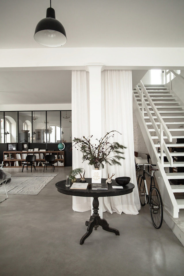
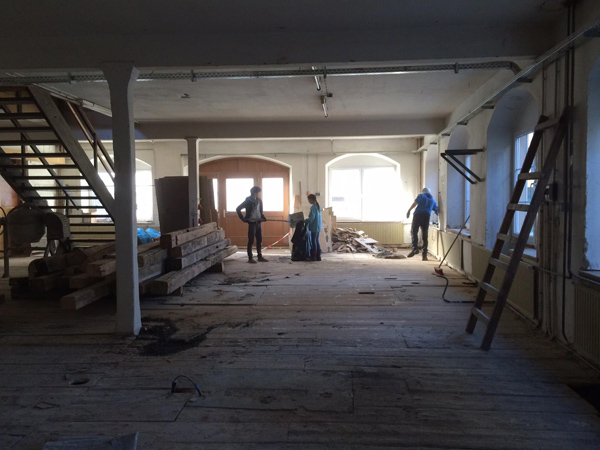
As for the original condition I enclose a photo to give you an idea (scroll to the bottom). We had to completely strip it down and start again, new floors, heating, electrics etc. The windows were very important to us and we made sure they were restored to it’s original condition including the arches which had been squared off over the years.

interiors crush, renovated, refurbished, recycled, converted, old factory hall, germany, interior design, style, styling, live work space, monochrome, collectors items, flea market finds, vintage pieces, junk shops, decor, mixing old and new, architects, craftsmanship, metalsmith, wertvoll fotografie, petra reger

 
How have you divided the space in terms of living and working?

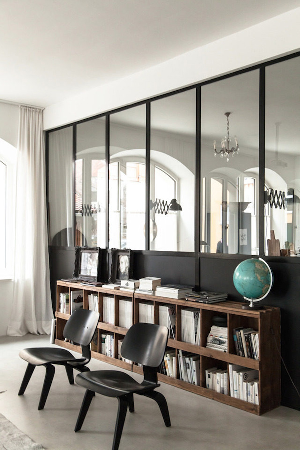
The dividing metal wall was designed by our architect and custom made by a local metalsmith. We love it as it defines the different zones in the large downstairs space between cooking / dining and living / working.

The factory is perfect for us as I can welcome clients discussing work in a warm environment that also represents my style and additionally can serve as a backdrop for photoshoots. It was also important to us to separate work and private life so upstairs you can find the bedrooms, bathroom, TV room and Eddie’s office.

How long did the renovation take and how involved were you in the physical restauration?

It took almost a year and we were only involved in the demolition part of it with great help from our kids and friends. The rest of the project was left to the architect and local craftsmen.

interiors crush, renovated, refurbished, recycled, converted, old factory hall, germany, interior design, style, styling, live work space, monochrome, collectors items, flea market finds, vintage pieces, junk shops, decor, mixing old and new, architects, craftsmanship, metalsmith, wertvoll fotografie, petra reger

 
How would you describe your interior style? Has it evolved over the years?

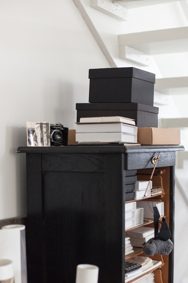
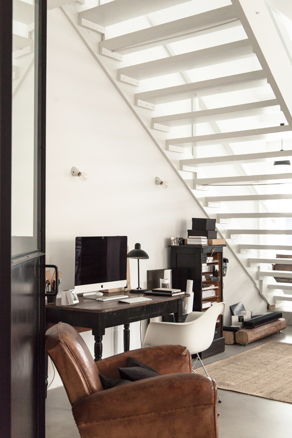
Oh, gosh this is hard… ‘collector’s items in a monochrome colour scheme’? Since Eddie and I got married quite young we’ve always had old furniture in our home. We loved scouring flea markets and junk shops for vintage pieces before we even heard of the term shabby chic. Many of our pieces have been reincarnated and painted several times over the years, eg the desk used to be a white kitchen table before being used as a green crafts table for the children and now it’s back in fashionable black as a desk.

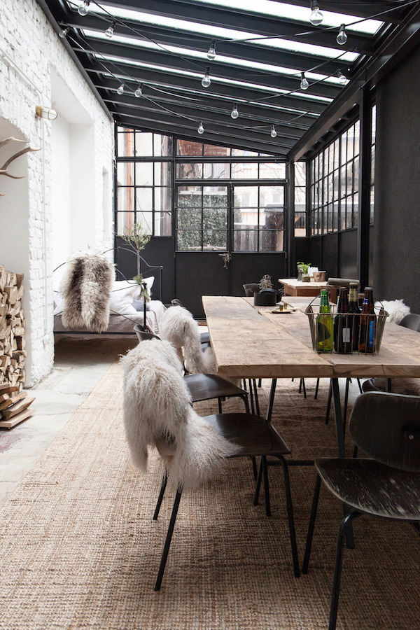
We also re-cycled the old floor boards to create the shelves, the table in the conservatory and the large work table near the entrance. In addition we have purchased some new furniture, mostly design classics as I feel as long as the colour is neutral it all fits together somehow. I’m keen to avoid trends and so pleased I didn’t buy the dyed oriental carpet which at the time I thought was achingly cool.

I’m particularly attracted to industrial furniture and lighting. Pieces that have marks and scratches, signs of having been lived in and with, eg the daybed in the conservatory was my 14 year old daughter’s cot bed and I hope she’ll put her children to bed in there some day.

My style has definitely developed over the years… at one point we used to have a red feature wall and bright colourful pieces of furniture dotted around. My inspiration mostly comes from books and magazines like Living Etc and Danish RUM, which I’ve been collecting for years. I’ve got to admit that I’ve only a recent discovered Pinterest.

interiors crush, renovated, refurbished, recycled, converted, old factory hall, germany, interior design, style, styling, live work space, monochrome, collectors items, flea market finds, vintage pieces, junk shops, decor, mixing old and new, architects, craftsmanship, metalsmith, wertvoll fotografie, petra reger
 
Thanks so so much for your time Petra and sharing your story. It’s fascinating to read how your project has come together. Finally, where is your favourite spot in the house?

It has to be my little office corner where I am in the thick of it. And in the summer I imagine it’ll probably be the daybed in the conservatory as the windows and doors open wide letting in the summer breeze and sunshine.

interiors crush, renovated, refurbished, recycled, converted, old factory hall, germany, interior design, style, styling, live work space, monochrome, collectors items, flea market finds, vintage pieces, junk shops, decor, mixing old and new, architects, craftsmanship, metalsmith, wertvoll fotografie, petra reger

interiors crush, renovated, refurbished, recycled, converted, old factory hall, germany, interior design, style, styling, live work space, monochrome, collectors items, flea market finds, vintage pieces, junk shops, decor, mixing old and new, architects, craftsmanship, metalsmith, wertvoll fotografie, petra reger

interiors crush, renovated, refurbished, recycled, converted, old factory hall, germany, interior design, style, styling, live work space, monochrome, collectors items, flea market finds, vintage pieces, junk shops, decor, mixing old and new, architects, craftsmanship, metalsmith, wertvoll fotografie, petra reger

interiors crush, renovated, refurbished, recycled, converted, old factory hall, germany, interior design, style, styling, live work space, monochrome, collectors items, flea market finds, vintage pieces, junk shops, decor, mixing old and new, architects, craftsmanship, metalsmith, wertvoll fotografie, petra reger

interiors crush, renovated, refurbished, recycled, converted, old factory hall, germany, interior design, style, styling, live work space, monochrome, collectors items, flea market finds, vintage pieces, junk shops, decor, mixing old and new, architects, craftsmanship, metalsmith, wertvoll fotografie, petra reger

interiors crush, renovated, refurbished, recycled, converted, old factory hall, germany, interior design, style, styling, live work space, monochrome, collectors items, flea market finds, vintage pieces, junk shops, decor, mixing old and new, architects, craftsmanship, metalsmith, wertvoll fotografie, petra reger

interiors crush, renovated, refurbished, recycled, converted, old factory hall, germany, interior design, style, styling, live work space, monochrome, collectors items, flea market finds, vintage pieces, junk shops, decor, mixing old and new, architects, craftsmanship, metalsmith, wertvoll fotografie, petra reger

interiors crush, renovated, refurbished, recycled, converted, old factory hall, germany, interior design, style, styling, live work space, monochrome, collectors items, flea market finds, vintage pieces, junk shops, decor, mixing old and new, architects, craftsmanship, metalsmith, wertvoll fotografie, petra reger

interiors crush, renovated, refurbished, recycled, converted, old factory hall, germany, interior design, style, styling, live work space, monochrome, collectors items, flea market finds, vintage pieces, junk shops, decor, mixing old and new, architects, craftsmanship, metalsmith, wertvoll fotografie, petra reger

interiors crush, renovated, refurbished, recycled, converted, old factory hall, germany, interior design, style, styling, live work space, monochrome, collectors items, flea market finds, vintage pieces, junk shops, decor, mixing old and new, architects, craftsmanship, metalsmith, wertvoll fotografie, petra reger

interiors crush, renovated, refurbished, recycled, converted, old factory hall, germany, interior design, style, styling, live work space, monochrome, collectors items, flea market finds, vintage pieces, junk shops, decor, mixing old and new, architects, craftsmanship, metalsmith, wertvoll fotografie, petra reger


INTERVIEW & PHOTOGRAPHY | Petra Reger, Wertvoll Fotografie with kind permission
 
Follow Stylejuicer with Bloglovin
GREEN OASIS IN COPENHAGEN

27 January 2016

ggreen oasis, tree, interior, design, interior style, styling, decor, wall art, gallery wall, ornamental plants, statement piece, quirky touch, striking, impact, cophenhagen, period building
 

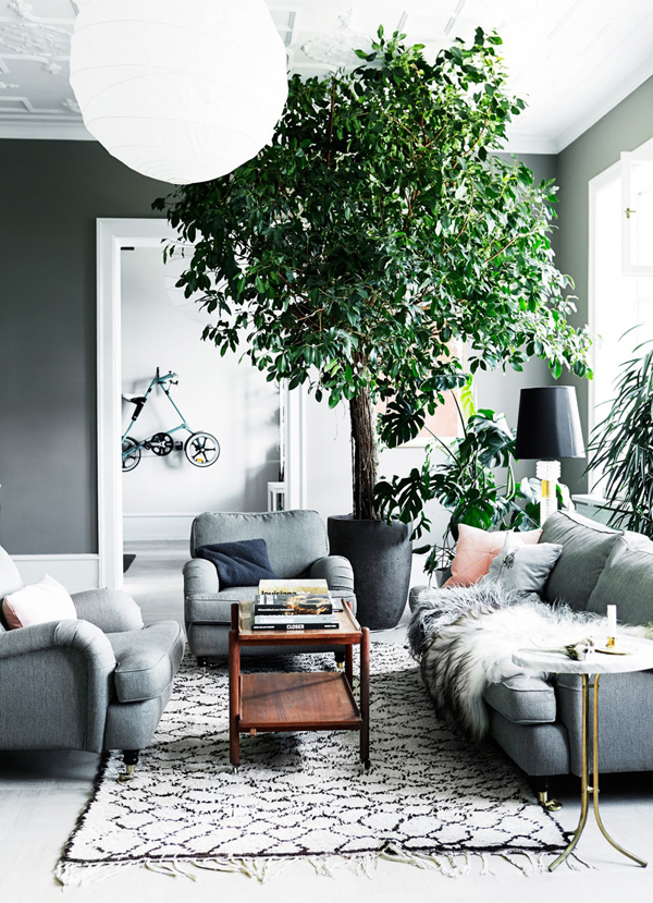
This Copenhagen home has got epic proportions and stunning dimensions but the real show stopper is the huge potted tree in the middle of the living room, a statement piece transforming the place into a green oasis.

A great choice for rooms with high ceilings and how wonderful to have that green in your home all year round. I’m toying with the idea of buying some big leafy ornamental plants this Spring for our own home though I can’t quite decide where to put them… or which ones to buy. Help!

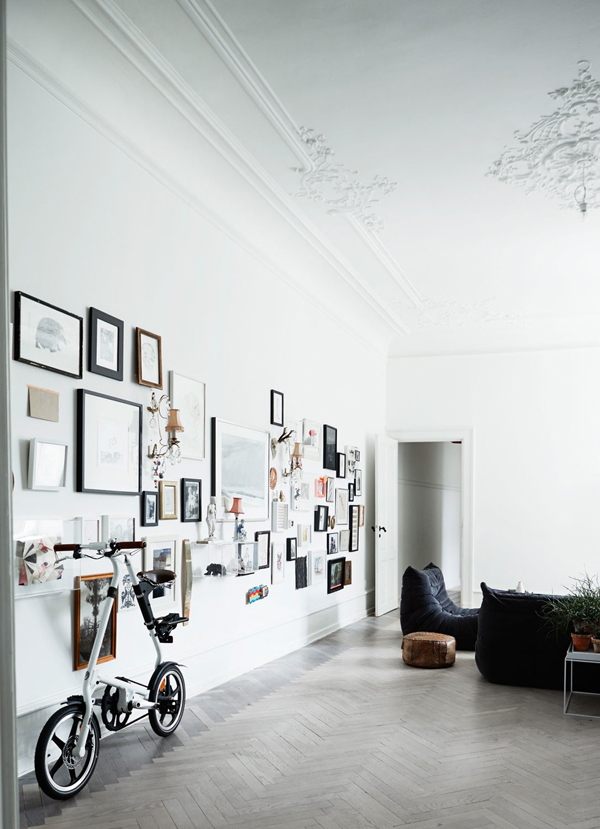
The other idea I spotted is the gallery wall – a collection of artworks, both home made and gifts – which has great impact when grouped and framed together.

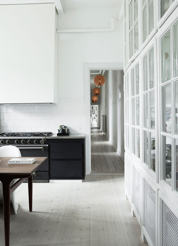
For me a period home like this has doesn’t need much in terms of styling as its generous proportions are striking enough though it’s little touches like the gallery wall and the 3m high tree that give it that extra quirky touch.
 
ggreen oasis, tree, interior, design, interior style, styling, decor, wall art, gallery wall, ornamental plants, statement piece, quirky touch, striking, impact, cophenhagen, period building

ggreen oasis, tree, interior, design, interior style, styling, decor, wall art, gallery wall, ornamental plants, statement piece, quirky touch, striking, impact, cophenhagen, period building

ggreen oasis, tree, interior, design, interior style, styling, decor, wall art, gallery wall, ornamental plants, statement piece, quirky touch, striking, impact, cophenhagen, period building

ggreen oasis, tree, interior, design, interior style, styling, decor, wall art, gallery wall, ornamental plants, statement piece, quirky touch, striking, impact, cophenhagen, period building

ggreen oasis, tree, interior, design, interior style, styling, decor, wall art, gallery wall, ornamental plants, statement piece, quirky touch, striking, impact, cophenhagen, period building

 
MORE INFORMATION | Bo Bedre
PHOTOGRAPHY | Mikkel Adsbol / House of Pictures with thanks
 
Follow Stylejuicer with Bloglovin
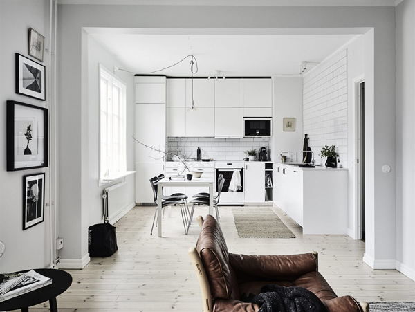
MONOCHROME STOCKHOLM APARTMENT

11 January 2016

interior, interiors, style, styling, trend, monochrome, brown, natural materials, textures, stockholm apartment, wood burner, inspo, inspiration, instagram, haussmith, Chloé Crane-Leroux, photography


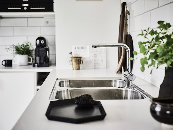
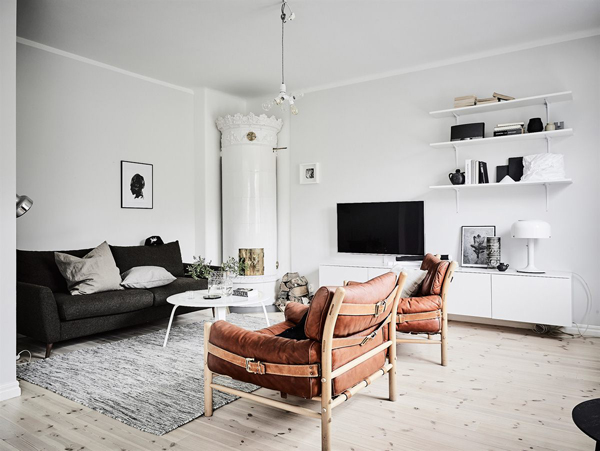
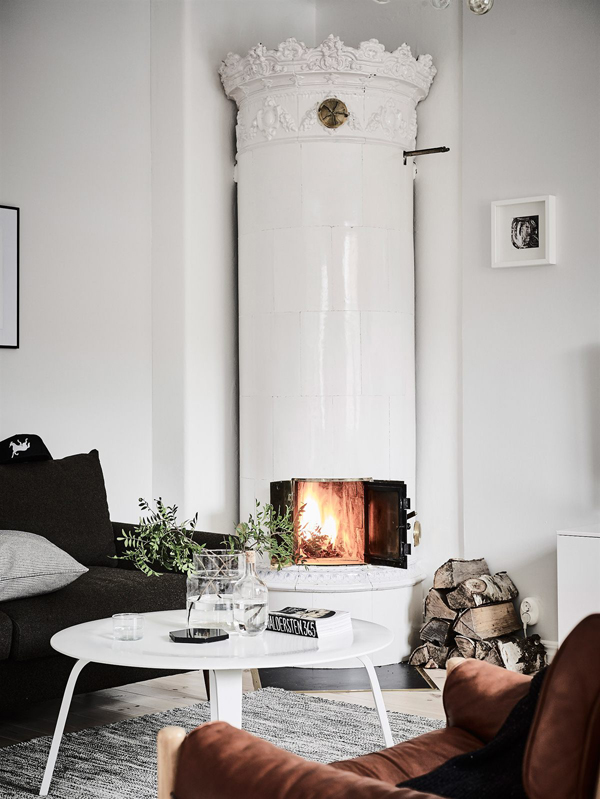
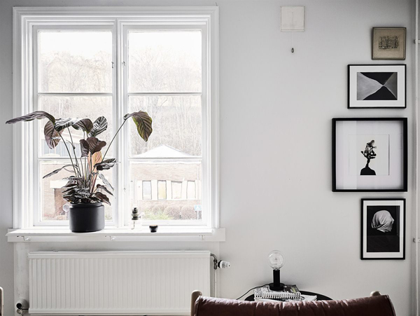
I don’t know what it is with me at the moment but I just can’t get enough of the monochrome / browns / natural materials combo. This Stockholm apartment is another great example of how a little texture goes a long way with those beautiful leather armchairs in a black and white interior.
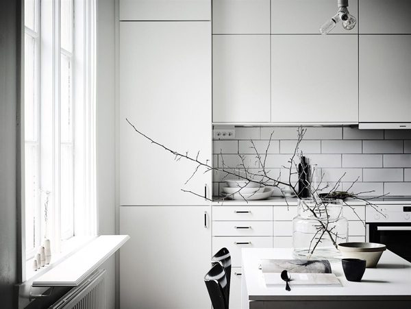
And that cylindrical wood burner in the corner… *swoon*. A perfect pied-a-terre apartment for that luscious relaxing self-indulgent time before you have kids. No, I’m not bitter – just nostalgic.
For more inspo along this gorgeous colour and texture palette check out two of my favourite Instagram accounts: Rachel from Haussmith and Montreal based Chloé Crane-Leroux. Pure eye candy!


interior, interiors, style, styling, trend, monochrome, brown, natural materials, textures, stockholm apartment, wood burner, inspo, inspiration, instagram, haussmith, Chloé Crane-Leroux, photography

interior, interiors, style, styling, trend, monochrome, brown, natural materials, textures, stockholm apartment, wood burner, inspo, inspiration, instagram, haussmith, Chloé Crane-Leroux, photography

interior, interiors, style, styling, trend, monochrome, brown, natural materials, textures, stockholm apartment, wood burner, inspo, inspiration, instagram, haussmith, Chloé Crane-Leroux, photography

interior, interiors, style, styling, trend, monochrome, brown, natural materials, textures, stockholm apartment, wood burner, inspo, inspiration, instagram, haussmith, Chloé Crane-Leroux, photography

interior, interiors, style, styling, trend, monochrome, brown, natural materials, textures, stockholm apartment, wood burner, inspo, inspiration, instagram, haussmith, Chloé Crane-Leroux, photography

interior, interiors, style, styling, trend, monochrome, brown, natural materials, textures, stockholm apartment, wood burner, inspo, inspiration, instagram, haussmith, Chloé Crane-Leroux, photography

interior, interiors, style, styling, trend, monochrome, brown, natural materials, textures, stockholm apartment, wood burner, inspo, inspiration, instagram, haussmith, Chloé Crane-Leroux, photography

interior, interiors, style, styling, trend, monochrome, brown, natural materials, textures, stockholm apartment, wood burner, inspo, inspiration, instagram, haussmith, Chloé Crane-Leroux, photography

interior, interiors, style, styling, trend, monochrome, brown, natural materials, textures, stockholm apartment, wood burner, inspo, inspiration, instagram, haussmith, Chloé Crane-Leroux, photography

 
MORE INFORMATION | 55 Kvadrat
STYLING | Sarah Widman and Elin Kicken
PHOTOGRAPHY | Anders Bergstedt
 
Follow Stylejuicer with Bloglovin