Category Archives: Home & Interior

SEMI-CIRCULAR SWEDISH SUMMERHOUSE

4 June 2016

sweden, swedish summerhouse, weekend get-away, lake, polished concrete, chimney, industrial texture, neutral interior, designer furniture, photography, kristofer johnsson, styling, alexandra ogonowski, residence magazine, interior design, trend, style, minimal
 

I’ve been enviably following the weather app on my iphone this week. It seems that summer has arrived in Northern Europe with temperatures in the mid twenties whilst we’re still in our winter coats dodging the showers in London. #notfair

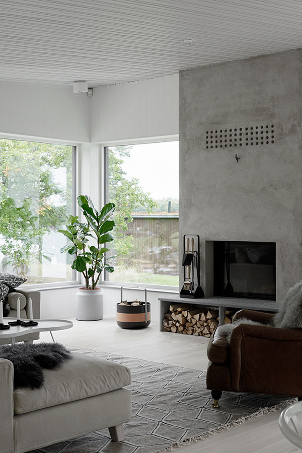
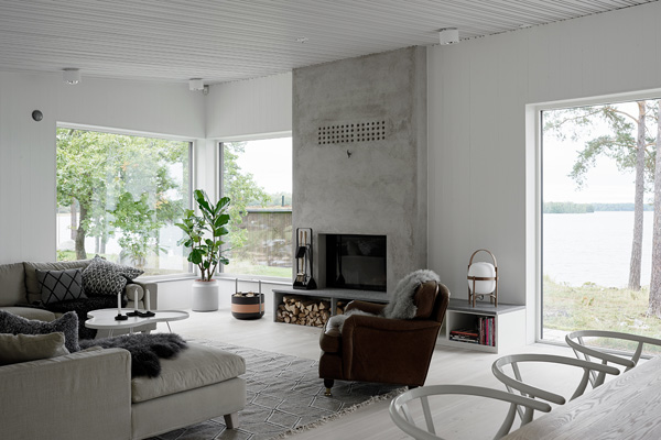
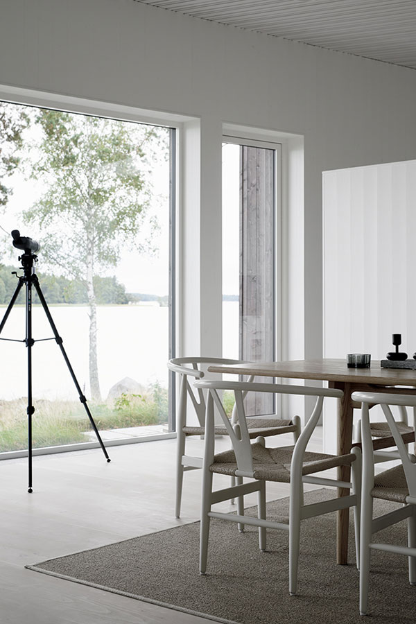
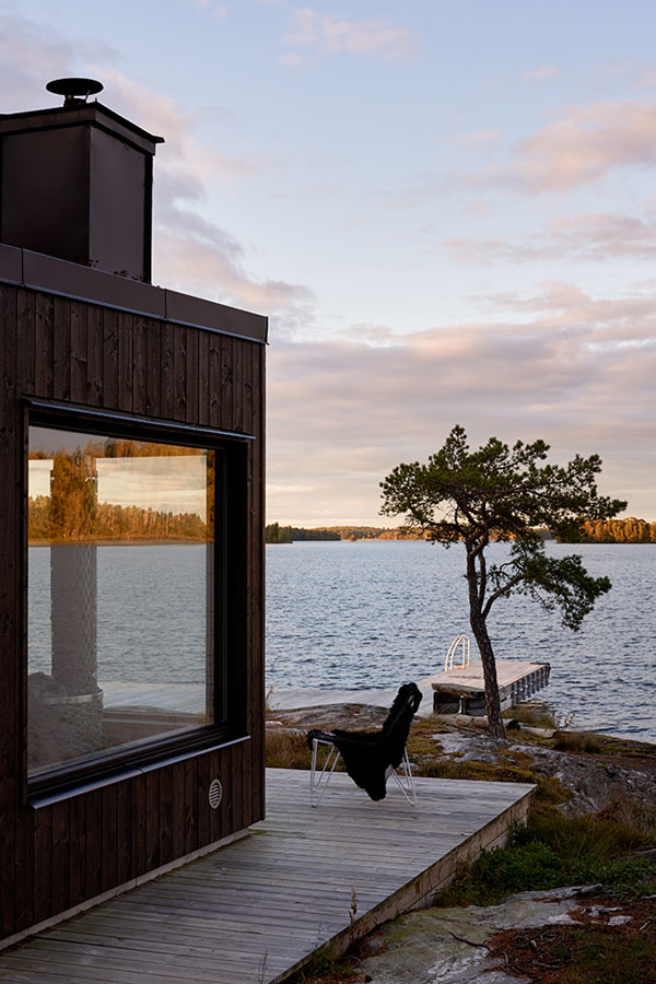
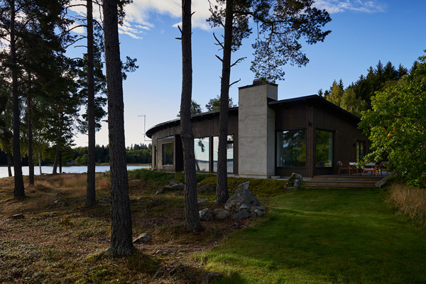
So it’s no surprise that I was drawn to this semi-circular Swedish summerhouse. Nestled between the pine trees on the shores of a lake this is my idea of a peaceful weekend get-away and I’m sure the owners enjoyed some balmy evenings and summer BBQs this week, maybe even a dip in the lake!

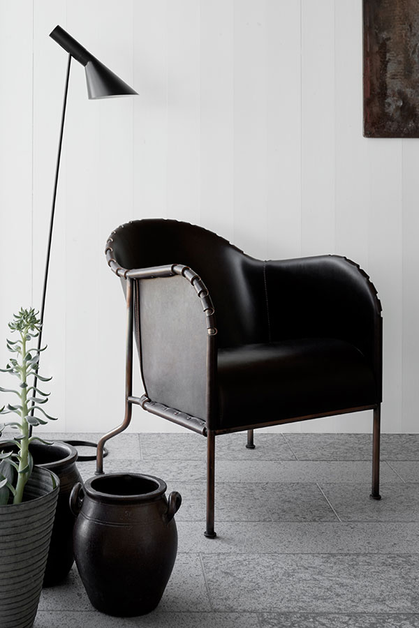
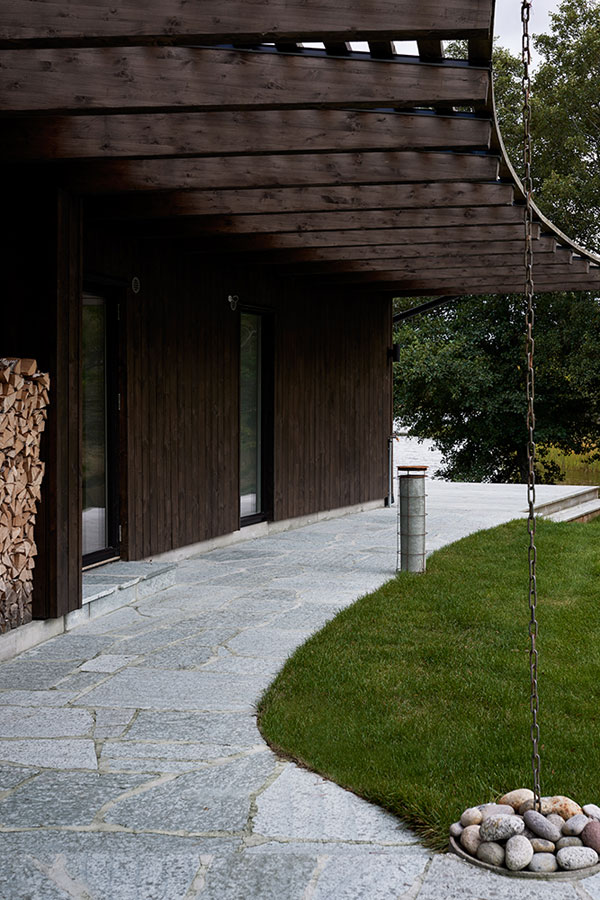
The semi-circular house is clad in dark wood with large windows around the outside giving views of the stunning scenery and the lake. I like how the chimney stands out in polished concrete providing a focal point in the living area and adding a bit of industrial texture amongst the crisp white walls and ceilings and neutral-coloured furniture.

Enjoy the eye candy shot by Kristofer Johnsson and styled by Alexandra Ogonowski.

 
sweden, summerhouse, weekend get-away, lake, polished concrete, chimney, industrial texture, neutral interior, designer furniture, photography, kristofer johnsson, styling, alexandra ogonowski, residence magazine, interior design, trend, style, minimal

sweden, summerhouse, weekend get-away, lake, polished concrete, chimney, industrial texture, neutral interior, designer furniture, photography, kristofer johnsson, styling, alexandra ogonowski, residence magazine, interior design, trend, style, minimal

sweden, swedish summerhouse, weekend get-away, lake, polished concrete, chimney, industrial texture, neutral interior, designer furniture, photography, kristofer johnsson, styling, alexandra ogonowski, residence magazine, interior design, trend, style, minimal

sweden, swedish summerhouse, weekend get-away, lake, polished concrete, chimney, industrial texture, neutral interior, designer furniture, photography, kristofer johnsson, styling, alexandra ogonowski, residence magazine, interior design, trend, style, minimal

sweden, swedish summerhouse, weekend get-away, lake, polished concrete, chimney, industrial texture, neutral interior, designer furniture, photography, kristofer johnsson, styling, alexandra ogonowski, residence magazine, interior design, trend, style, minimal

sweden, swedish summerhouse, weekend get-away, lake, polished concrete, chimney, industrial texture, neutral interior, designer furniture, photography, kristofer johnsson, styling, alexandra ogonowski, residence magazine, interior design, trend, style, minimal


PHOTOGRAPHY | Kristofer Johnsson
STYLING | Alexandra Ogonowski
VIA | Residence Magazine
 
Follow Stylejuicer with Bloglovin

INTERIOR DESIGN | FAURSKOV GYMNASIUM BY SOFIE LADEFOGED

23 May 2016

danish, grammar, school, gymnasium, faurskov, interior design, sofie ladefoged, contemporary, form follows function, modernist, polished concrete flooring, stackable chairs, birch wood, adolescents, teach, respect
 

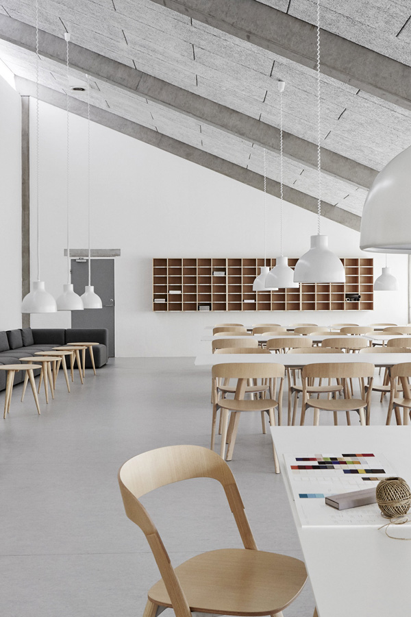
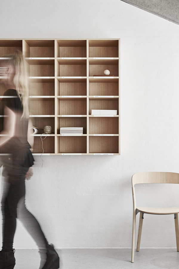
I came across these shots of a Danish grammar school on one of my late night Pinterest trawling sessions. The interior has been designed by Sofie Ladefoged and combines beautifully simple Danish (?) furniture in a contemporary environment true to the modernist design principle of form follows function.

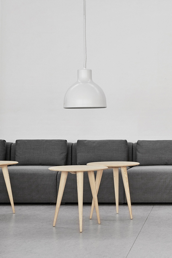
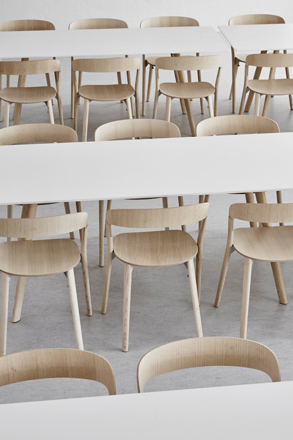
The space is almost industrial with polished concrete flooring and white walls and has been carefully zoned with long white tables and stackable birch wood chairs for eating / working and a more relaxing dark grey sofa along one wall with small circular coffee tables that can easily be rearranged and grouped.

I’m a big believer that smart, arguably grown-up environments make adolescents behave better and teach them to treat their environment with respect. It would be interesting to see the space now and find out if my theory holds up. I’ve got a sneaky suspicion it might.


danish, grammar, school, gymnasium, faurskov, interior design, sofie ladefoged, contemporary, form follows function, modernist, polished concrete flooring, stackable chairs, birch wood, adolescents, teach, respect

danish, grammar, school, gymnasium, faurskov, interior design, sofie ladefoged, contemporary, form follows function, modernist, polished concrete flooring, stackable chairs, birch wood, adolescents, teach, respect

danish, grammar, school, gymnasium, faurskov, interior design, sofie ladefoged, contemporary, form follows function, modernist, polished concrete flooring, stackable chairs, birch wood, adolescents, teach, respect

danish, grammar, school, gymnasium, faurskov, interior design, sofie ladefoged, contemporary, form follows function, modernist, polished concrete flooring, stackable chairs, birch wood, adolescents, teach, respect

danish, grammar, school, gymnasium, faurskov, interior design, sofie ladefoged, contemporary, form follows function, modernist, polished concrete flooring, stackable chairs, birch wood, adolescents, teach, respect


INTERIOR DESIGN & STYLING | Sofie Ladefoged
PHOTOGRAPHY | Christian B
 
Follow Stylejuicer with Bloglovin
INTERIOR DESIGNER HANNA WESSMAN AT HOME

17 May 2016

hanna wessman, interior designer, home, decor, artwork, sophisticated, interior design, style, styling, trend, design objects, designer furniture, circular mirror, ilse crawford, cork bench, ikea, mix and match, residence magazine
 

The home of Hanna Wessman oozes quality, luxury and sophistication. The Swedish interior designer is a self-taught multi talent and incredibly hard working despite or maybe because of her lack of academic qualifications.

It’s hard to believe that this is not a show home but she actually lives here with her husband and two small children (5 and 7). I wonder how does she manages to keep sticky little fingers from touching the artwork, design objects and furniture dotted around. I suspect this is the work of a good stylist to make people forget that there’s a ‘behind the scenes’ shot we will never see. 😉

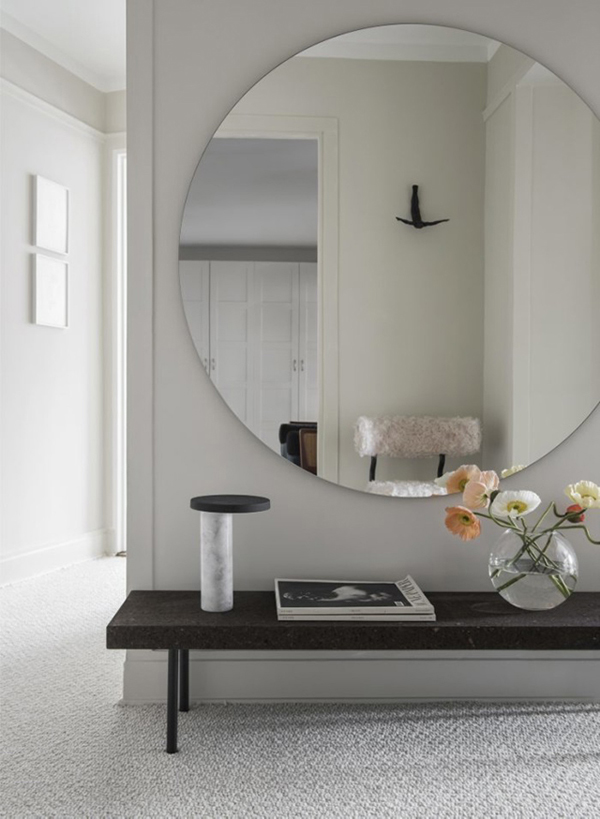
What really caught my eye was the striking circular mirror in the hallway. Pure elegance and so well matched with Ilse Crawford’s cork bench from Ikea. Now that’s what I call mix and match.

See more pictures of her posing like a pro in her home on Residence here.

 
hanna wessman, interior designer, home, decor, artwork, sophisticated, interior design, style, styling, trend, design objects, designer furniture, circular mirror, ilse crawford, cork bench, ikea, mix and match, residence magazine

hanna wessman, interior designer, home, decor, artwork, sophisticated, interior design, style, styling, trend, design objects, designer furniture, circular mirror, ilse crawford, cork bench, ikea, mix and match, residence magazine

hanna wessman, interior designer, home, decor, artwork, sophisticated, interior design, style, styling, trend, design objects, designer furniture, circular mirror, ilse crawford, cork bench, ikea, mix and match, residence magazine

hanna wessman, interior designer, home, decor, artwork, sophisticated, interior design, style, styling, trend, design objects, designer furniture, circular mirror, ilse crawford, cork bench, ikea, mix and match, residence magazine

hanna wessman, interior designer, home, decor, artwork, sophisticated, interior design, style, styling, trend, design objects, designer furniture, circular mirror, ilse crawford, cork bench, ikea, mix and match, residence magazine

hanna wessman, interior designer, home, decor, artwork, sophisticated, interior design, style, styling, trend, design objects, designer furniture, circular mirror, ilse crawford, cork bench, ikea, mix and match, residence magazine

hanna wessman, interior designer, home, decor, artwork, sophisticated, interior design, style, styling, trend, design objects, designer furniture, circular mirror, ilse crawford, cork bench, ikea, mix and match, residence magazine

 
MORE INFORMATION | Residence Magazine
PHOTOGRAPHY | Erik Lefvander
STYLING | Hanna Wessman
 
Follow Stylejuicer with Bloglovin
INTERIORS CRUSH | WHITE HOME IN MILAN

13 May 2016

interiors crush, style, trend, styling, interior design, shabby chic, all white, vintage finds, relaxing feel, unpretentious, plants, urban jungle, cacti, riad food garden, Mediterranean cuisine, northern europe, morocco, milan, hand crafted items, concept store

 
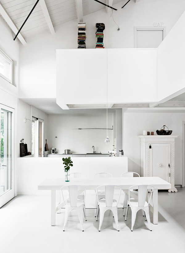
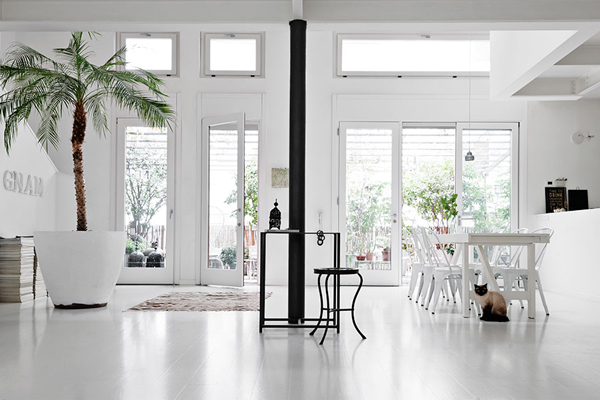
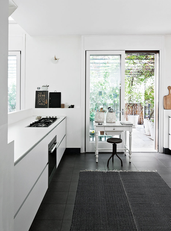
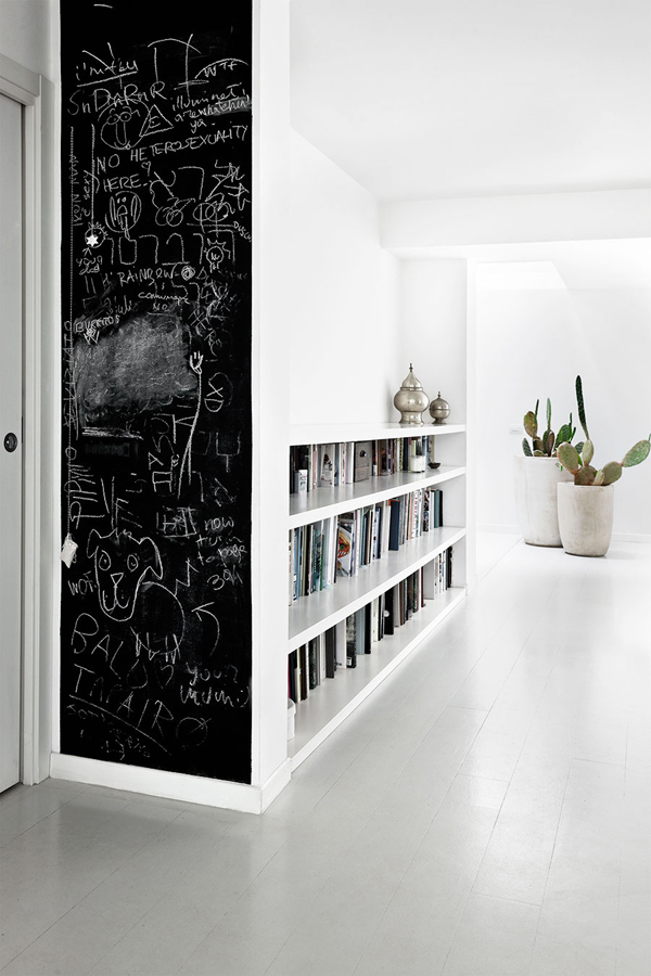
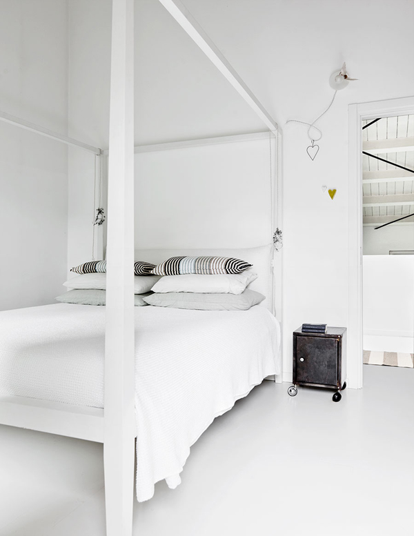
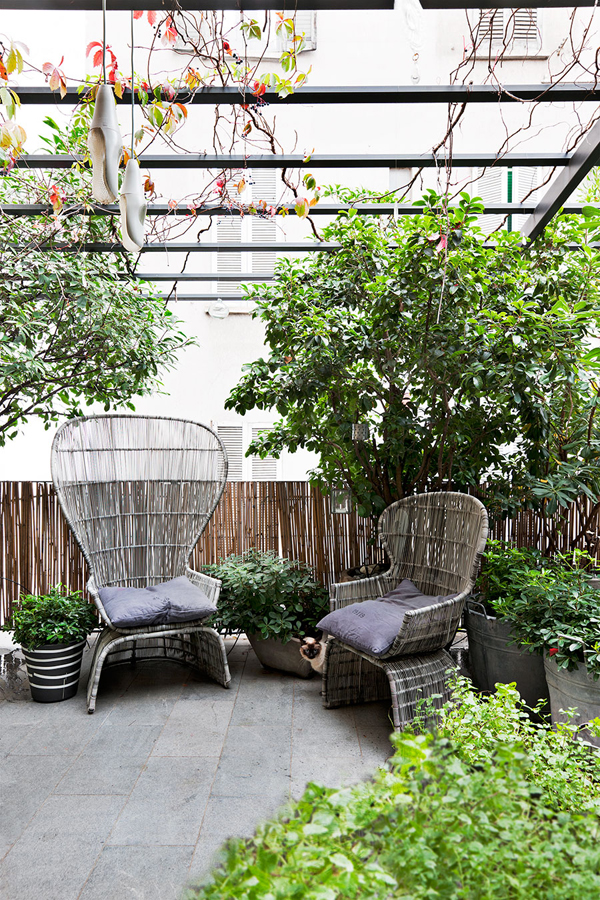
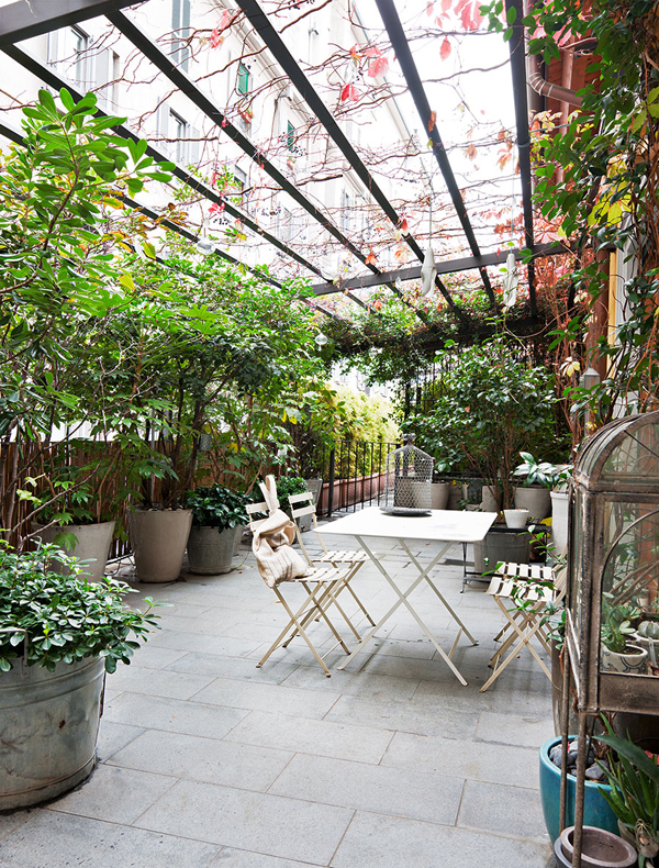
I’ve got a massive interiors crush on this white home in Milan. Yes, I know the all white theme has been around for a while but it’s the way owner Laura has mixed lots of plants, cacti and some vintage finds that makes the place feel unpretentious and relaxing.

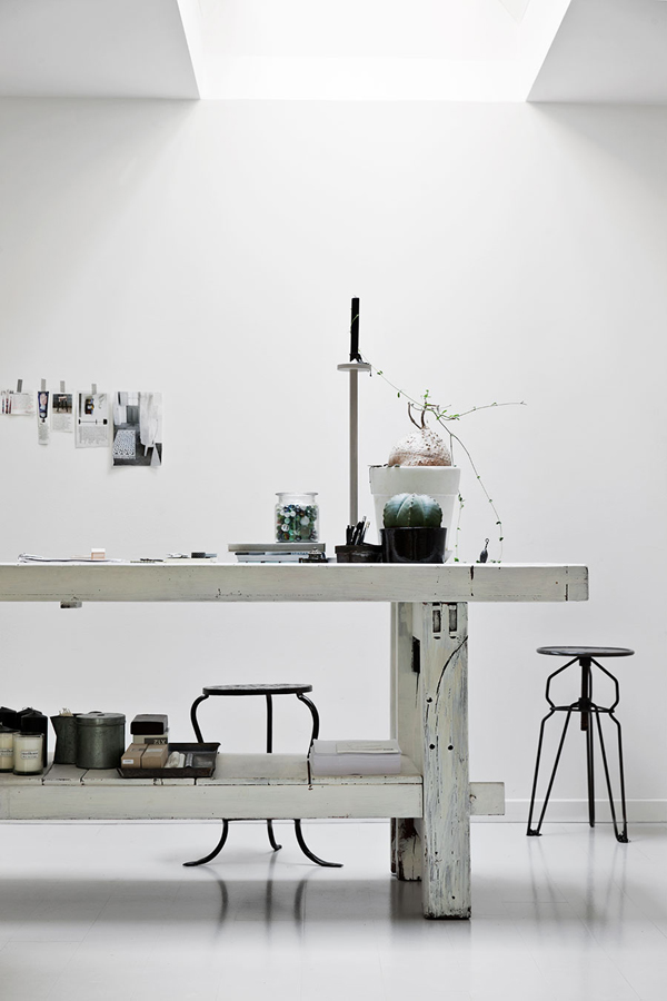
Laura says the interior courtyard was one of the main selling points for her and she has managed to create a wonderful urban jungle which can be admired from the main living / dining / kitchen area when not immersed in it. I’m also totally in love with the old workbench which she has shabby chic repainted and now serves to display some treasured items.

It’s no surprise to find that she has recently opened Riad Food Garden – a concept store serving Mediterranean cuisine as well as a careful selection of hand crafted items such as vases, jugs, lanterns, oil cruets, dishes and cutlery from northern Europe to Morocco.

If you happen to head to Milan make sure you stop by this magical sounding place who “welcomes those who want to play a game of cards, draw, write, read newspapers and books”. They’re even happy for you to recharge your phone and tablet and offer free wifi. What’s not to like!?
 

interiors crush, style, trend, styling, interior design, shabby chic, all white, vintage finds, relaxing feel, unpretentious, plants, urban jungle, cacti, riad food garden, Mediterranean cuisine, northern europe, morocco, milan, hand crafted items, concept store

interiors crush, style, trend, styling, interior design, shabby chic, all white, vintage finds, relaxing feel, unpretentious, plants, urban jungle, cacti, riad food garden, Mediterranean cuisine, northern europe, morocco, milan, hand crafted items, concept store

interiors crush, style, trend, styling, interior design, shabby chic, all white, vintage finds, relaxing feel, unpretentious, plants, urban jungle, cacti, riad food garden, Mediterranean cuisine, northern europe, morocco, milan, hand crafted items, concept store

interiors crush, style, trend, styling, interior design, shabby chic, all white, vintage finds, relaxing feel, unpretentious, plants, urban jungle, cacti, riad food garden, Mediterranean cuisine, northern europe, morocco, milan, hand crafted items, concept store

interiors crush, style, trend, styling, interior design, shabby chic, all white, vintage finds, relaxing feel, unpretentious, plants, urban jungle, cacti, riad food garden, Mediterranean cuisine, northern europe, morocco, milan, hand crafted items, concept store

interiors crush, style, trend, styling, interior design, shabby chic, all white, vintage finds, relaxing feel, unpretentious, plants, urban jungle, cacti, riad food garden, Mediterranean cuisine, northern europe, morocco, milan, hand crafted items, concept store

interiors crush, style, trend, styling, interior design, shabby chic, all white, vintage finds, relaxing feel, unpretentious, plants, urban jungle, cacti, riad food garden, Mediterranean cuisine, northern europe, morocco, milan, hand crafted items, concept store

interiors crush, style, trend, styling, interior design, shabby chic, all white, vintage finds, relaxing feel, unpretentious, plants, urban jungle, cacti, riad food garden, Mediterranean cuisine, northern europe, morocco, milan, hand crafted items, concept store

interiors crush, style, trend, styling, interior design, shabby chic, all white, vintage finds, relaxing feel, unpretentious, plants, urban jungle, cacti, riad food garden, Mediterranean cuisine, northern europe, morocco, milan, hand crafted items, concept store

interiors crush, style, trend, styling, interior design, shabby chic, all white, vintage finds, relaxing feel, unpretentious, plants, urban jungle, cacti, riad food garden, Mediterranean cuisine, northern europe, morocco, milan, hand crafted items, concept store

interiors crush, style, trend, styling, interior design, shabby chic, all white, vintage finds, relaxing feel, unpretentious, plants, urban jungle, cacti, riad food garden, Mediterranean cuisine, northern europe, morocco, milan, hand crafted items, concept store


VIA | Elle Decoration
PHOTOGRAPHY | Morten Holtum
 
Follow Stylejuicer with Bloglovin
STYLING | A LITTLE COLOUR

11 May 2016

a little colour, fantastic frank, estate agents, apartment, apricot, nude trend, white washed, ikea, sinnerlig, ilse crawford, mood board, styling, style, trend, interior design, decor, interior style
 

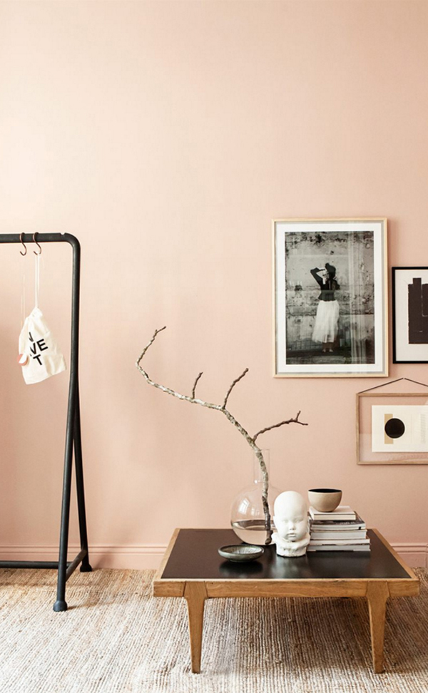
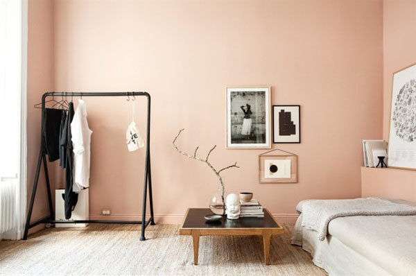
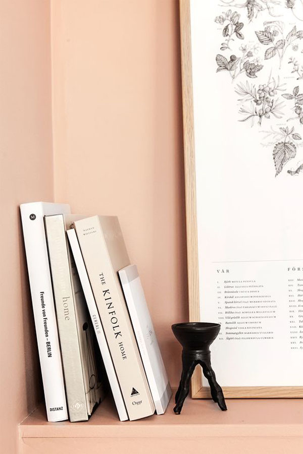
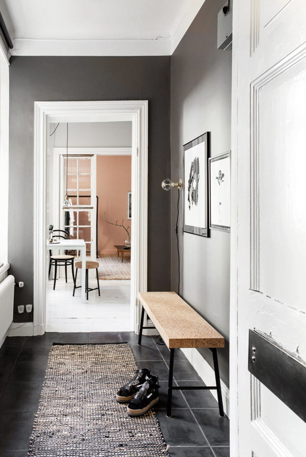
This apartment is only 23 sq meters and I’m so pleased to see that the owner was brave clever enough to add a little colour to it.

In the last shot you can see how each ‘room’ is painted in a different colour, starting with the hall in dark grey, leading into the kitchen in light grey before drawing the eye into the main bed / living room painted in a wonderfully indescribable shade of apricot / nude / pink. A clever trick to draw you into the apartment making it feel a lot bigger than it seems on paper and making it stand out from the rest of the white washed apartments in the listings at Swedish estate agents Fantastic Frank.
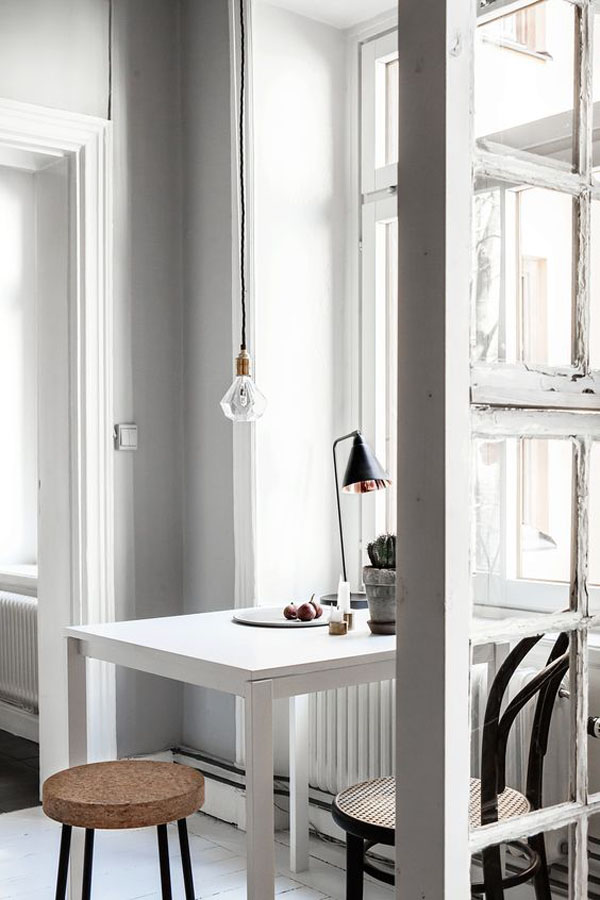
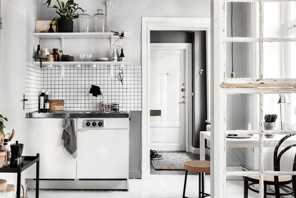
The cork stools and benches from Ikea’s Sinnerlig collection designed by Ilse Crawford seem to be made for this space and I love the old glass door divider between the kitchen and the main room which contrasts so nicely with the sleek lamps and furniture dotted around.

More of the nude trend on my last mood board here.

 
a little colour, fantastic frank, estate agents, apartment, apricot, nude trend, white washed, ikea, sinnerlig, ilse crawford, mood board, styling, style, trend, interior design, decor, interior style

a little colour, fantastic frank, estate agents, apartment, apricot, nude trend, white washed, ikea, sinnerlig, ilse crawford, mood board, styling, style, trend, interior design, decor, interior style

a little colour, fantastic frank, estate agents, apartment, apricot, nude trend, white washed, ikea, sinnerlig, ilse crawford, mood board, styling, style, trend, interior design, decor, interior style

a little colour, fantastic frank, estate agents, apartment, apricot, nude trend, white washed, ikea, sinnerlig, ilse crawford, mood board, styling, style, trend, interior design, decor, interior style

a little colour, fantastic frank, estate agents, apartment, apricot, nude trend, white washed, ikea, sinnerlig, ilse crawford, mood board, styling, style, trend, interior design, decor, interior style

a little colour, fantastic frank, estate agents, apartment, apricot, nude trend, white washed, ikea, sinnerlig, ilse crawford, mood board, styling, style, trend, interior design, decor, interior style

 
MORE INFORMATION & PHOTOGRAPHY | Fantastic Frank

 
Follow Stylejuicer with Bloglovin