Category Archives: Architecture

Mexico | Monolithic apartment by PPAA architects

27 July 2020

This monolithic apartment designed by PPAA architects just north of Mexico City is a celebration of proportion, minimalism and restraint.

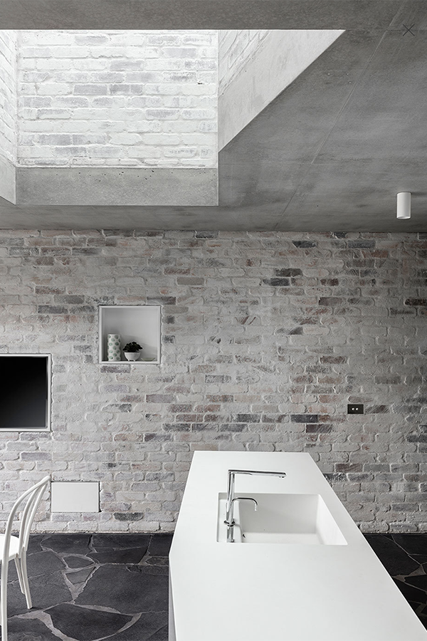
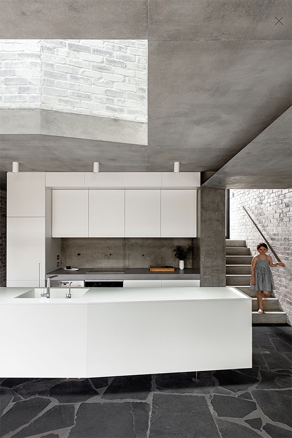
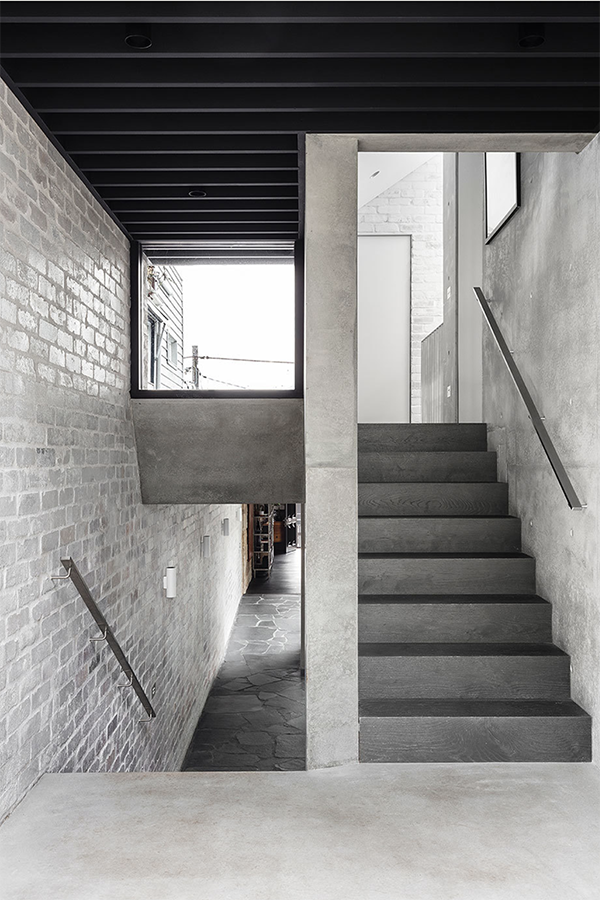
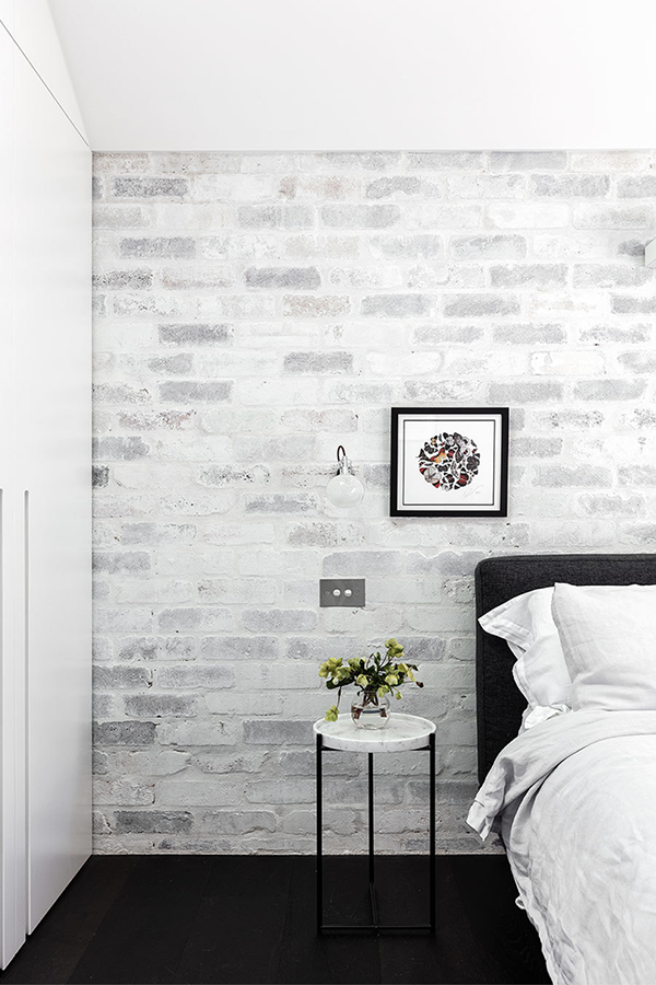
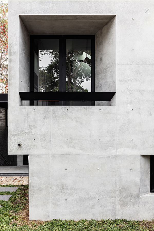
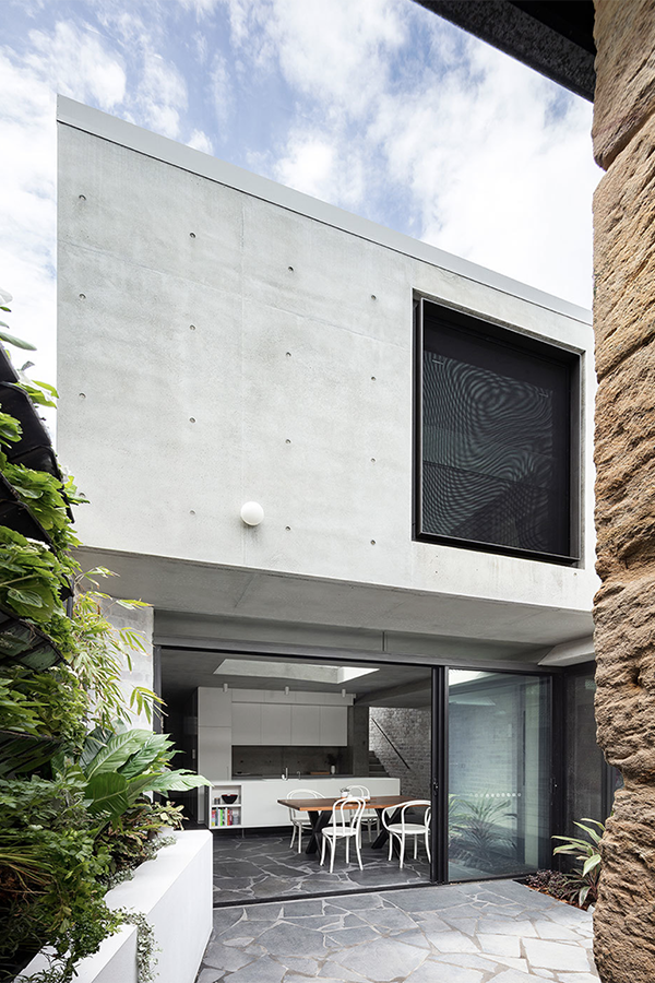
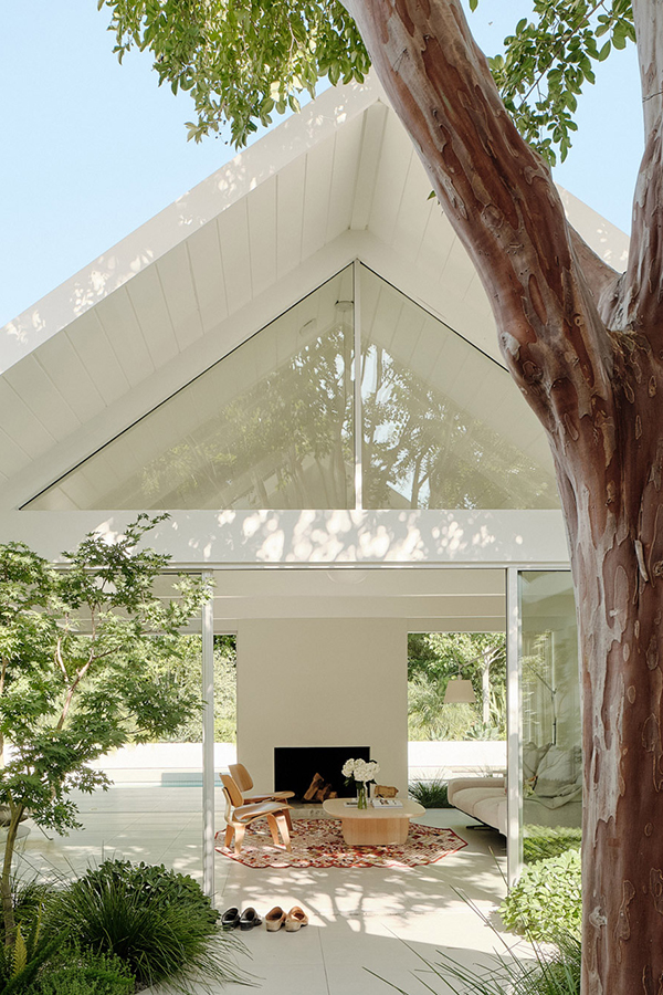
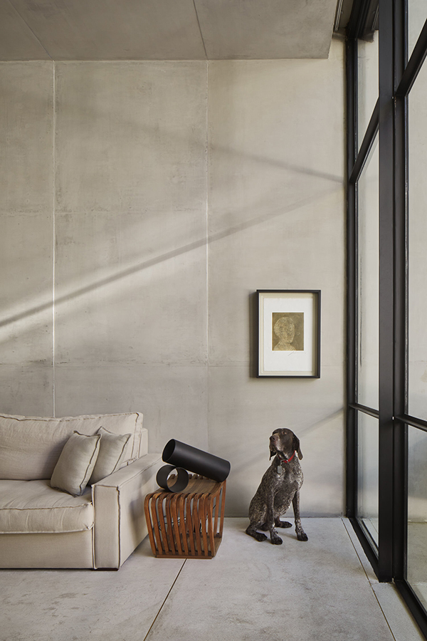
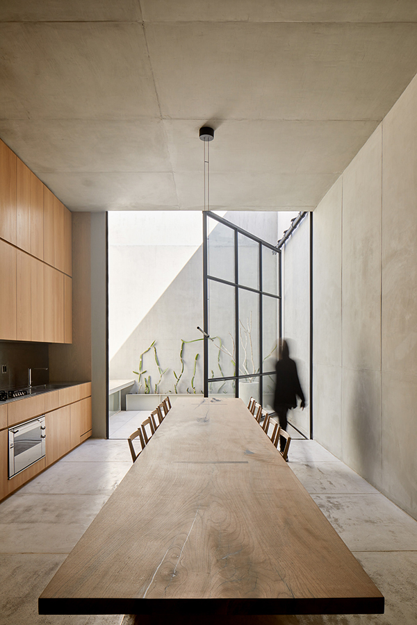
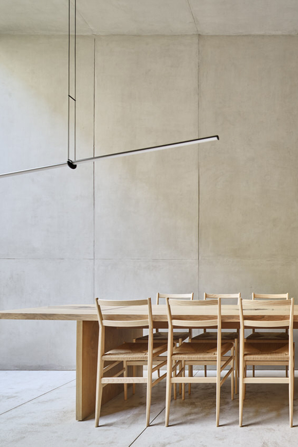
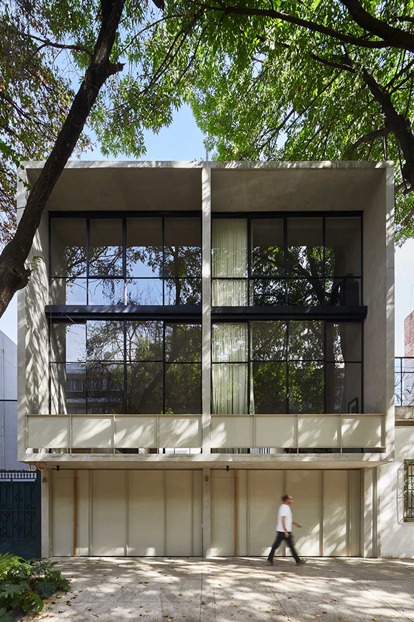
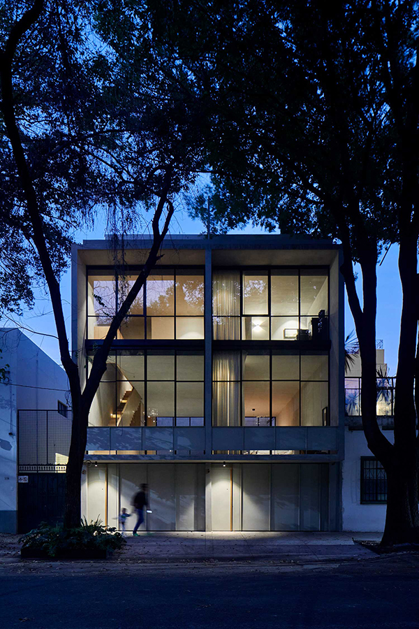
This monolithic apartment just north of Mexico City is a celebration of proportion, minimalism and restraint. Built as two identical duplex townhouses by PPAA architects the space feels solid and protective yet lets enough light and air flow through that it’s never claustrophobic.

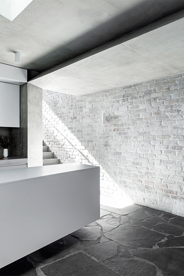
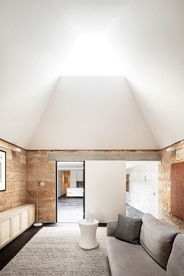
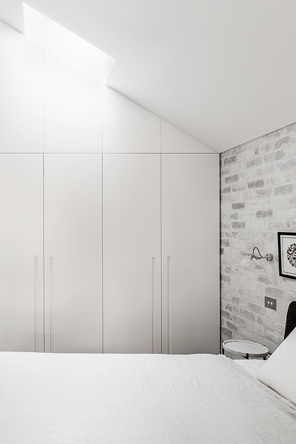
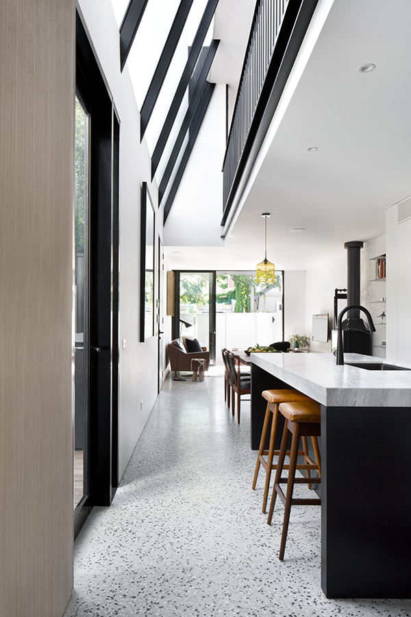
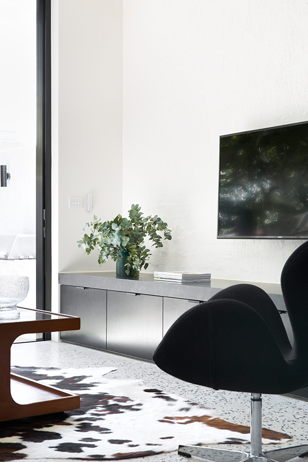
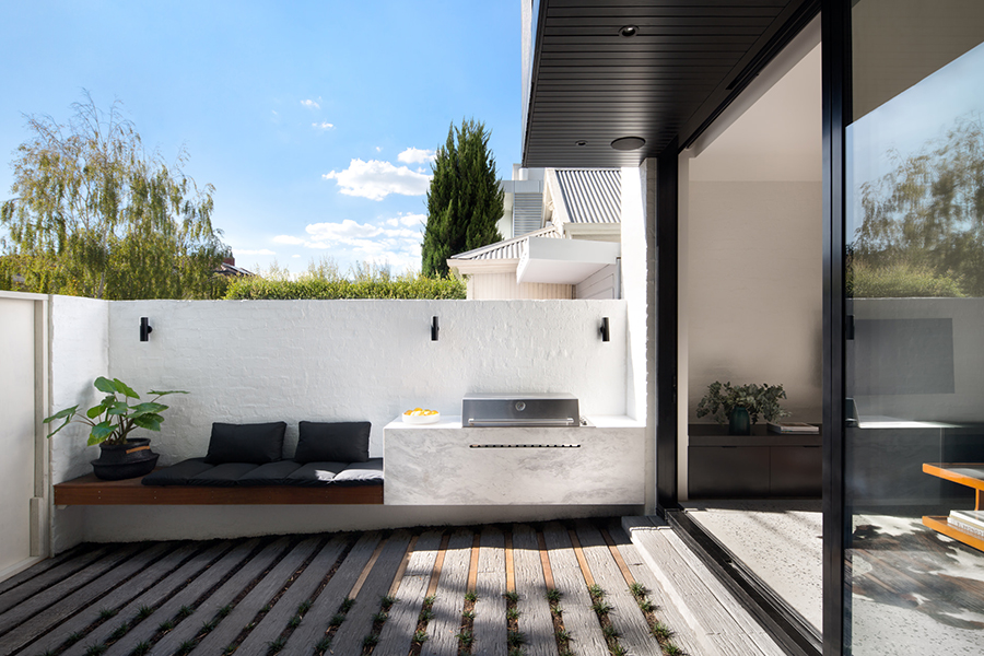
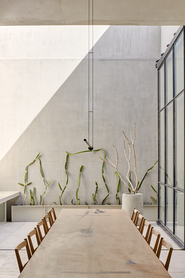
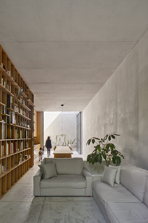
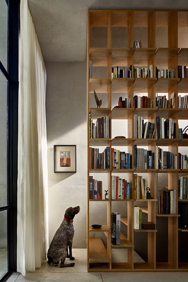
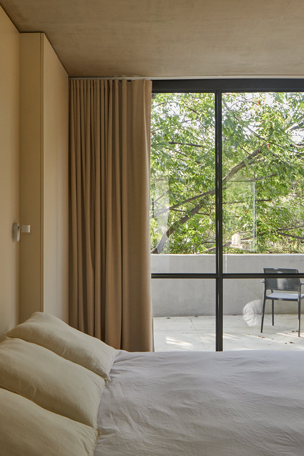
The extensive use of concrete is carefully balanced by warm timber in the kitchen and open timber book shelving serving as a semi transparent divider. The high ceilings give dramatic dimensions and I love the gigantic Crittall style door that opens up from the kitchen to the small courtyard featuring some extremely stylish cacti. Watching the light move through the house during the day must be magical and extremely calming for the mind.

I think PPAA architects have managed to create a truly stunning urban sanctuary with this monolithic apartment almost more akin to a public art space which is called home by two lucky parties. I’m not jealous… much.

_______________________________________________________________________________________

You may be able to tell I do love the use of concrete and I’ve featured quite a few spaces in the past that make great use of this modernist material. See my post about the Barbican apartment in London and how the owners of this stunning townhouse in Taipei have used it.

This monolithic apartment designed by PPAA architects just north of Mexico City is a celebration of proportion, minimalism and restraint.
monolithic apartment mexico living dining table, courtyard, dramatic ceiling light, cacti
monolithic apartment mexico dining table, kitchen, ceiling light
monolithic apartment mexico living room sofa, dining table, kitchen, courtyard
monolithic apartment mexico bookcase, staircase and dog
monolithic partment bedroom and roof terrace
This monolithic apartment designed by PPAA architects just north of Mexico City is a celebration of proportion, minimalism and restraint. By day.
This monolithic apartment designed by PPAA architects just north of Mexico City is a celebration of proportion, minimalism and restraint. By night.

PHOTOGRAPHY | Rafael Gamo (with thanks)

ARCHITECTS | PPAA

_______________________________________________________________________________________

Follow Stylejuicer with Bloglovin and never miss a post. Just follow the link.

_______________________________________________________________________________________

A balmain cottage with a concrete extension

13 July 2020

This Balmain cottage got an extensive renovation and a contemporary concrete extension thanks to craftsmanship and the vision of architects Benn and Penna.

Today’s house tour is of a Balmain cottage that got an extensive face lift and a mind blowing concrete extension thanks to the craftsmanship of stonemasons and builders Newmark Construction and the architects Benn and Penna.

This is one of those projects where trust and understanding between client, architect and builder have created a masterpiece that has won various awards. The existing cottage was built with sandstone walls back in 1870 and was in bad shape when the clients bought it. The brief was to sensitively restore the cottage and add an extension at the rear that works for modern living and enlarges the footprint considerably.

Benn and Penna designed the extension as a contemporary version of the cottage and linking it with a glass corridor that brings natural light into the central part of the house. It’s not your usual open-plan but instead presents many angles, light wells and nooks and crannies to discover, each considered in their appearance and flow through the residence.

I love how the house unfolds and reveals itself through the different stone textures and colours that lead you from the old cottage to the concrete extension. Starting with soft yellow-brown sandstone when you enter, following the new broken up slate flooring along the connecting corridor to white-washed recycled brick and sharp concrete in the extension and eventually via a wide staircase leading out into the garden. 

Considering the rear view of the magnificent concrete extension it is no surprise this Balmain cottage was named Balmain Rock by the achitects.

_______________________________________________________________________________________

If you enjoyed this house tour have a look at this flat in Copenhagen with polished concrete floor and this beauty – one of my all time favourites.

This Balmain cottage got an extensive renovation and a contemporary concrete extension thanks to craftsmanship and the vision of architects Benn and Penna.

PHOTOGRAPHY | Tom Ferguson with thanks

ARCHITECTS | Benn and Penna.

STONEMASONS | Newmark Construction

_______________________________________________________________________________________

Follow Stylejuicer with Bloglovin and never miss a post. Just follow the link.

_______________________________________________________________________________________

CONTEMPORARY, LIGHT FILLED RESIDENCE BY CERA STRIBLEY

15 June 2020

melbourne contemporary light filled residence by cera stribley

It’s my birthday today and I’m treating myself and you lovely readers to some extra cool eye candy from down under. This contemporary light filled residence has been cleverly designed with an angled skylight in the entryway extending to the mezzanine landing on the first floor. Thus bringing brightness into the house even on the dullest of rainy days. 

I love how architects Cera Stribley have managed to create a sort of sundial in the bathroom through the installation of a narrow strip of skylight. I’m sure you’d be able to judge if you’re late for work in the morning just by where the shaft of light falls.

You know I’m still a fan of the overall monochrome look which in my opinion brings sharpness, style and calm into the home. The dark kitchen island with grey marble (quartz?) worktop is a particular favourite and one that I’ve had on my own kitchen idea board for a long time. I also totally dig the black and white speckled terrazzo flooring which I think works perfectly in warmer climes, like this Melbourne residence. Though judging by the installation of a wood burner maybe it does get chilly in Oz occasionally!? 

Overall, this is an exceptional light filled 3-bedroom urban residence and I’m glad that inspirational new builds like these get realised and not choked with red tape and regulations. Hats off to Cera Stribley and it’s clients.

_______________________________________________________________________________________

Can’t get enough of Australian interior design and architecture? Check out some previous blog posts here and here.

melbourne contemporary light filled residence by cera stribley

MORE INFORMATION & PHOTOGRAPHY | Cera Stribley

_______________________________________________________________________________________

Follow Stylejuicer with Bloglovin and never miss a post. Just follow the link.

_______________________________________________________________________________________

1960 californian remodel by ryan leidner architects

25 May 2020

1960 californian remodel by ryan leider architects photo by joe fletcher

It’s been over a year since my last blog post so I thought now is as good a time as any to start again. In case you’re wondering about the radio silence – no dramas, just life.

But I couldn’t pass the opportunity to share this 1960 Californian remodel of a modernist Joseph Eichler house in Silicon Valley. The studio Ryan Leidner Architects did an amazing job stripping back all the previous reincarnations and came up with this simple broken plan remodel for a family of four centering around a lush courtyard. 

The white walls, lofty ceilings and modernist lines contrast beautifully with the lush green foliage that features an array of climate appropriate planting, from cacti to grasses and trees, displaying texture with large foliage and interest at every level. The landscape Stephens Design Studio also added a new swimming pool – a must-have in sunny California.

I just can’t stop staring at the photos by Joe Fletcher and think this remodel may be right up there on my list of dream homes.

_______________________________________________________________________________________

If you like this post, check out these stunning New York lofts, one in Gramercy Park and one in Tribeca.

1960 californian remodel by ryan leider architects photo by joe fletcher

MORE INFORMATION | Ryan Leidner Architects

PHOTOGRAPHY | Joe Fletcher

_______________________________________________________________________________________

Follow Stylejuicer with Bloglovin and never miss a post. Just follow the linkety link.

_______________________________________________________________________________________

Finally, whilst we’re all in the throws of Covid19 I want to share this quote from Rich Roll with you which really resonated with me this week:

Breathe.
Be gentle on yourself and others.
Move your body.
Eat healthy.
Rest.
Let go of expectations.
Accept what is.
Go inward.
Make a list of things to be grateful for.
And tell your loved ones how you feel.

PINK AESOP STORE IN LONDON BY SNØHETTA

15 February 2019

This new pink AESOP store in London features a large vaulted structure originating from a central round basin which gives the store a real sense of drama.

I’ve featured a few AESOP interiors on the blog before – remember the Melbourne one – but none of them had such a strong colour reference as the new pink AESOP store in London’s Duke of York Square, just off the famous Kings Road.

AESOP interiors around the world are show stoppers, always pushing the boundaries of what we traditionally think a skin care brand should look like. None look the same and they often commission famous leading interior designers to fit out their stores, like Ilse Crawford or in today’s feature Norwegian studio Snøhetta.

I love the strategic thinking behind the brand which has become synonymous with innovation and leadership in design. This can only be a good thing and from working with clients on a daily basis I know who much guts and bravery it takes to push such a brand strategy through. ‘It’s lonely at the top’ as they say but polarising your audience also ensures a loyal following from those who do ‘buy into’ your values.

I for one am totally addicted to their mandarin, rosemary and cedar hand wash and cream and I never tire of their exotic and complex Marrakesh scent. The functional, apothecary-style packaging and ‘off’ colours like brown, sludgy grey, moss green or burnt orange is an equally brave choice amongst the sea of white and vibrant colours used by competitors.

This new pink AESOP store in London features a large vaulted structure originating from a central round basin which gives the store a real sense of drama.

But I digress and giving you far too much marketing spiel. The main point is the new store’s dominate pink colour, a pigmented clay based plaster by Clayworks sourced from the South West of England. It totally nails sophistication and approachability, a subtle grown up greyish pink. Perfectly contrasted by the use of futuristic steel in the other customised store elements. 

The addition of a large vaulted structure originating from a central round basin gives the store a sense of drama and rather weirdly (but in a good way) it reminds me of the insides of a large fictional organ, especially in combination with the colour. Not too far fetched considering they sell skin care products.

This is seventh store designed by Snøhetta and if you live in Oslo, Düsseldorf, Berlin or Singapore you can check out their extraordinary store designs for yourself.

This new pink AESOP store in London features a large vaulted structure originating from a central round basin which gives the store a real sense of drama.
AESOP interiors around the world are show stoppers and this new pink AESOP store in london designed by Snøhetta is no exception.
 pink aesop store, london, duke of york square, interior design, architecture, marketing, brand, loyalty, Ilse Crawford, Snøhetta, style, sophisticated, futuristic, steel, vaulted structure, stylejuicer, trend, blog

MORE INFORMATION & PHOTOGRAPHY | Snøhetta

––––––––––––––––––––––––––––––––––––––––––––––––––––––––––––––––––––––––

Follow Stylejuicer with Bloglovin