Monthly Archives: September 2014

ALMOST… MEETING VICTORIA BECKHAM

29 September 2014

victoria beckham, store, london, dover street, vb, collection, label, fashion, style, trend, quality, luxury, detail, exquisite, fabrics, polished concrete, mirror, walnut, farshid moussavi, architecture, interior design, design, mayfair

I’d read a few interviews with Victoria Beckham in the run up to her new store opening in London’s Dover St and was curious to see for myself the alleged attention to detail that had gone into everything from the designs of the hanging rails to the generous size of the changing rooms allowing yummy mummies to bring their brood and get changed in comfort.

To be honest I wish I’d had my brood with me when I went to see the store last Saturday. It would have been a good ice breaker to start chatting to Victoria who actually arrived at the store with a few pals whilst us commoners waited patiently in line.

I have to say the experience was slightly surreal but also strangely normal. Maybe because she was surrounded by what looked like a bunch of good mates, or maybe because of her media exposure I felt as if I’d met her a dozen times before or maybe because I’m just super cool. Yeah… right!

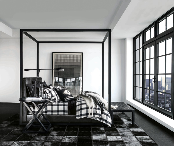
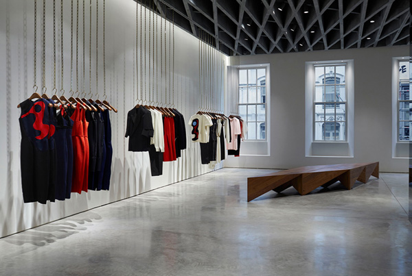
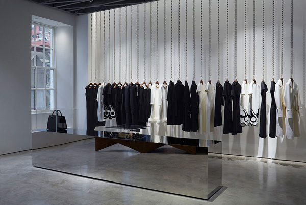
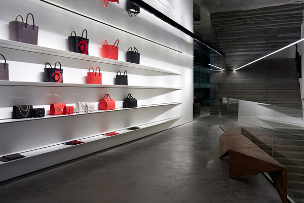
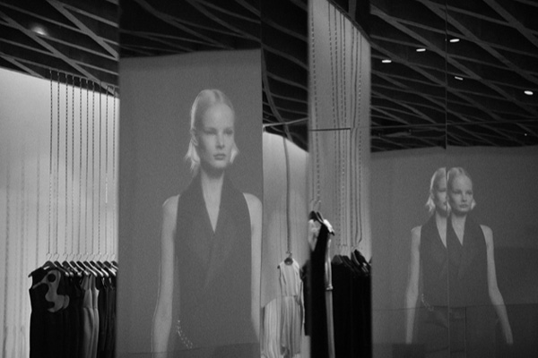
What did blow my mind though was the interior design by Farshid Moussavi currently one of the most successful female architects around. I read that VB worked closely with her and I have to say that the minimalist design compliments her collection beautifully, showing off the designs and quality fabrics.

Victoria-Beckham-Store-London-05

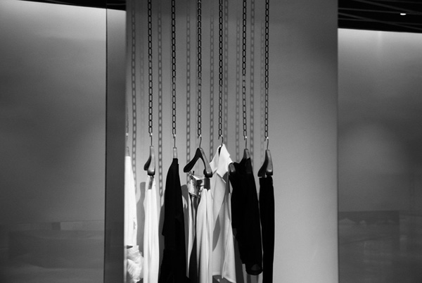
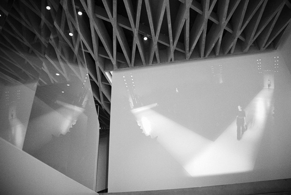
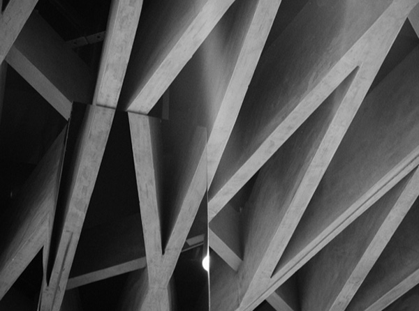
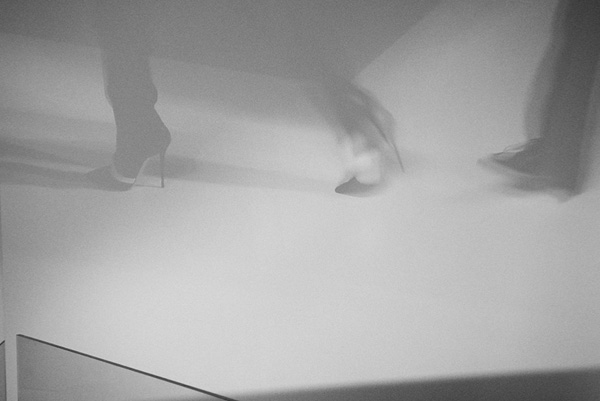
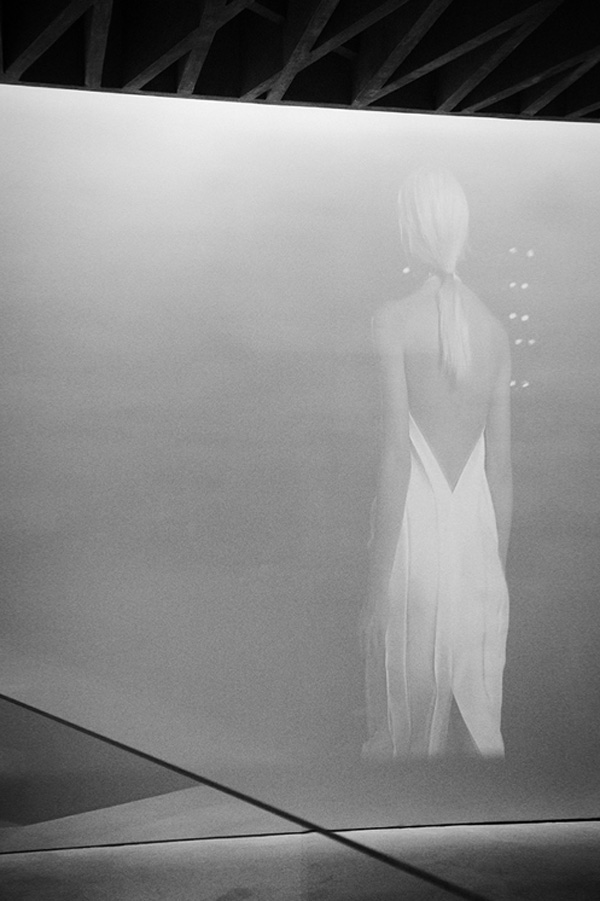
I was surprised how the classic Mayfair facade hides an almost warehouse like interior with polished concrete floors, mirrored walls and a concrete zigzag ceiling on the first floor that cleverly hides the grooves and runners for the free hanging chain rails. Walking up the almost sculptural concrete staircase you can see the latest runway collection being projected on to the wall ahead of you before entering a world of luxurious materials, beautiful cuts and exquisite details.

It’s a fabulous shopping experience and one that I gather VB has put her heart and soul into. For me the piece de resistance was the scent of Diptyque’s Feu de Bois which was subtle but distinctly present and left me feeling as if I’d just been to a luxury spa.

Victoria-Beckham-Store-London-08

Last but not least I have to mention the amazing sales staff. One thing that always bugs me about high end fashion stores are the often snooty assistants who seem to judge you the minute you walk in. Something unlikely to happen at VB who I hear hand selected the staff who could not have been more friendly and helpful. I genuinely felt welcome and not just because of the glass of champagne (or fizzy elderflower cordial) but I had a lovely chat with the store manager who also informed me politely not to take any photographs of VB – fair enough considering the hordes of paps outside.

I admit I was tempted to try a few things on but in the end I was afraid my Dutch courage would lead me to spend a months rent on a beautiful winter coat that would look lovely in a Mayfair restaurant but slightly unsuitable for my daily playground outing.

 
Victoria-Beckham-Store-London-02

Victoria-Beckham-Store-London-03

Victoria-Beckham-Store-London-04

Victoria-Beckham-Store-London-06

Victoria-Beckham-Store-London-07

Victoria-Beckham-Store-London-09

victoria beckham, store, london, dover street, vb, collection, label, fashion, style, trend, quality, luxury, detail, exquisite, fabrics, polished concrete, mirror, walnut, farshid moussavi, architecture, interior design, design, mayfair

 
PHOTOGRAPHY | Victoria Beckham with thanks
INTERIOR DESIGN & ARCHITECTURE | Farshid Moussavi Architecture
 
Follow Stylejuicer with Bloglovin

MOOD BOARD | WEEKEND VIBES #03

27 September 2014

weekend, vibe, vibes, mood board, bedouin societe, bed linen, pure, tumblr, raysofthesun, scandinavian deko, annabell kutucu, interior stylist, interior design, trend, dark, raw, vintage, leather, gym, equipment, bed, lazy, day, sunday, iced coffee, latte, drink
 

Sending you some great weekend vibes with this little collection of images found via my beloved Pinterest – kinda describing my perfect slow Sunday.

Starting with a lazy lie in letting my thoughts drift away before kick starting the day with an iced latte and heading off to a flea market in search of some vintage treasure. I’m getting slightly obsessed with Annabell Kutucu’s styling who’s also responsible for the look at the San Giorgio in Mykonos and I love how she’s used vintage gym equipment to style the shot above. Fresh bed linen is a must at the weekend and as the nights draw in I find myself favouring darker bedlinen and colour around me to create a cozy space.

Happy weekend all and enjoy the mood board!
 

SLUMBER //
COFFEE //
VINTAGE GYM //
LINEN //

 
NOTE | All via my Pinterest boards
 
Follow Stylejuicer with Bloglovin

DESIGN INSPIRATION | WHITNEY LINDSEY

24 September 2014

whitney lindsey, graphic design, design, inspiration, embossing, typography, production, texas, photography, materials, production, dallas, Ussery Printing, interior design, letterpress, tactile,

I’m always excited to come across like-minded people especially if they’re fellow graphic designers and share my passion for typography and production.

Whitney Lindsey might live around 5,000 miles south west of me but we sure speak the same graphic language. Not surprisingly we also share a similar background. The 28-year old grew up on a farm (like me) and spent a lot of time outside using her imagination to keep her occupied. Being so closely connected to nature she says that she always had a natural inclination to appreciate beauty and great design she just didn’t know it was called design – as silly as that sounds I can totally relate to that.

Despite her lack of exposure to any urban art or culture when growing up she has succeeded in her field and credits exactly that lack to making her very introspective which defines her as a person and designer.

I’ve always believed that true creativity is challenged and stimulated when we’re left to our own devices and that boredom is actually healthy for children – a point I try to make with my own kids. Whitney is a great example of that theory and I was entranced when she told me about her work, her inspiration and how she discovered graphic design almost by accident. Dive into the interview below and admire her beautiful work along the way.

whitney lindsey, graphic design, design, inspiration, embossing, typography, production, texas, photography, materials, production, dallas, Ussery Printing, interior design, letterpress, tactile,

Let me start by asking how you got into graphic design?

When I started college I had no idea what I wanted to do (and really no idea what graphic design was) so I just started taking my core classes without picking a major. After about a year and a half I was starting to run out of core classes to take so my advisor suggested that I look through the course catalogue and pick out a couple of classes that looked interesting to me. The things that looked most interesting to me were all of the art classes, but being the procrastinator I can sometimes be, all of the art classes were already full except for Photography and Graphic Design. I was really excited about photography, but not that thrilled about graphic design. For some reason I thought graphic design was going to be a bunch of web banners and not much else. On my first day of class I was proven very wrong. The professor gave a lecture on “What Is Graphic Design” and I absolutely fell in love. I saw how alive type could come—how it had the ability to visually speak louder than the words themselves. I saw how visual design could create very powerful experiences and I was hooked. I remember leaving class that night knowing that was what I would do for the rest of my life. I’ve never had an experience like that before. It was pretty magical.
 

How would you describe your style and aesthetic?

My style is generally pretty clean and airy. I tend to focus on the production of a piece just as much as the design. The physical feel of a piece—the texture and weight of the paper, the quality of the materials, the contrasts in textures throughout the piece—plays such a big part in the overall experience of it and I always try to keep that in mind. Design is never just visual to me and I think that mentality really influences my work.
 

Which part do you enjoy most?

I enjoy the entire process! I love the actual design phase—I can spend hours in front of my computer completely enthralled in a design and it will feel as if only an hour has passed. I also love the energy and collaborative nature of a photo shoot. I enjoy the production phase of a project as well and getting to see all of the hard work put into a project come to fruition. Of course, there are bumps along the road of every project, but overall I thoroughly enjoy the whole process.
 

What gets you excited and how much do you get involved in the art direction and styling of the shots.

I do get involved in art direction and I’m continuously art directing more and more. Lately I’ve been working on projects where my only role is art directing a photo shoot.

 
design-inspiration-whitney-lindsey-via-stylejuicer-04

design-inspiration-whitney-lindsey-via-stylejuicer-05

design-inspiration-whitney-lindsey-via-stylejuicer-03

design-inspiration-whitney-lindsey-via-stylejuicer-07

design-inspiration-whitney-lindsey-via-stylejuicer-08

whitney lindsey, graphic design, design, inspiration, embossing, typography, production, texas, photography, materials, production, dallas, Ussery Printing, interior design, letterpress, tactile,
 

What about the production values… do you get to chose the materials?

I usually choose the materials for the projects I work on. I really believe that the materials can make or break a design. On most of the projects I’ve worked on, I work with Ussery Printing in Dallas. They are the best. I do a lot of production-heavy things in my work and the representative from Ussery that I work with, John Lawrimore, goes above and beyond to make my vision a reality. I really could not do the things I’ve been able to without the hard work of the pressmen, the diemakers, the foil stampers, and anyone else who has a hand in the production and the dedication they have to their craft. I have so much respect for these individuals and could not create successful work without them.
 

Where do you get your inspiration from?

Everywhere! I feel very inspired by seeing other people who have so much passion for what they do—whatever it is. I’m very inspired by great music. I’m inspired by beautiful interiors, nature, and fashion. Honestly, I’m just inspired by anything I find beautiful. Having such a great appreciation for the beauty in our world lights some sort of fire in me to add to it by creating beautiful things.
 

design-inspiration-whitney-lindsey-via-stylejuicer-10

design-inspiration-whitney-lindsey-via-stylejuicer-11

design-inspiration-whitney-lindsey-via-stylejuicer-12

design-inspiration-whitney-lindsey-via-stylejuicer-13

design-inspiration-whitney-lindsey-via-stylejuicer-14

design-inspiration-whitney-lindsey-via-stylejuicer-15

whitney lindsey, graphic design, design, inspiration, embossing, typography, production, texas, photography, materials, production, dallas, Ussery Printing, interior design, letterpress, tactile,
 

My surroundings are very important to me… Do you have a penchant for interior design too? If so how would you describe your style at home

Oh, I love interior design. Sometimes I wish I had studied interior design as well as graphic design. I am such a homebody—my home is my sanctuary. When the world feels crazy and overwhelming my home is my retreat and I try to make it as beautiful and calming as I can. Honestly, I don’t know how to describe my style at home. I love having rustic, historic pieces and mixing them with refined pieces. It’s very much a balance between rustic and refinement. I’m very particular about the details of my home—lighting is very important to me and I don’t like having clutter. I try to have a reason and purpose for everything I have out in my home—even down to the kitchen countertops. If a bag of chips sitting on the counter isn’t adding to the look and feel of the kitchen, it gets put away very quickly.
 

design-inspiration-whitney-lindsey-via-stylejuicer-17

design-inspiration-whitney-lindsey-via-stylejuicer-18

design-inspiration-whitney-lindsey-via-stylejuicer-19

whitney lindsey, graphic design, design, inspiration, embossing, typography, production, texas, photography, materials, production, dallas, Ussery Printing, interior design, letterpress, tactile,
 

And finally, where’s your happy place? Where do you feel most comfortable? Can you describe a perfect day scenario for us?

Home. My happy place is definitely my home. A perfect day would be spent at home with beautiful music quietly playing, my fiancée in the kitchen cooking something amazing (he’s a wonderful cook), the weather’s perfect outside (which is a rarity living in Texas) and the windows are open.
 

Aw, that sounds wonderful! Thank you so much for your time Whitney – you’re a true design inspiration.

NOTE: Whitney is a tad social media shy but loves hearing from other designers and artists so feel free to drop her an email whitney [at] brickandmortarco.com


PORTFOLIO | Whitney Lindsey
 
Follow Stylejuicer with Bloglovin

RALPH LAUREN | DOWNTOWN MODERN AW14

22 September 2014

ralph lauren, downtown modern, collection, aw14, fall, holiday, season, country in the city, navajo, cypress wood, oak, textiles, fabrics, cashmere, mohair, graphic, black and white, prints, fulton pendant, Equilibrium table lamp, luxury, comfort

You’ve gotta love Ralph Lauren. His rags to riches story is well documented and there’s barely a harder working man in the business who despite his age is still very much hands on and signs off on every single piece as I found out at the press launch for his new AW14 Home collection last week.

There were of course the over-the-top sumptuously dressed beds with a multitude of delicate and luxurious fabrics and trims but I was pleasantly surprised to find a pared back version in the ‘Downtown Modern’ collection. A kind of country in the city style with ebonized oak, cypress wood and textiles inspired by Navajo prints adding a touch of warmth.

The graphic prints and black and white palette give a modern feel and I like how a few industrial piece have been incorporated – my favourites being the large Fulton pendant and Equilibrium table lamp. The throws and cushions are beautifully tactile in mohair and cashmere oozing Ralph Lauren luxury and comfort. At one point I just wanted to curl up on the sofa with one of the cashmere rugs and have the superb caterers feed me teeny tiny eggs benedict and blueberry pancakes but luckily my manners got the better of me.

I have to concede that I’m not the target market but it is interesting to see how Ralph is reaching out to new customers. I also like to believe that he has a wry sense of humour as the press shot of the loaded jeep outside an old red brick factory made me smile. What better way to conjure up his country in the city style than to include some vintage skis, freshly chopped logs and a fluffy white American Eskimo dog?

You’ve gotta love Ralph Lauren!
 
Ralph-Lauren-Home-Downtown-Modern-AW14-02

Ralph-Lauren-Home-Downtown-Modern-AW14-03

Ralph-Lauren-Home-Downtown-Modern-AW14-04

Ralph-Lauren-Home-Downtown-Modern-AW14-05

Ralph-Lauren-Home-Downtown-Modern-AW14-06

ralph lauren, downtown modern, collection, aw14, fall, holiday, season, country in the city, navajo, cypress wood, oak, textiles, fabrics, cashmere, mohair, graphic, black and white, prints, fulton pendant, Equilibrium table lamp, luxury, comfort

NOTE: In case you were wondering what to get me for Christmas I’ve selected a few favourite pieces below.

ralph lauren, downtown modern, collection, aw14, fall, holiday, season, country in the city, navajo, cypress wood, oak, textiles, fabrics, cashmere, mohair, graphic, black and white, prints, fulton pendant, Equilibrium table lamp, luxury, comfort


PHOTOGRAPHY | Ralph Lauren

 
Follow Stylejuicer with Bloglovin

MOOD BOARD | LIVE WITH LESS

20 September 2014

live with less, mood board, black and white, architecture, fashion, quality, hands, typography, handbag, reflective, lines, stark, attitude, fabric
 
To Live With Less sure is easier said than done. After all I kind of need nice decorative things around me…

I was first attracted to the typography but then got thinking about what it means to Live With Less. For me this is about paring back, de-cluttering and making conscious decisions which things to keep and which ones to part with. As we’re slowly moving towards a new season maybe this is the time for me to have a clear out and re-organize my wardrobe. It somehow always feels cathartic…

What about you? Are you a hoarder or can you part with stuff easily?

Wishing you all a happy weekend!

 
WOMAN //
HANDS //
ARCHITECTURE //
TYPO //
BAG //

 
NOTE | All via my Pinterest boards
 
Follow Stylejuicer with Bloglovin